
Network data?
Chartbeat measures over 50,000 media sites, and tracks what people are reading on a second-by-second, pixel-by-pixel basis on each article and page. For obvious legal reasons, within our products, customers only get to see their own data.
However, we have the unique advantage of an all-seeing data eye on the industry. The following three projects explore different avenues of utilizing our anonymized network data to enlighten our customers, and anyone interested in media.

Chartbeat Discover
Background
An R&D team was put together with the prompt of "somehow product-izing our network data." We were tasked to find a use case and prototype our best hypothesis to incorporate into our customer base's workflow.
How might we utilize network data in an editorial workflow?
Solution
With such a broad prompt, we narrowed in on a workflow that Chartbeat had never really dug into before: the content creation phase. During our user research, we found that finding what story to write next was an all-manual, tedious, and time-consuming workflow. It was driven mostly by gut decision-making and we had a hypothesis that providing real-time data on content trends and audience saturation across our network would give editorial teams a clearer picture with which to make this decision.
Role
Product Designer
- Research
- UX/UI + Visual Design
- Prototyping + Testing
Team
- Product Manager
- Data Scientist
- Back-End Engineer
- Front-End Engineer
Prototypes
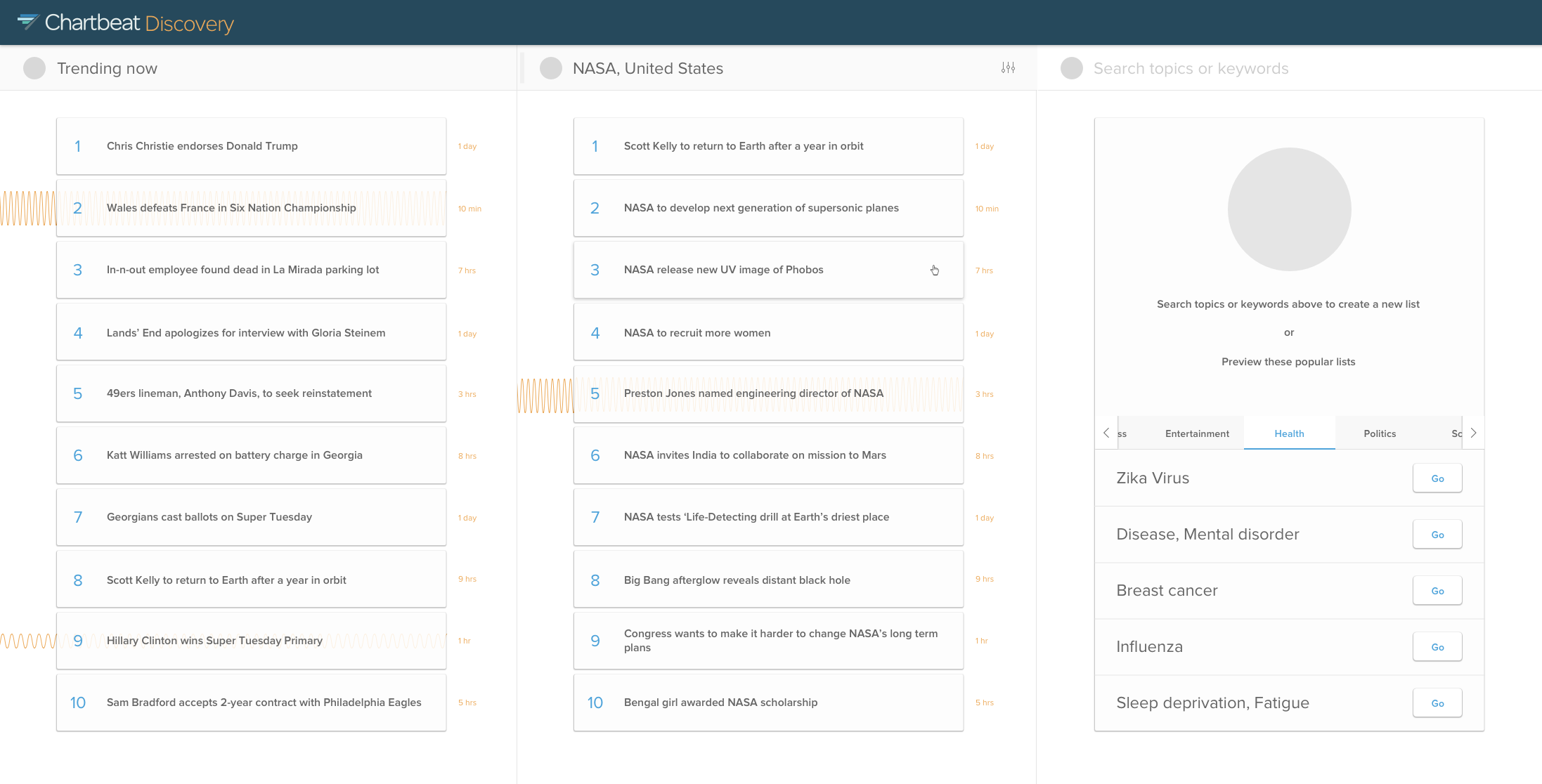
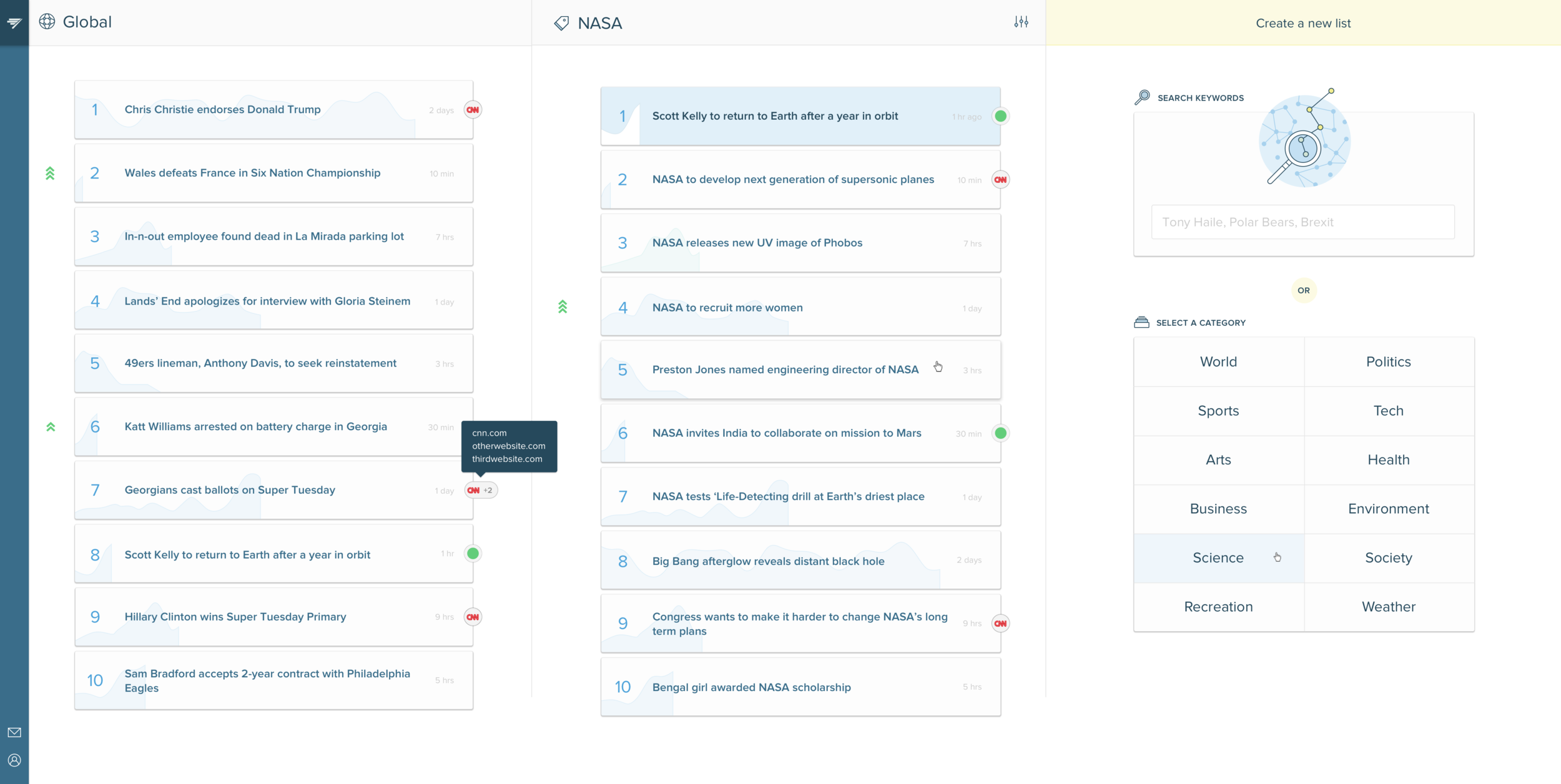
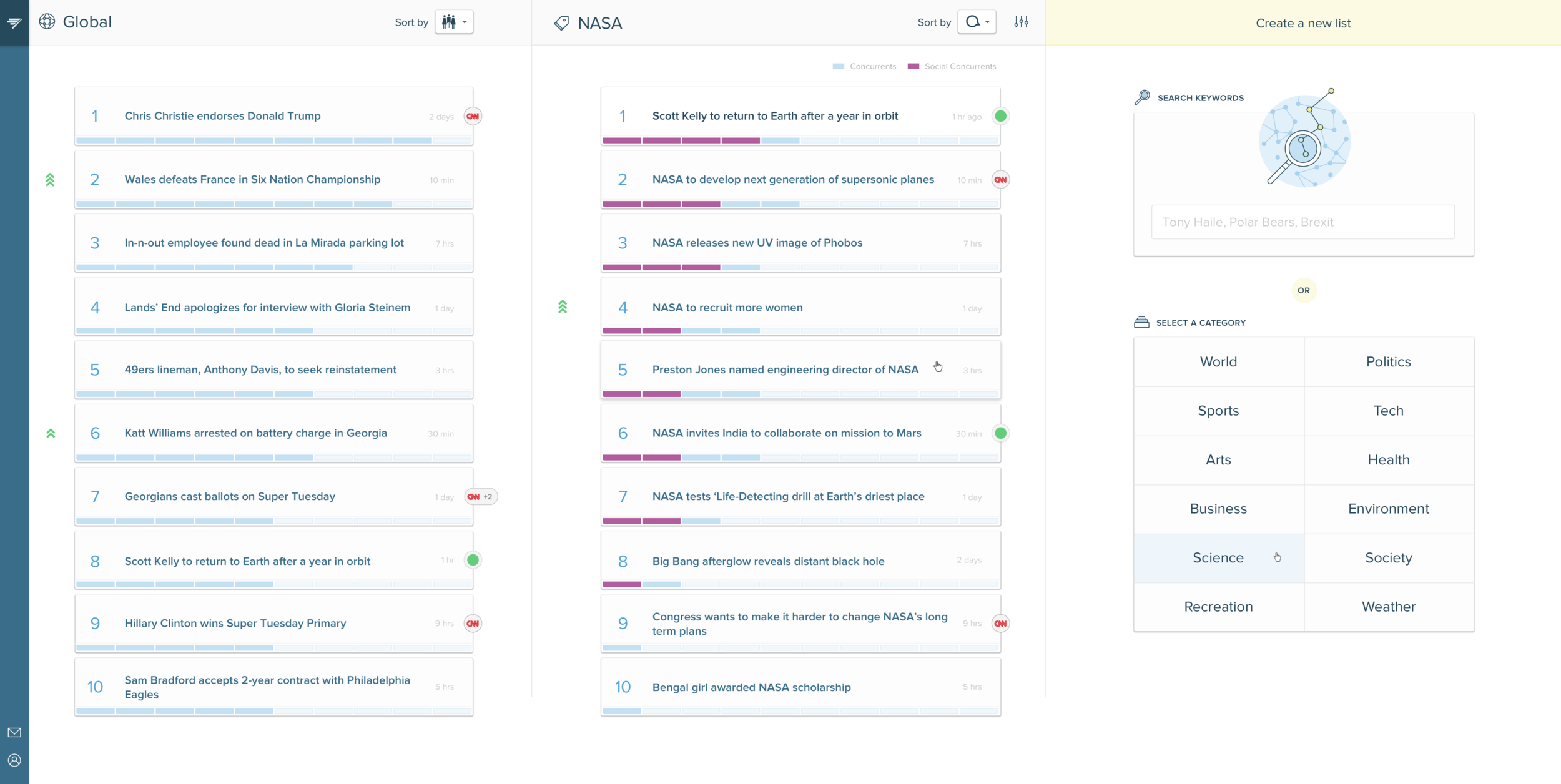
The guts of our idea relied on revealing a list of trending stories* across our network and making it the most relevant to our users as possible. There were two information levels that we prototyped: the list and the story.*
* For legal reasons, we cannot reveal specific article titles to customers, so we built a data pipeline that scraped text from all articles and used Natural Language Processing to combine them into "stories" or threads of conversation.
The List
Questions our prototypes hoped to answer:
- In a list of trending stories, besides order, what data is helpful and why?
- How can users make a trending stories list more relevant to them?
- How can we determine and flag content opportunities for our users? What are those opportunities?
The Story
Questions our prototypes hoped to answer:
- What data is relevant and actionable to users at the story level?
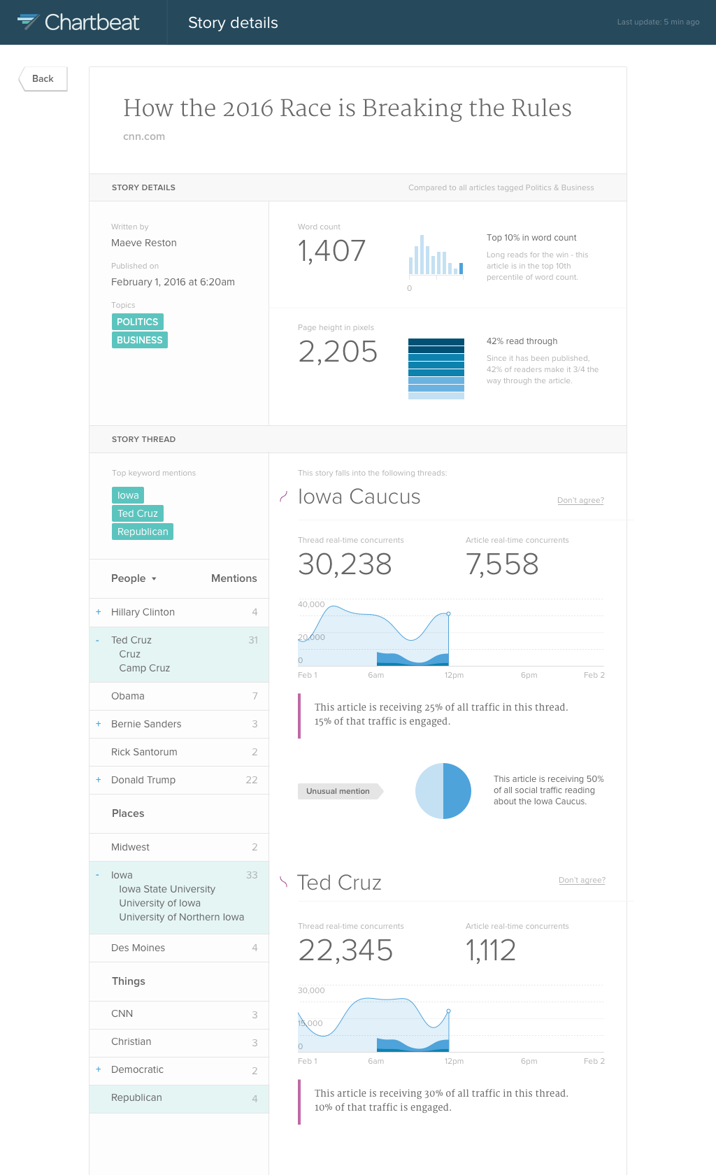
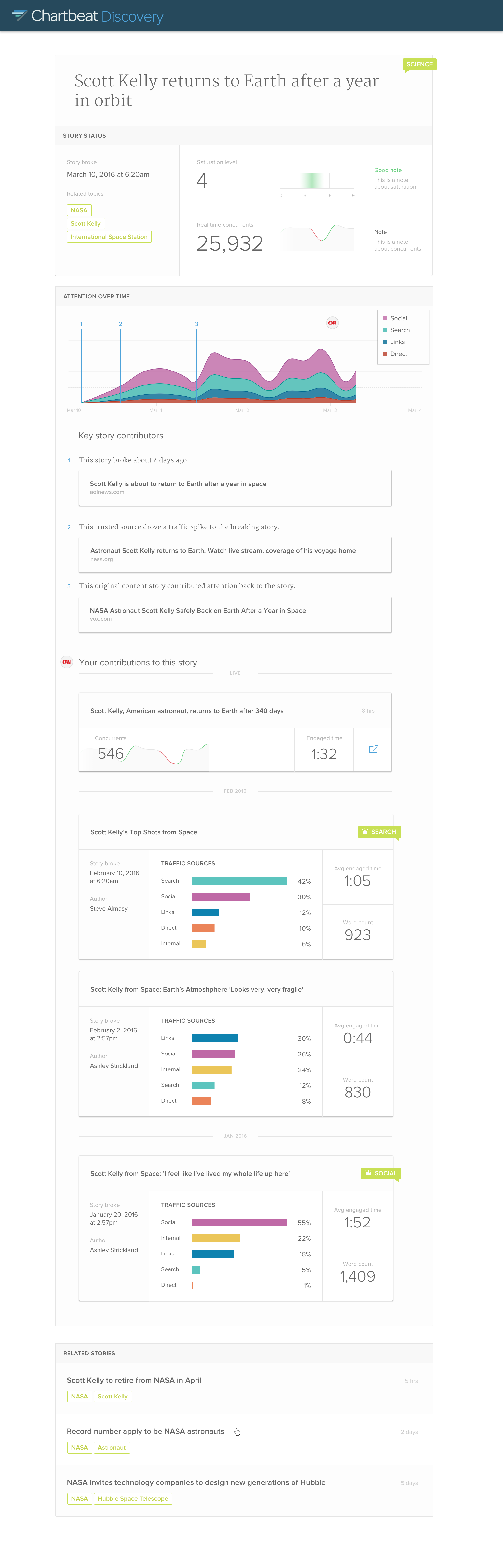
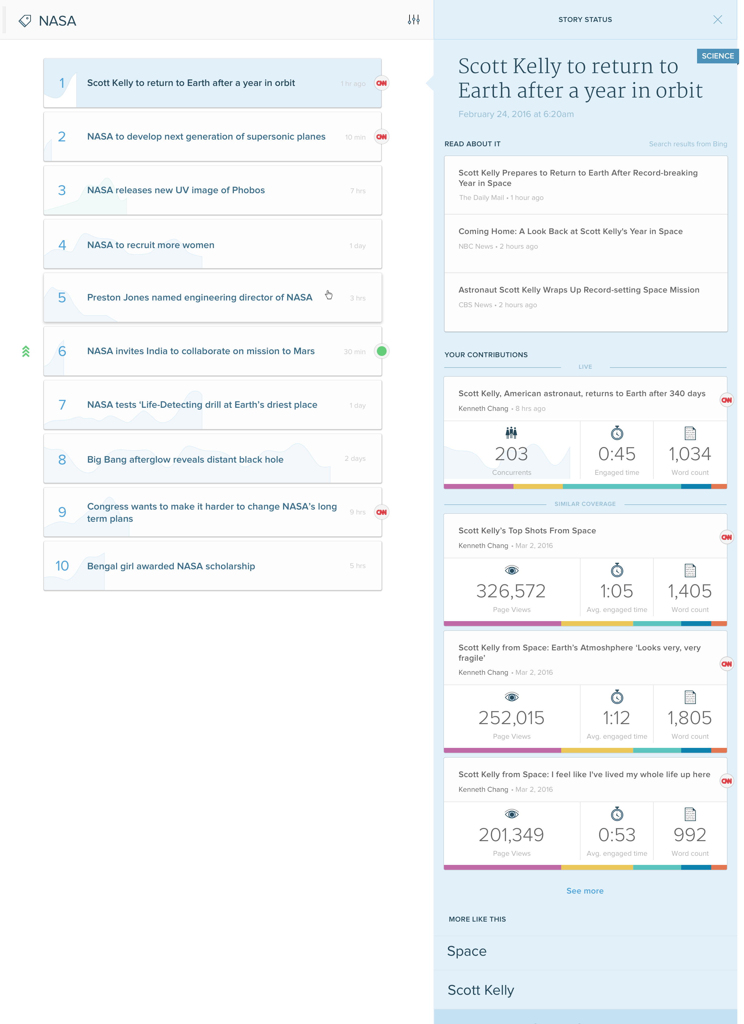
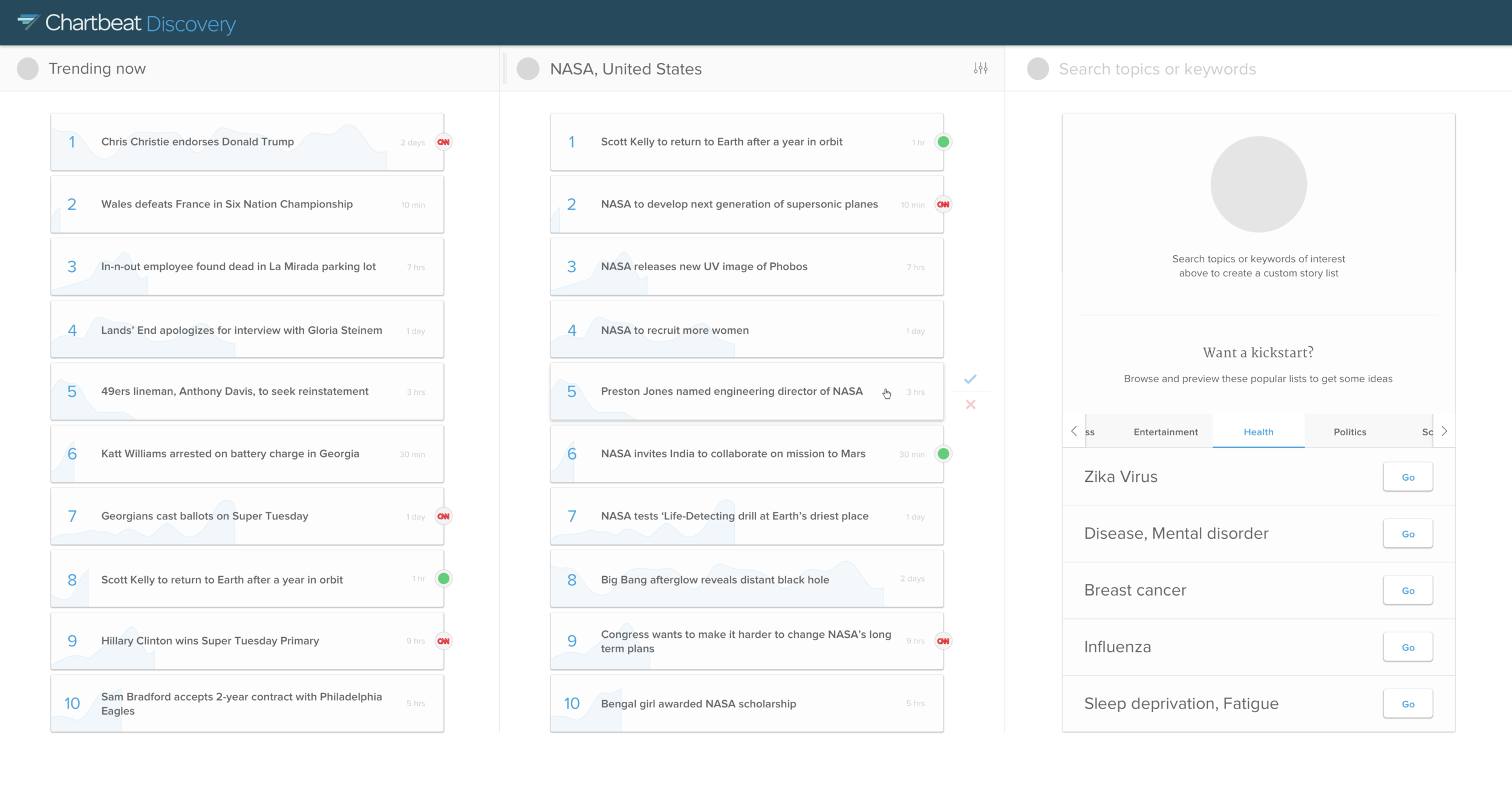
These designs provided a kickstart to conversations in which we discovered more about their content creation workflow and pain points. These directed the evolution and iteration of the designs and product features. Some examples of vetted workflow questions:
- Have we already covered this story? (Badges marked in list)
- Have we written about something similar that we can re-promote? (Similar coverage history included in story detail)
- Are there any traffic trends that can help sway my writing approach/angle on this story? (Sort options incorporated in list view, including Search/Social)
Invalidated Ideas

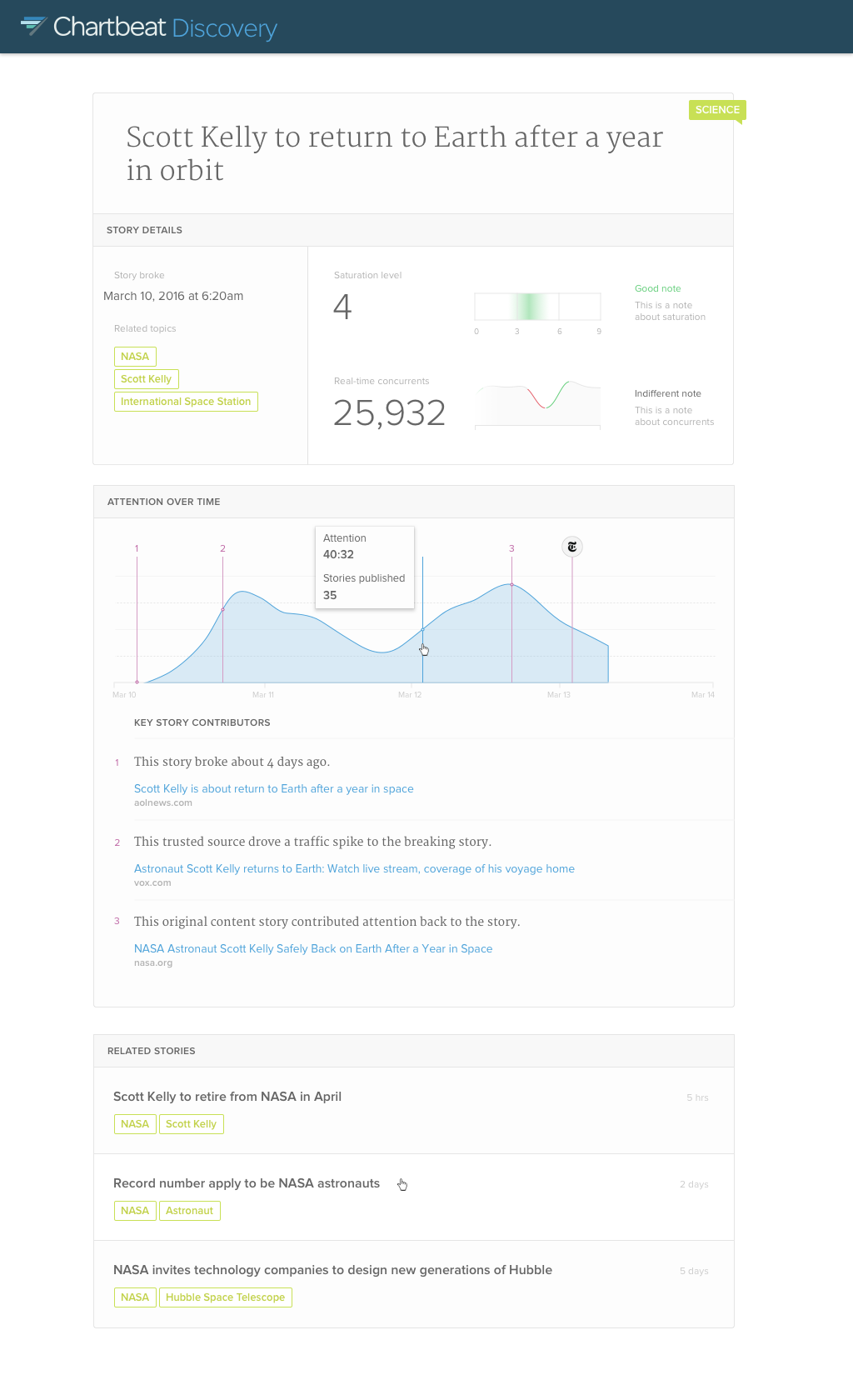
Saturation level
Is this story over?
We tested the idea of story "saturation" by plotting reader interest against to-date market reach.
This idea proved to be too complicating for users, and also did not take into account the different angles that content can be spun or sentiments on the topic.

Network benchmarking
How did your article compare to the rest of the network on this story thread?
Answering this could provide customers with another lens with which to review their content performance. Generally, this was a well-liked feature, but it came with too many caveats, including:
- Swayed use cases between large and small trafficked sites
- Only caring about specific peers and the desire to curate
Results
There were pockets of gold in what we discovered, but the beta feedback of the tool at large was not overwhelmingly positive. A large factor that effected the experience was the integrity of the content pipeline. NLP is hard to get right, and the time we projected to get the pipeline to production-ready was going to cost a lot of money. Unfortunately, this project didn't prove the level of impact needed to justify its spend and prioritization, so it was shut down.
However, the beginnings of the content pipeline started for this project have been used to build out other features (see Election Trackers below), and the user research on re-promotion and network benchmarking have proven to be very helpful for other features across the suite.

Election Trackers
Background
Election days are some of the most exciting times to be working at Chartbeat. Traffic spikes high across our network, and as understanding an election relies on real-time feedback, we feel such a direct connection between our products and the companies we work with.
How might we share some of this excitement and data with the world?
Role
Design Director
- Product Design Direction
- UX/UI + Visual Design
- Illustration
Team
- Data Scientist
- Back-End Engineer
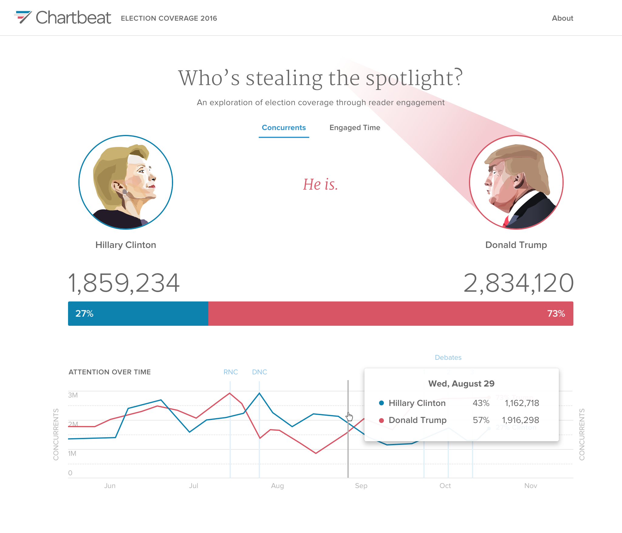
US Election Tracker
Project live here. (Data expired)
This project started out of a Hackweek idea. During the 2016 US Election, we had the idea of simply showing, across our network, which candidate was being read about more. We have a content pipeline that scrapes the text of every page and, using NLP, categorizes them by key words. This allowed us to visualize the amount of concurrents (people on an article right now), on any articles containing keywords related to the candidates.
Our Head of Product thought it was such a great idea, that it got prioritized to flesh out and promote to the world. We made the experience responsive, and for further context, added a list of top stories that contributed to traffic peaks along the way.
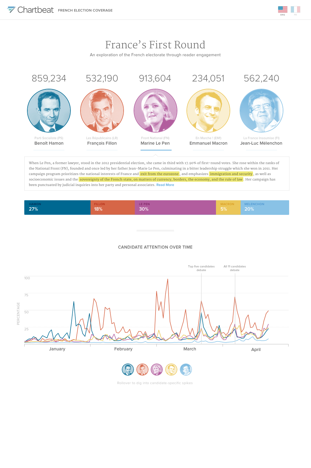
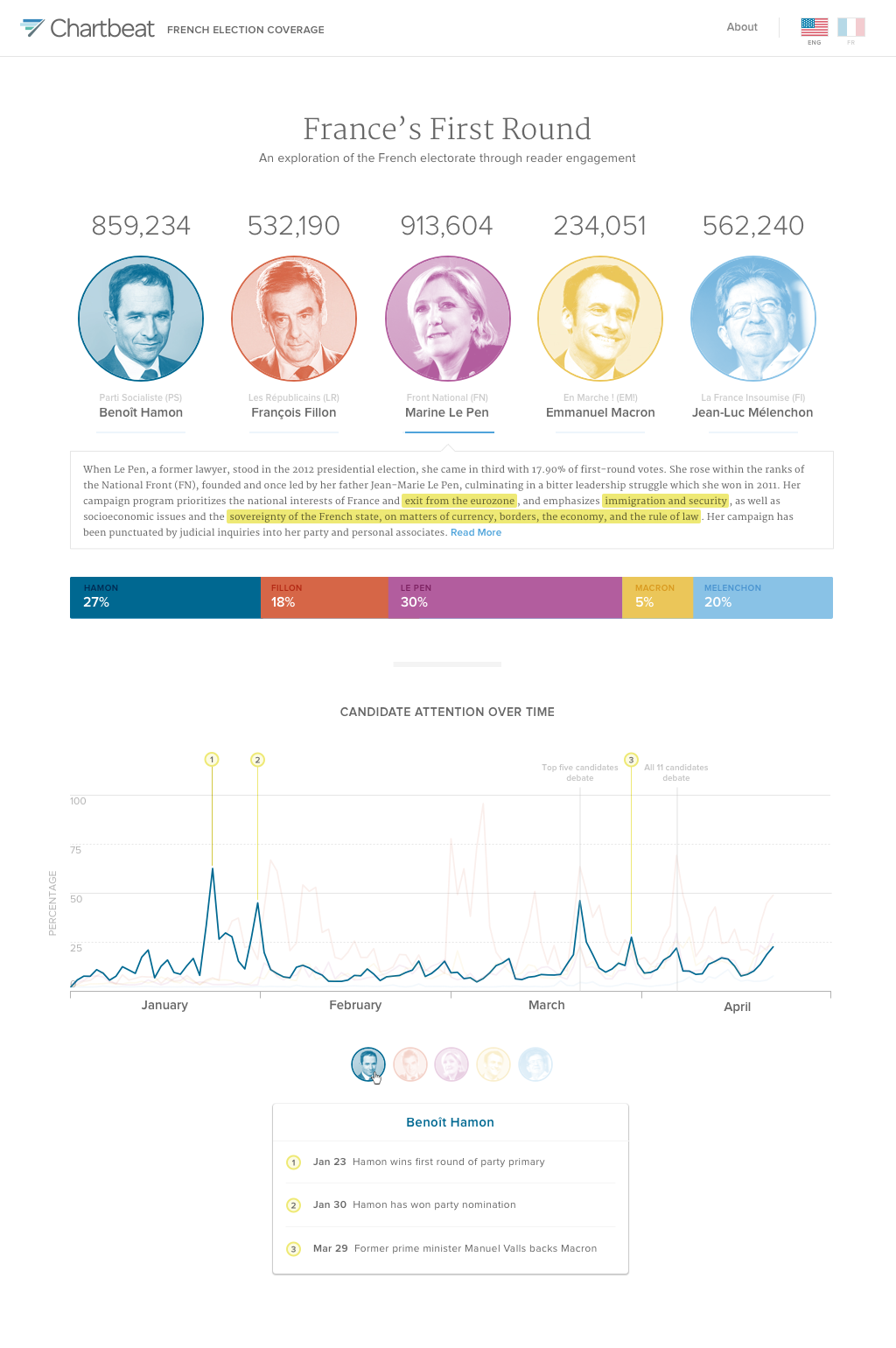
2017 French Election Tracker
Project live here. (Data expired)
After the US Election Tracker was such a success, we made the infrastructure scalable so that you are able to enter any type or amount of entities that you'd like to be compared to each other.
Our first use of this was for the French Election in 2017. Since we are US-based, we wanted to make this version more educational. We included snippets of information for each candidate to understand their background and agenda, as well as offered an English to French translation, our first multi-lingual product.
As you can see in the slideshow, we added traffic spike notation per candidate in order to better understand what drove reader engagement spikes over time.

Top Stories of the Year
Background
In 2015 the Marketing team published an end-of-the-year blog post that included a list of the most-read stories of the year, across our entire network. It sparked an idea; I saw so much potential for this to be something greater. This was information that nobody had, and its content was not only fascinating to customers, but also to the general public.
How might we make the most out of this insightful network data?
Solution
In 2016, I proposed that the Design and Marketing teams work together to build the top stories list into an interactive experience, our own version of a yearly report. We pulled and categorized our top 100 stories, and built an interactive experience around what we found. The 2016 launch was such a success, that we turned this into a yearly project.
From something that began as a blog post, this project turned into something much more meaningful for our company and brand reach. Customers are honored to make the list, and we have even received new business from non-customers that would like to join our network for the chance to be included on it.
Role
Design Director
- Creative Direction + Design
- UX/UI + Visual Design
- Swag Design
- Project Management + Ops
Team
- CMO
- Data Scientist
- Marketing Designer

The 2015 blog post that inspired this idea
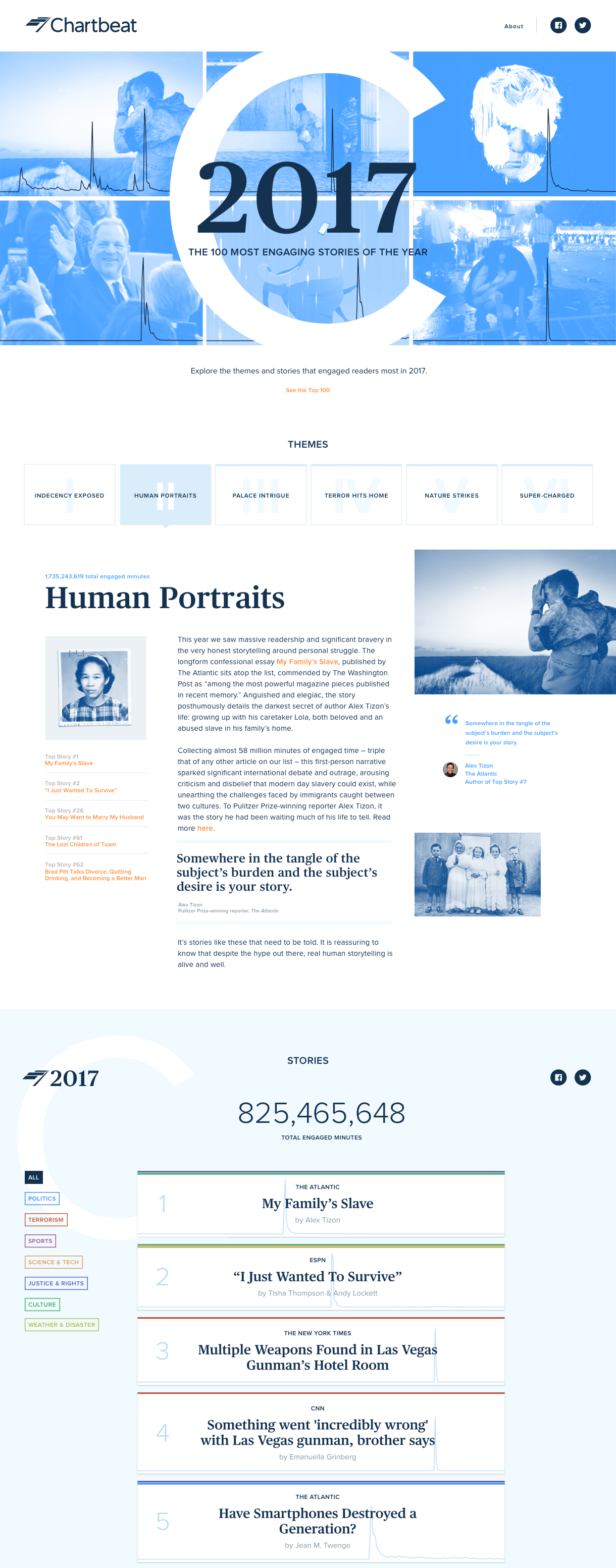
Top Stories of 2017
Project live here.
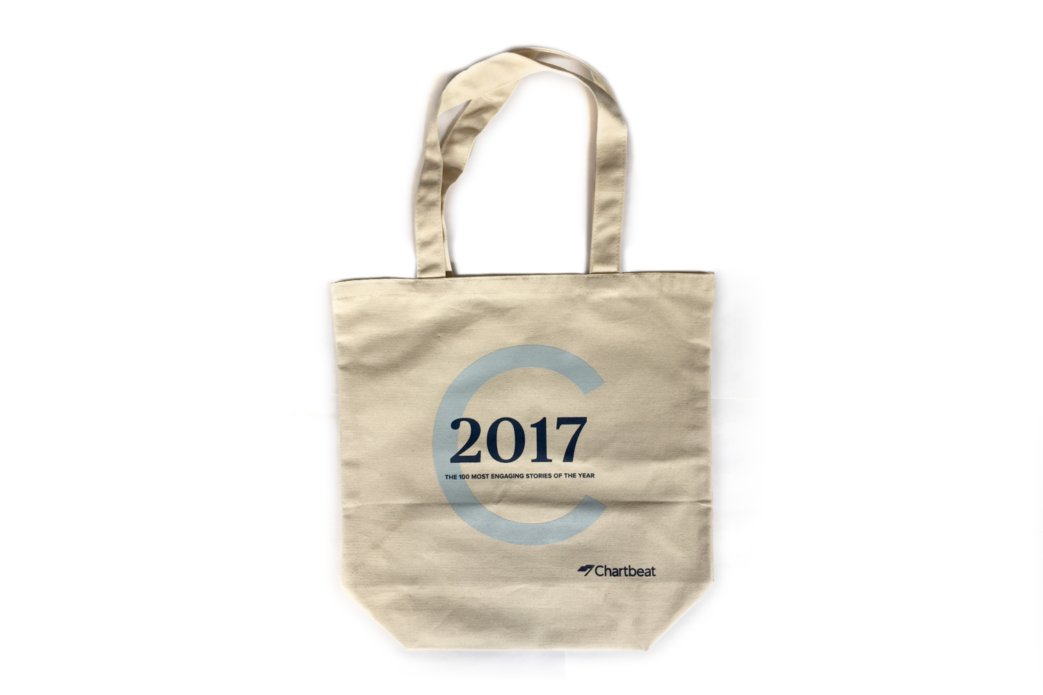
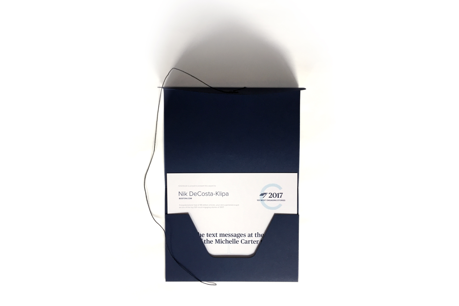
Inspired by our rebrand, I wanted the 2017 experience to focus on celebrating and honoring the stories and the authors who brought them to life. We pulled in story imagery and interviewed the authors in order to capture the story behind the story, which we included in a more robust roundup of yearly themes.
To further acknowledge their accomplishments, we also designed congratulatory packages sent to all companies that made the list. These included a company plaque, pins, tote bags, and awards for all authors.

Reactions
A few of the twitter reactions received in response to the 2017 experience.


