Background
GOOD launched in 2006 as a monthly magazine and media site dedicated to helping people live and do good. Over time, through content and event initiatives, GOOD grew a strong audience that embodied a smart and engaged community. We found a loyal, active niche, and wanted to get them even more involved.
How might we make the most out of our community?
Solution
One way of getting users more involved was to turn them into content contributors. We wanted to test out user-generated content to see if they would be interested in helping contribute GOOD content. We started slow, a widget here, a side-product there, but after a few beta programs, we were directed to design a full pivot from editorial content to UGC.
Role
Senior UI Designer
- UI + Visual Design
- UX Concepts
Team
- Design Director
- UX Designer
Where we begin
This is a screenshot of the GOOD homepage when we began, with all content written and curated by the GOOD Editorial staff.

Beta
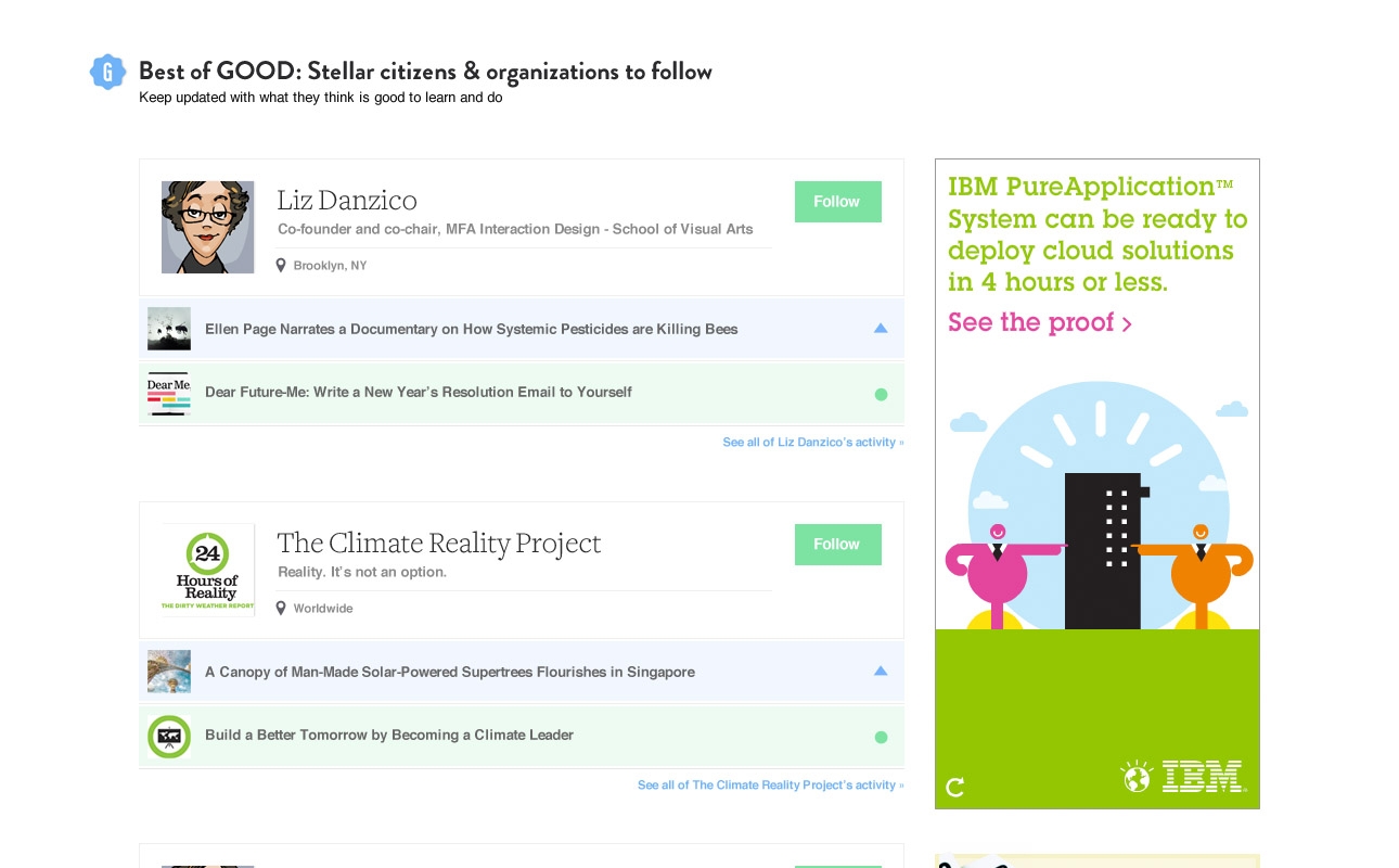
The purpose of this Beta was to start incorporating user generated content that users have "found" alongside the GOOD Editorial staff's original content in order to test usage and gage feedback.
The design challenge for this homepage was figuring out how to blend the two content types into one experience, but still clearly marking the difference. I added "G" badges for all original content and styled UGC with smaller type and imagery. I also introduced a left and right rail to the content stream focused on showing community activity and action widgets to get them involved.
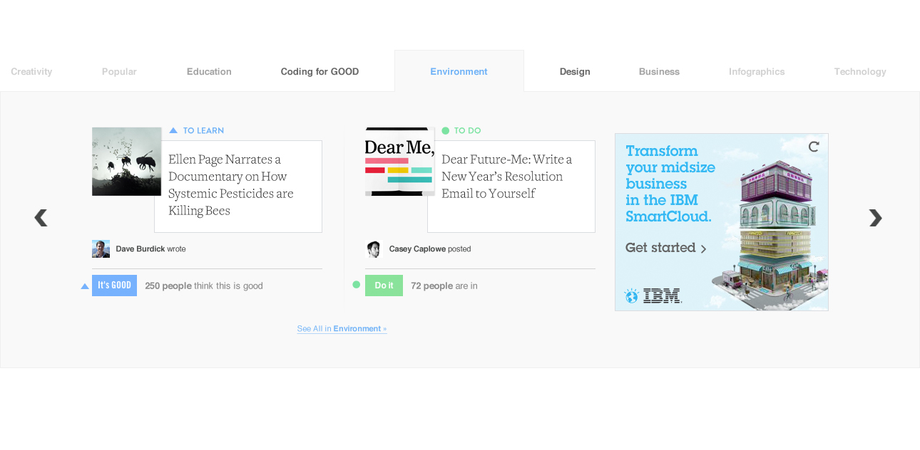
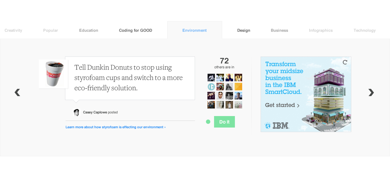
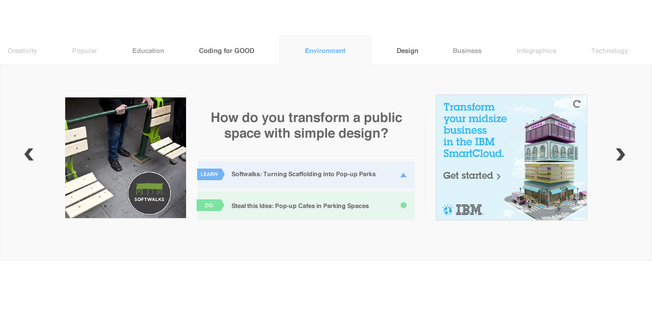
good.is Redesign
When we got the news that there was enough learned from the Beta to fully pivot to UGC content, our team was tasked to bring it to life with an updated look.
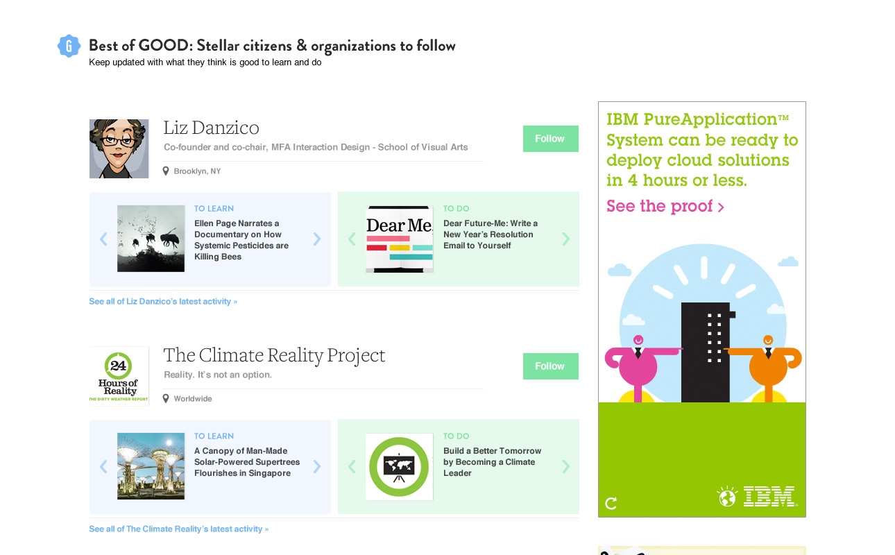
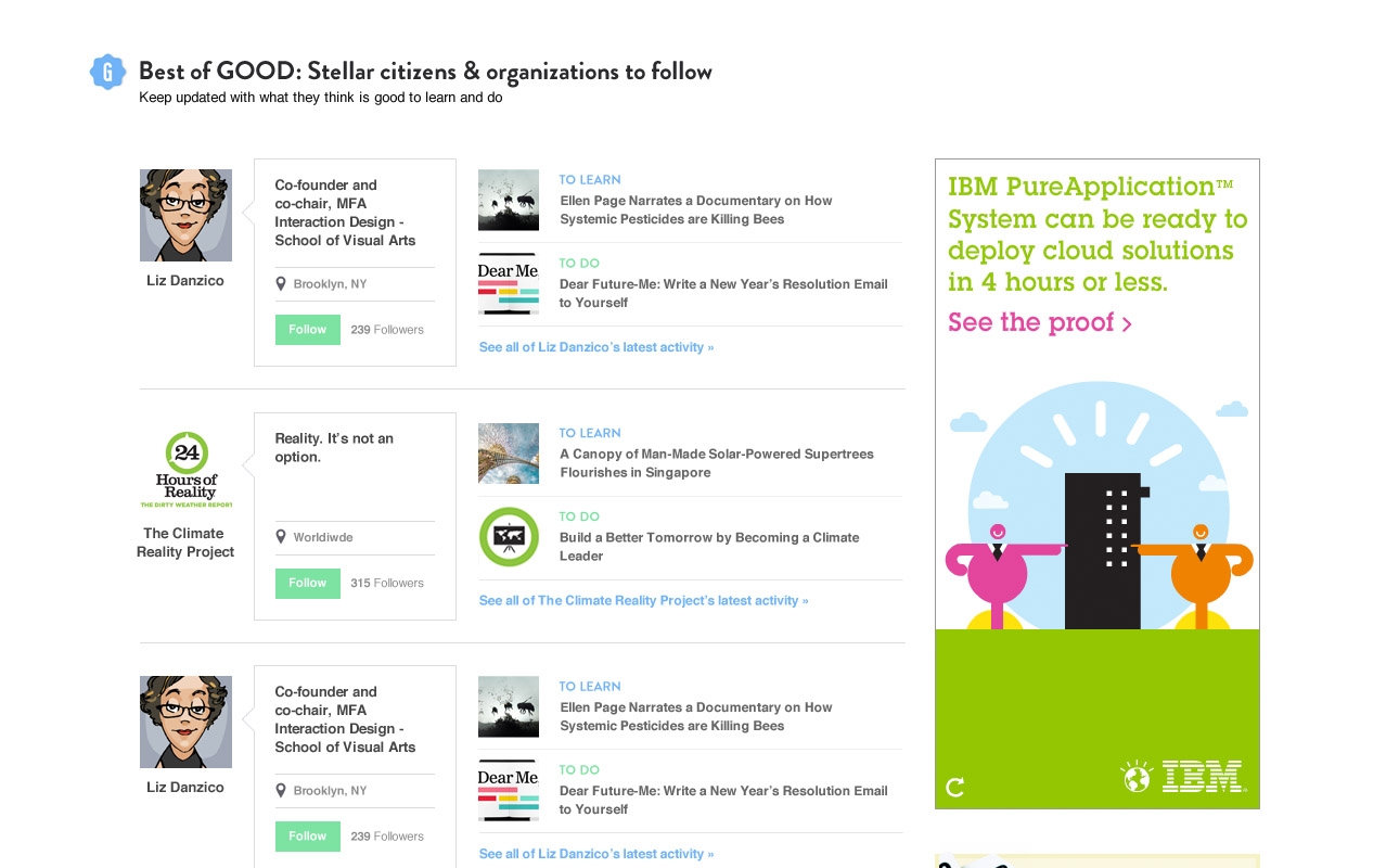
The contents of this design needed to shine a spotlight on inspiring community members, as well as make new visitors want to sign up. As members could now post content, and follow other members and topics to personalize their feed, these actions needed to be clearly shown.
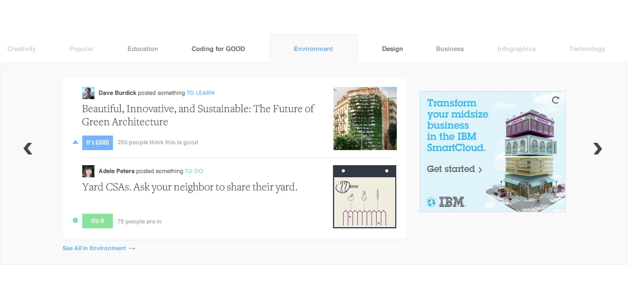
We introduced two paths of content consumption: learning and doing. I iterated on ways of showing the pair together (see below), as well as how to allow top community members to shine in the UI. This design broke free of the multi-well layout to utilize full white space and use sparing pops of color to highlight the learns/dos.
Design iterations on homepage carousel. Originally expected a 300x250 ad-space, but the final design (above) did not include it, so used the additional space to feature the contributors.
Design iterations on featured community members.