Background
This is Part 2 of the rebrand launch, for additional context, please see Part 1.
A quick recap: the majority of Chartbeat users only know and use our Real-Time Dashboard. We offer so much more than that, but our experience and usage data does not reflect that.
How might we evolve Chartbeat's user experience to embody a unified platform and ensure awareness of the breadth of our suite?
Solution
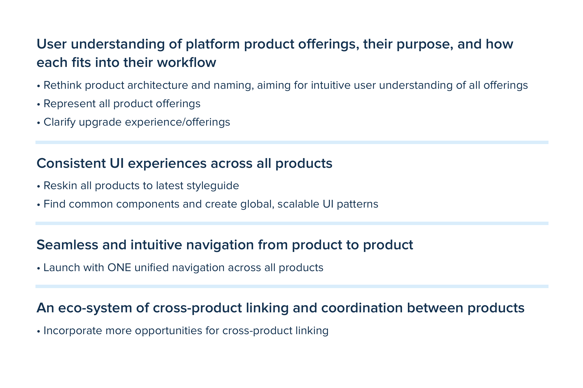
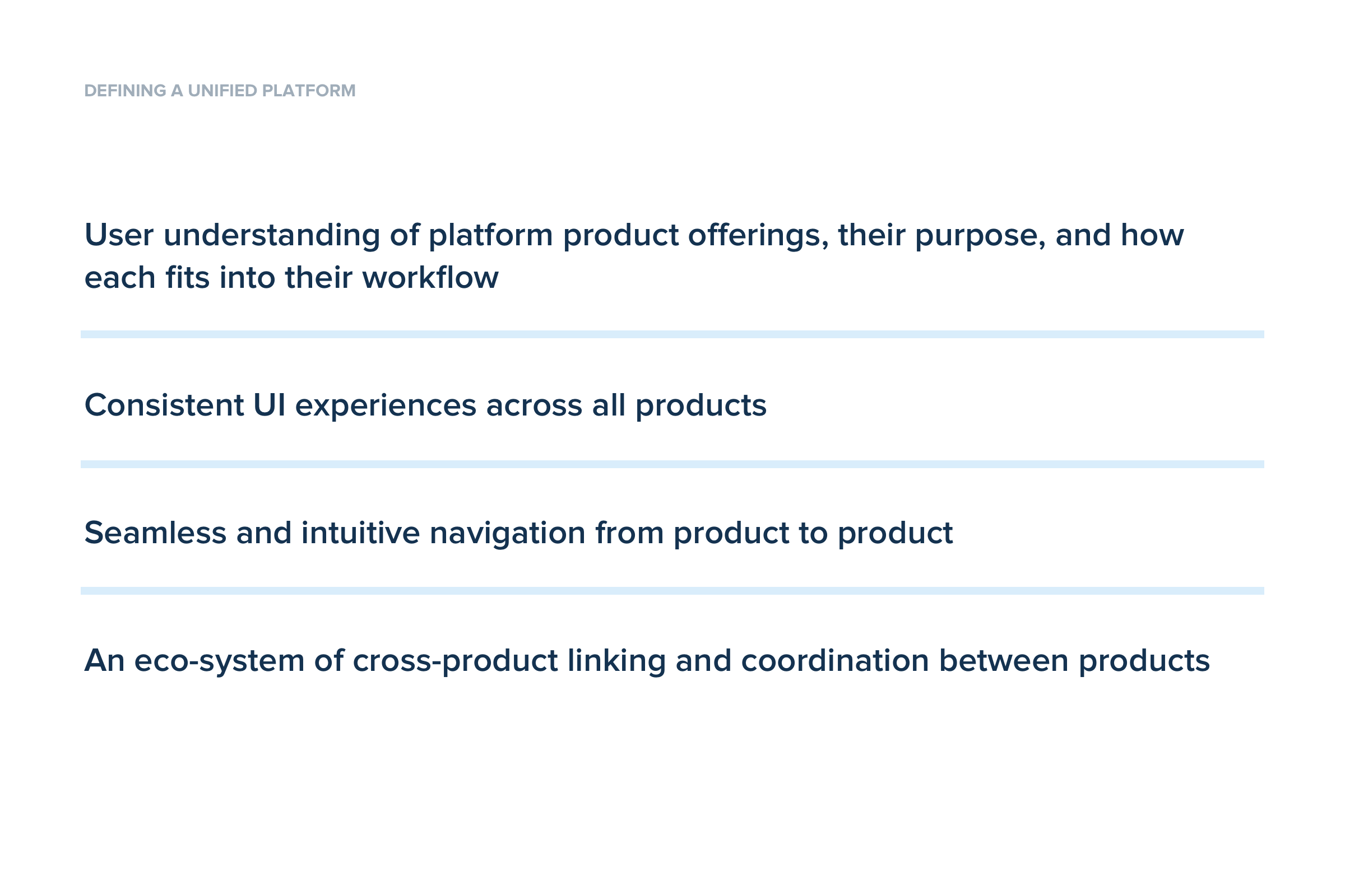
After defining what a unified platform meant to us, we mapped ourselves accordingly and prioritized fixing the roots of the problem: building a product architecture and naming system that our users understood, having one global navigation that carried users throughout our suite, having complete product offerings listed, and lastly, having a consistent UI experience across all products.
Role
Design Director
- Product Direction & Design
- Roadmap definition and launch criteria
- Project management and ops
Team
- Director of Front-End Engineering
- Director of Product Marketing
- 2 Product Designers
- 4 Front-End Engineers
- Copywriter
Where we begin
The design team worked together to define what "unified platform" meant. Through researching examples of effective product suites, we put together a list of traits that defined them, see slide 1.
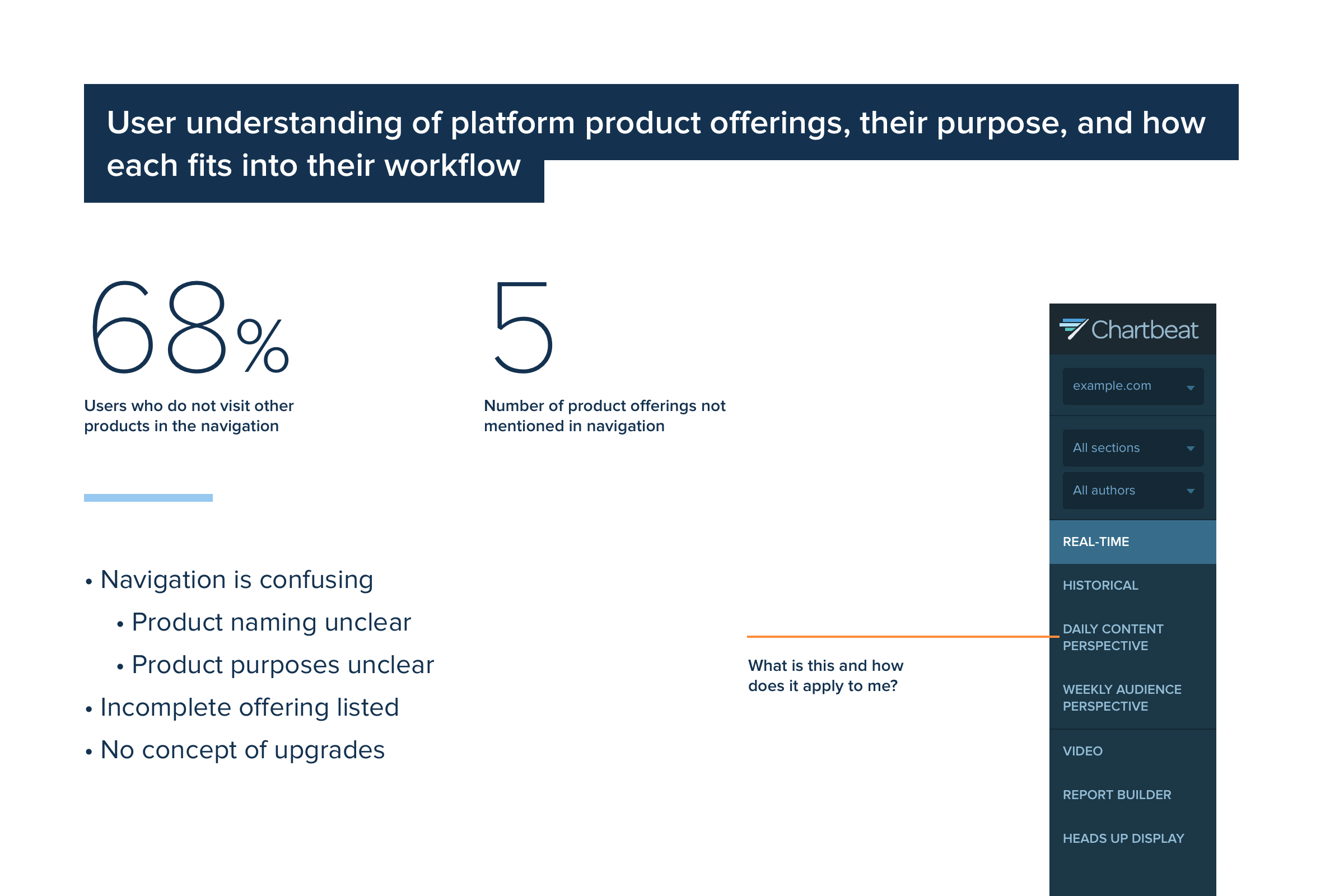
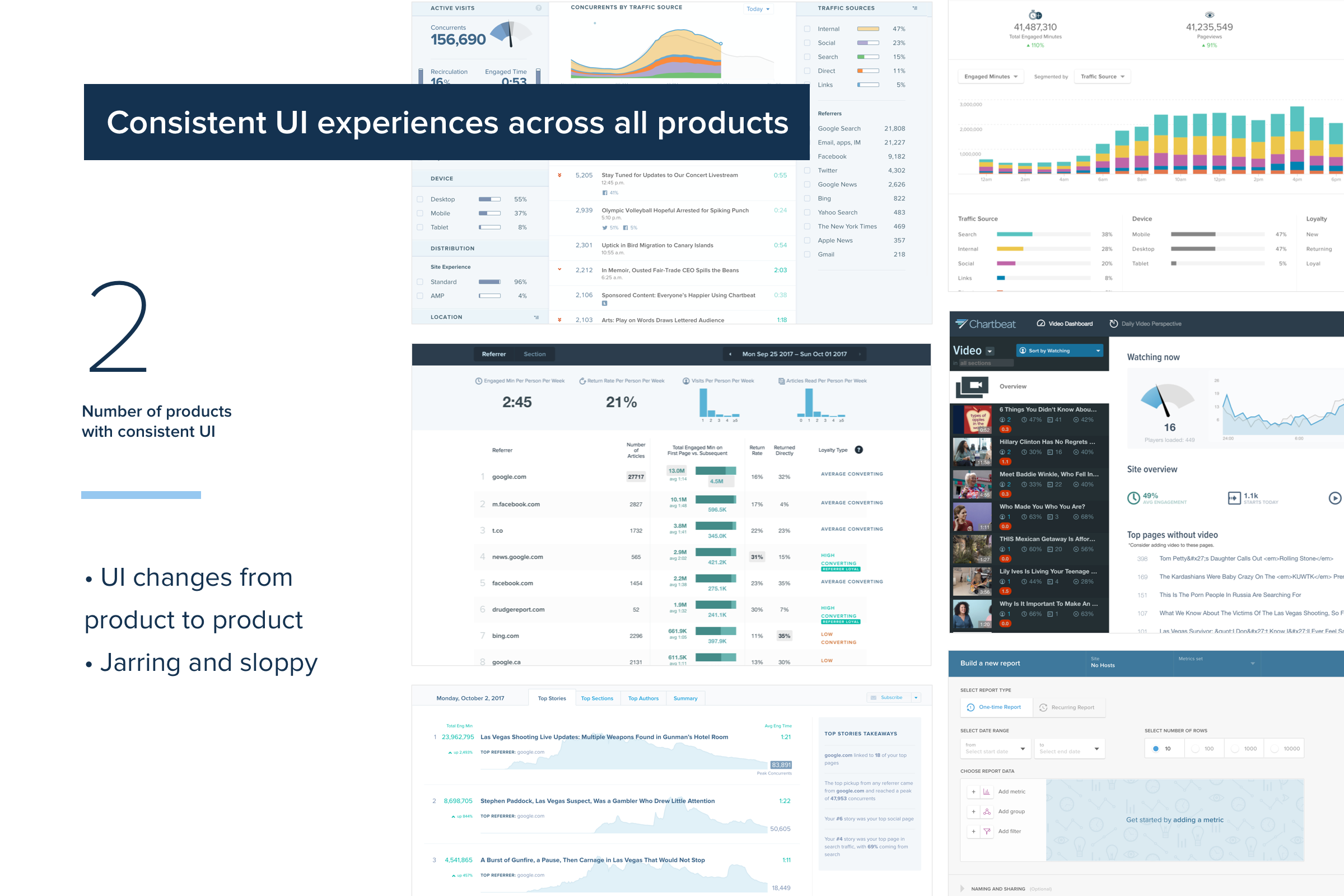
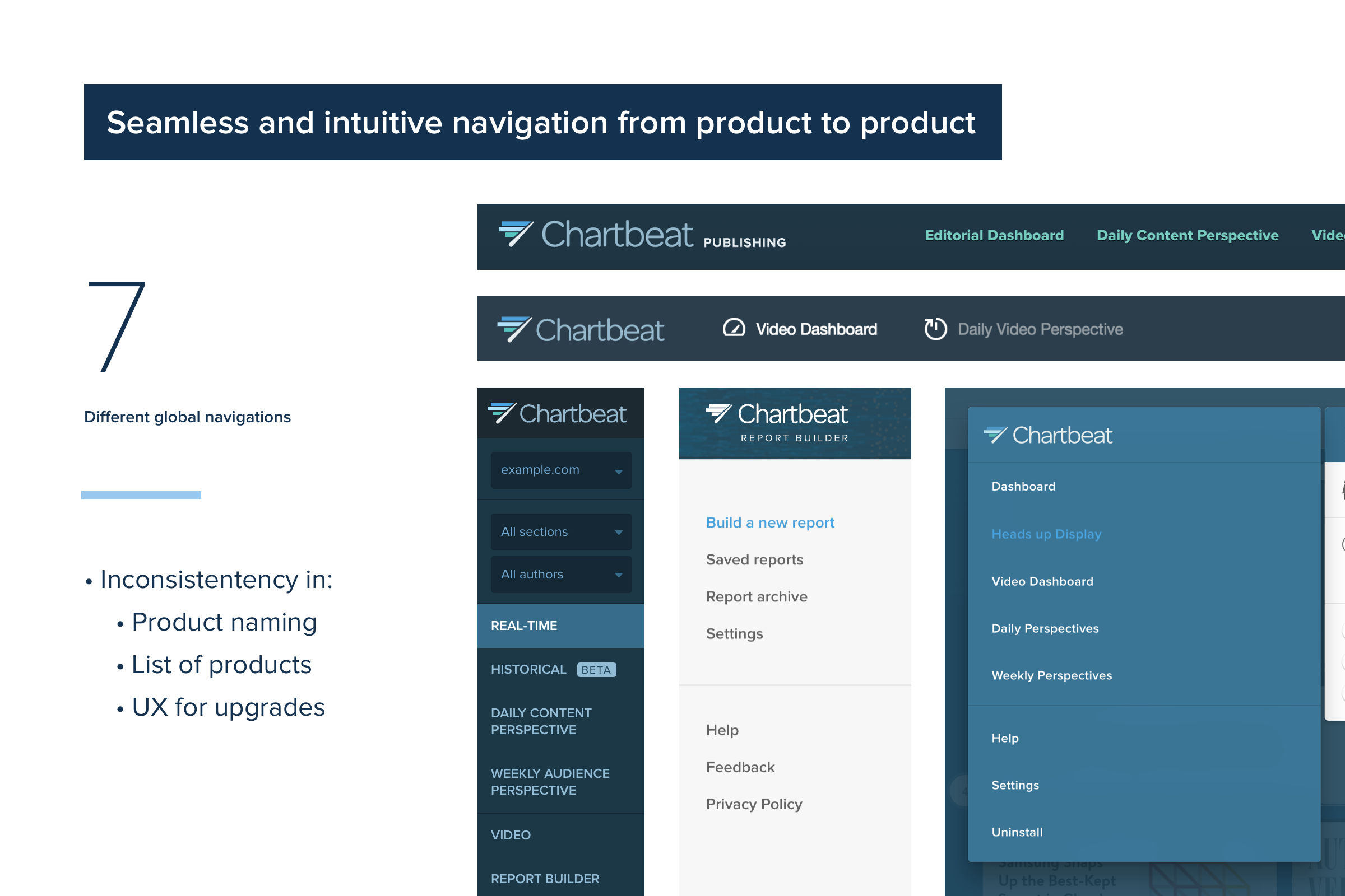
We then did an audit of our suite against this list, see slides 2-5. We were pretty far off. A few stats to capture this:
- 7 different live navigations
- 5 products missing in nav(s)
- Only 2 products out of 12 had consistent UI
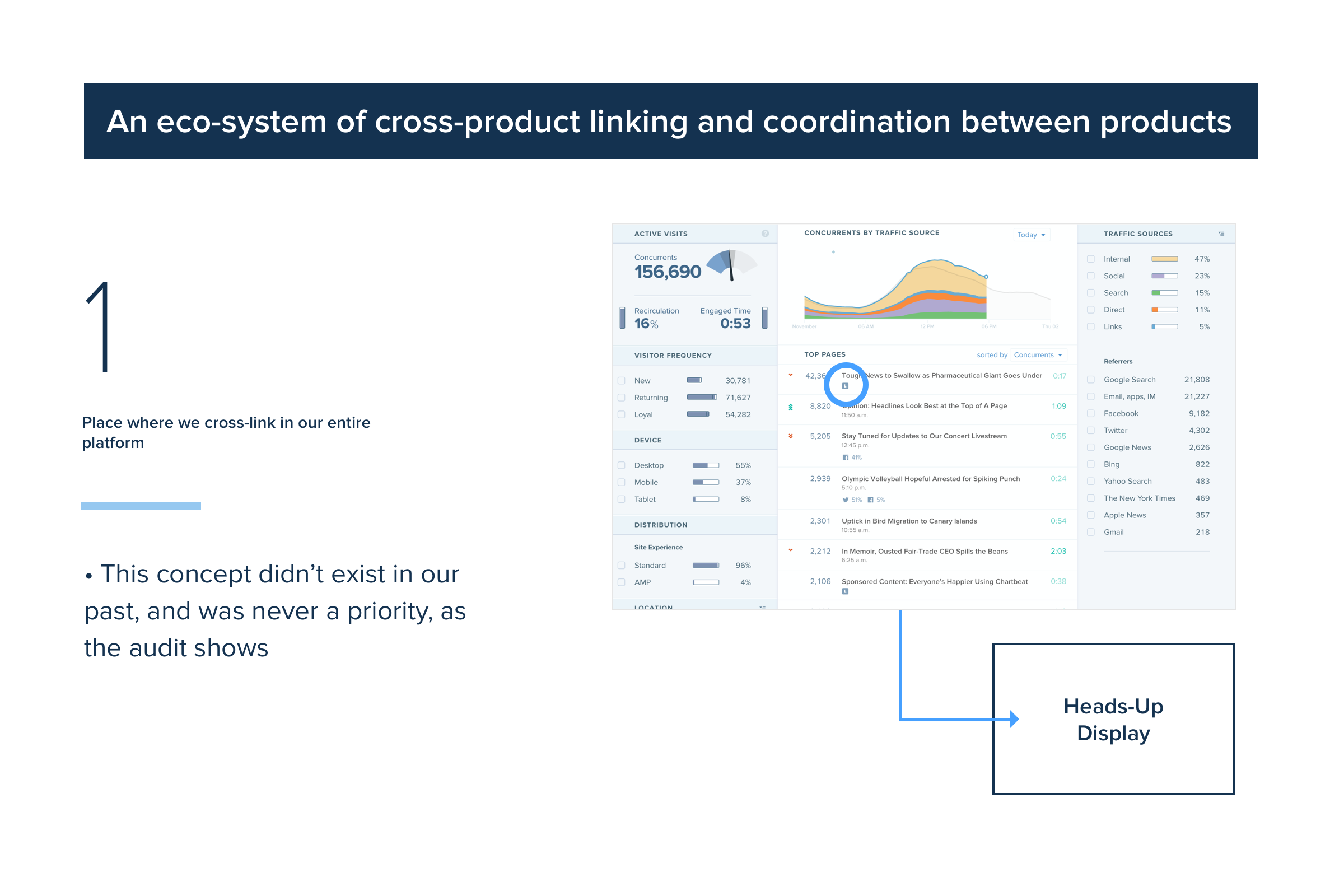
- Only 1 existing user flow with cross-product linking
Based on our findings I put together a project plan on how to tackle fixing these problems in priority order.
- Re-structure Product Architecture
- Build a scalable Global Navigation that works across all products
- Re-skin all legacy UI to latest styleguide
- Clarify upgrade experience and offerings
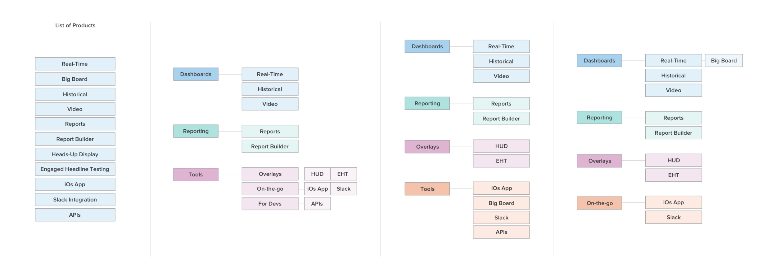
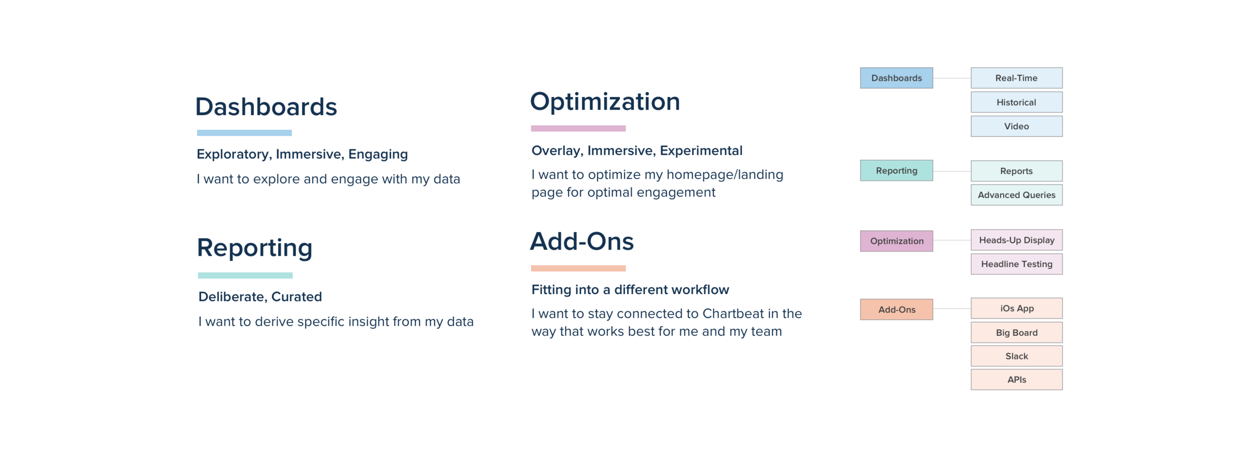
1. Product Architecture
First things first, we had to take a step back and look at all of the pieces of the puzzle. In collaboration with Product, Design, Marketing, and Sales, we workshopped ideas on how we could tell the story of out suite. What do/don't products have in common? We looked through the lenses of user roles, workflows, product experience, value props, as well as data.
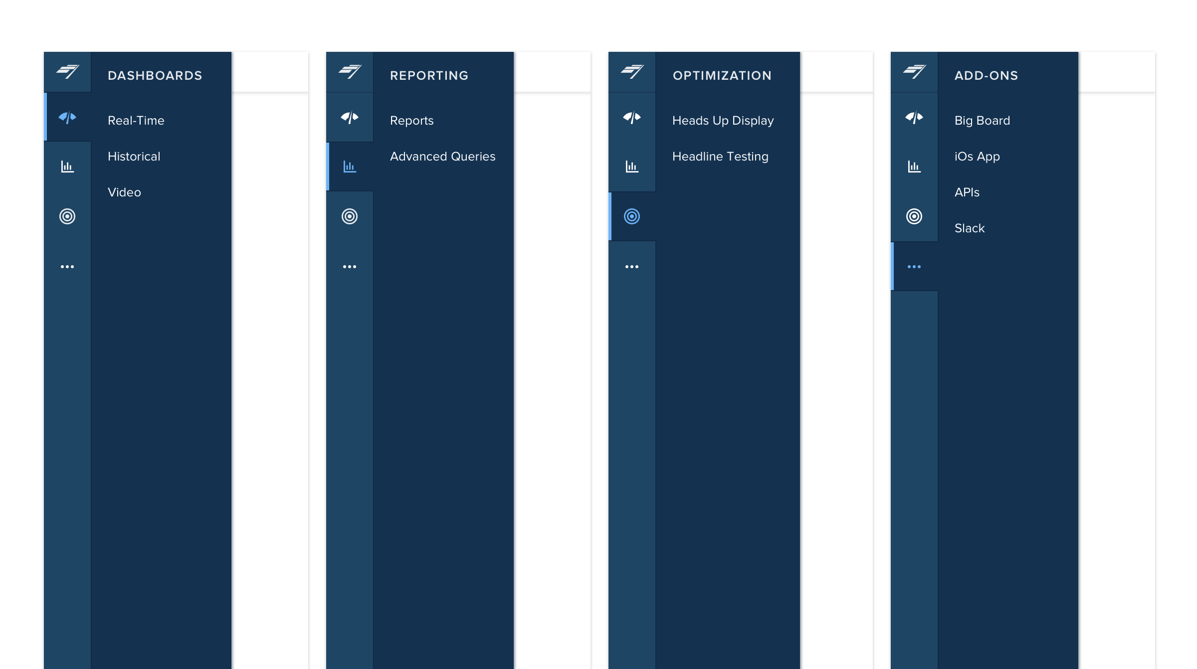
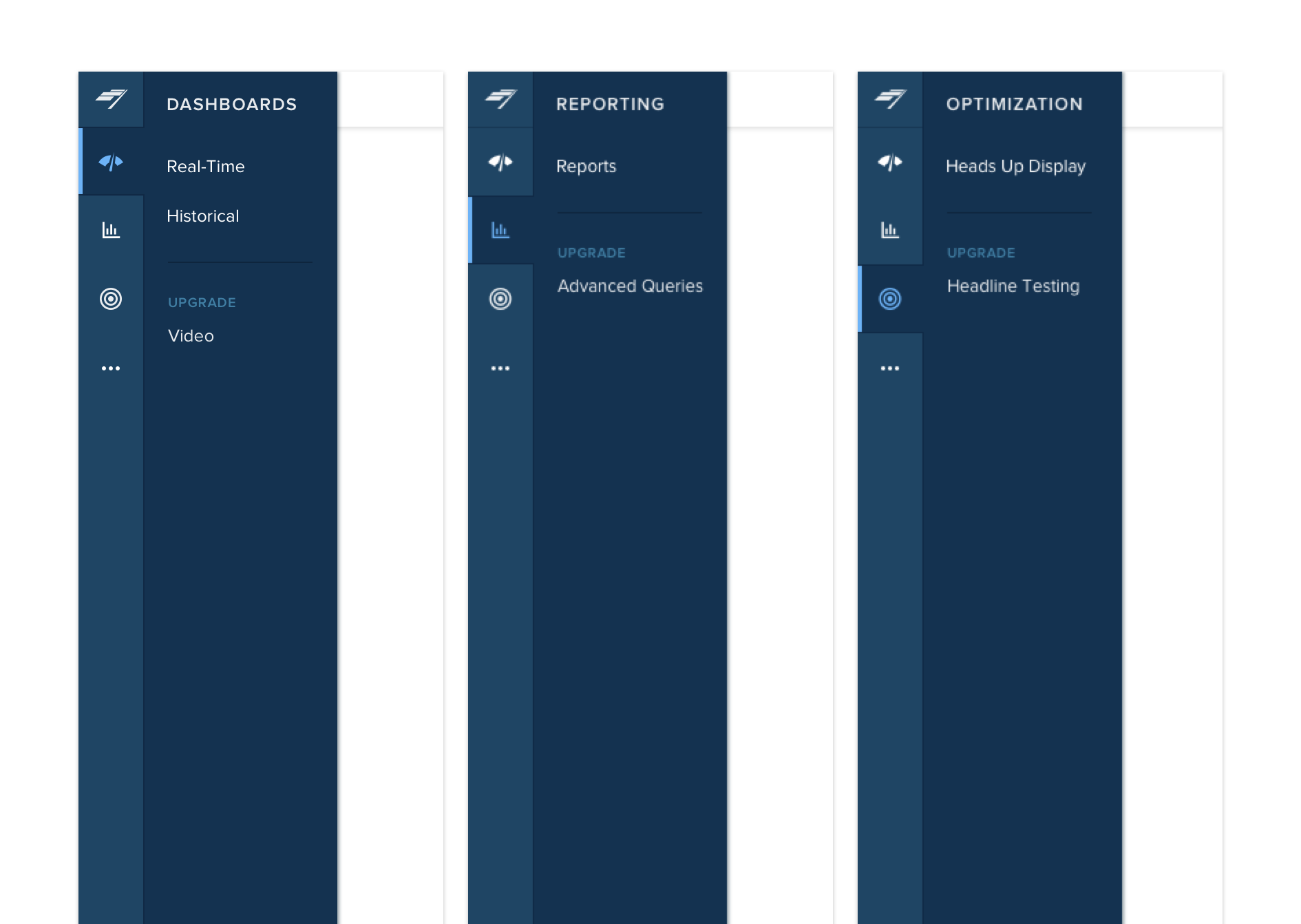
We landed on 4 product groupings that we believed to be intuitive and scalable for future additions: Dashboards, Reporting, Optimization, and Add-Ons. These groups helped shape our navigation experience, as well as redefined how the Marketing and Sales team spoke about our suite.
2. Global Navigation
Now that we had the architecture down, we needed to build a navigation to bring it to life. There were 2 pieces to the global navigation we needed to solve for:
- Seamless product to product navigation
- Consistent and scalable in-product functionality
Audit
To start, the design team audited all of the existing functionality across our navigations in order to find common components to flesh out the base of our system. What we found:
Common functionality to include:
- Site switcher
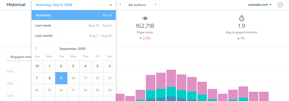
- Date-Picker
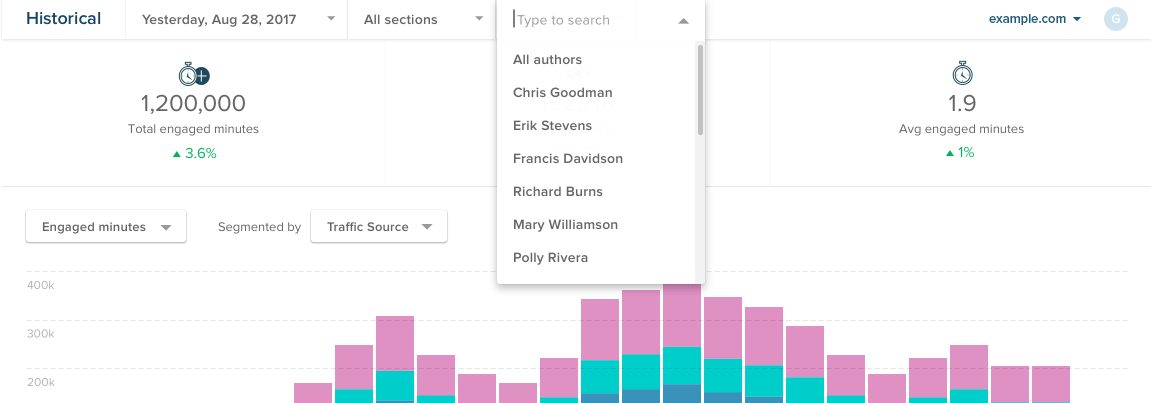
- Filtering (options vary by product)
- Sorting
- Tabs/ internal nav

In-Product functionality
We iterated on designs re-organizing the hierarchy and order of the common functionality we needed to include. We also kept in mind the ability to scale and the amount of screen space utilized.
The final designs utilized the left side for full product filters and sorts, and the right section reserved for account information. These also included something that our old navs never did, product names!

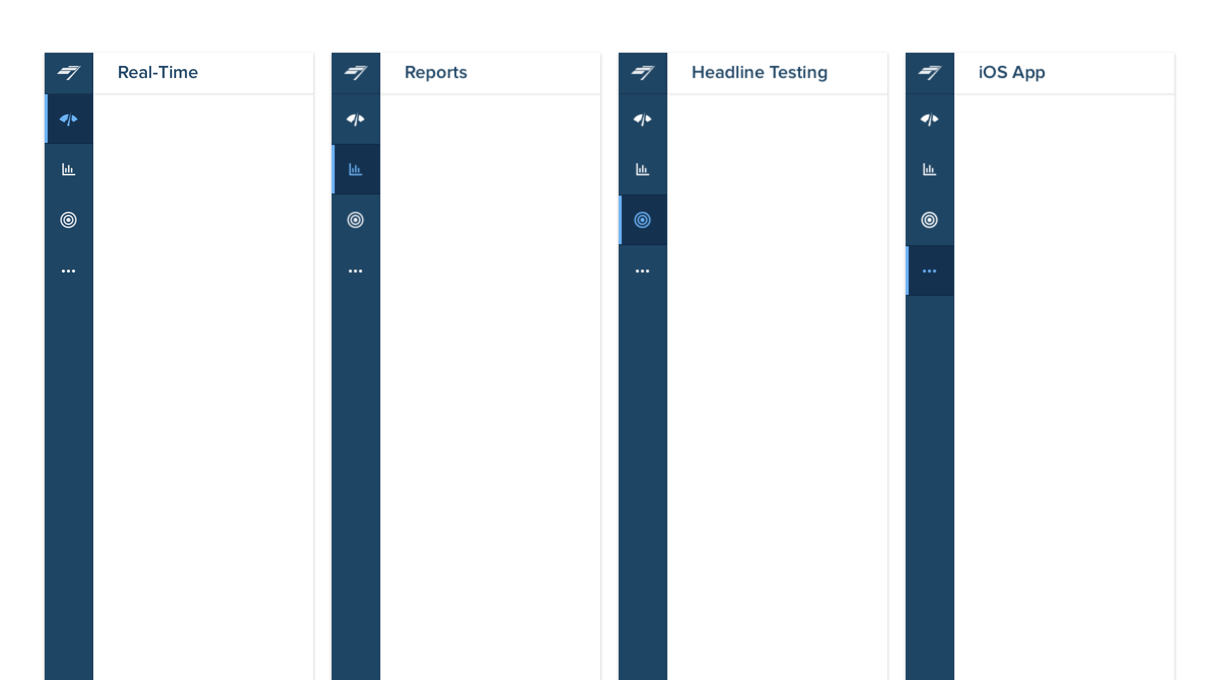
Product to Product Nav
We had a sneaking suspicion that users completely ignored our current nav, so we wanted to design an experience that forced users to interact with it.
We focused a lot on type hierarchy, animation transitions, and color. We wanted a nav that didn't distract from the product experience, but also didn't fade into the background.
The final designs included icon representations of the product groupings, a clear highlight state, and a required hover experience to jump from product to product.
•
A feature we added, to better ensure users noticed a product launch, was the "new" dot. For large launches, we were able to switch on a "new" state that included an orange dot and badge that would disappear after a click.

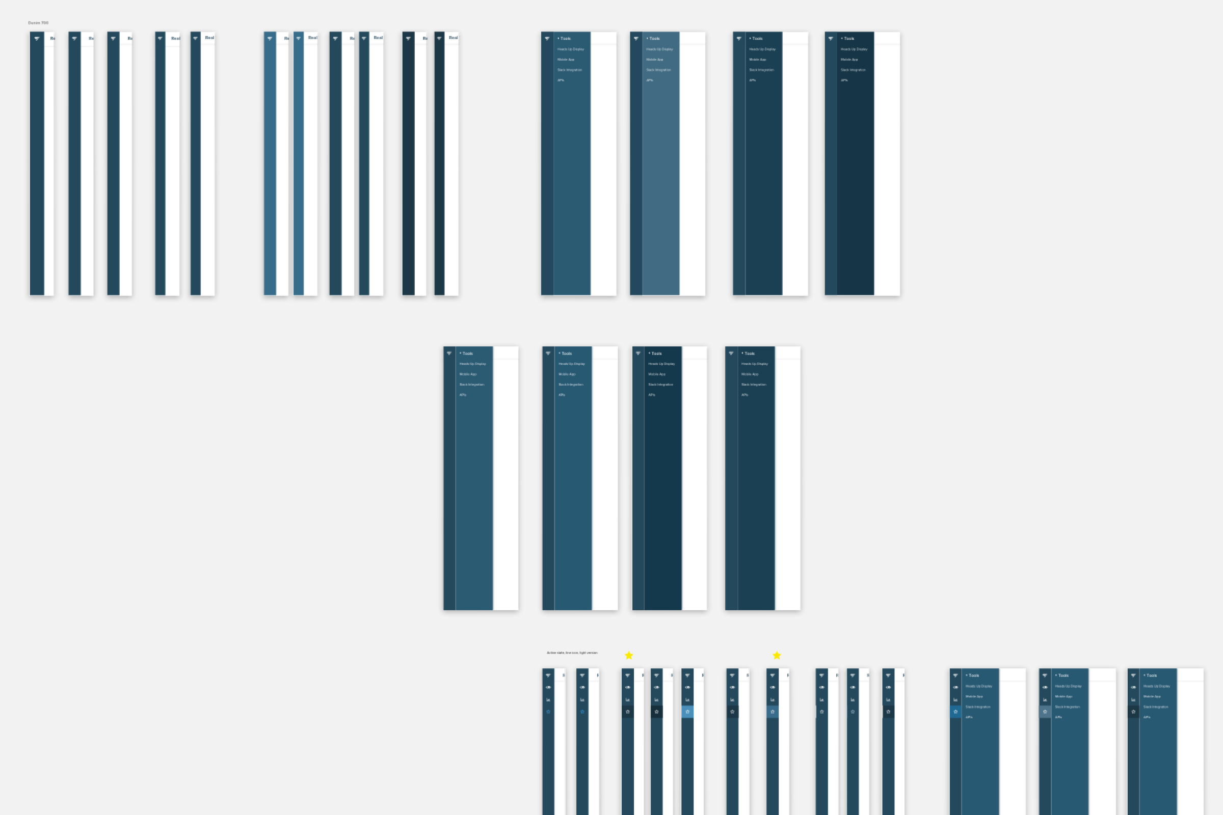
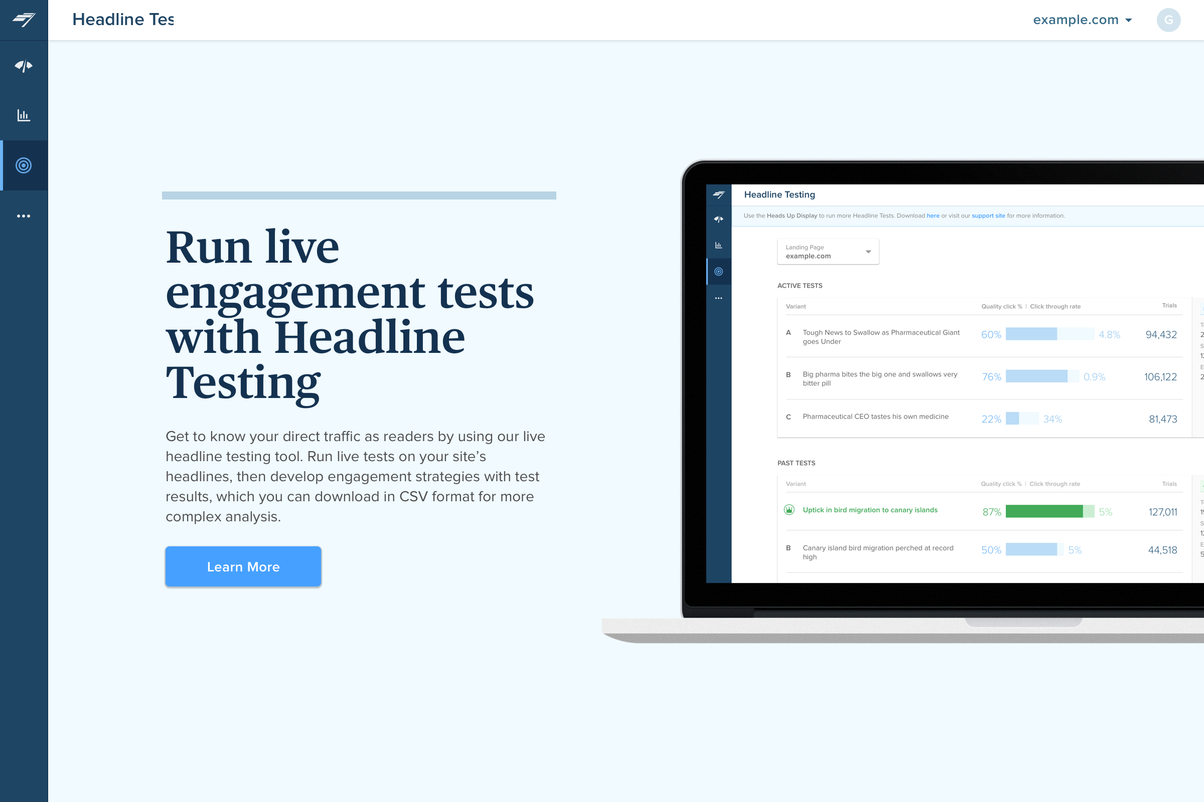
3. Consistent UI

Project priorities, working docs, and team Trello board
Navigating from product to product in our old UI was like traveling back in time. We had so many legacy products that had not been updated since release, and as the design team was building out new products in our updated styleguide, our products fell more and more out of touch with each other.
We designed and implemented a full design sweep, not only bringing updated palettes and typography to the UI, but also integrating the new global nav and tying together common components like badges and tooltips.
As there were so many moving parts to this project, I helped organize and prioritize work flow across the team to make sure we understood the full breadth of work, as well as hit our goals before the official launch date.
Click through to see the "before" screenshots
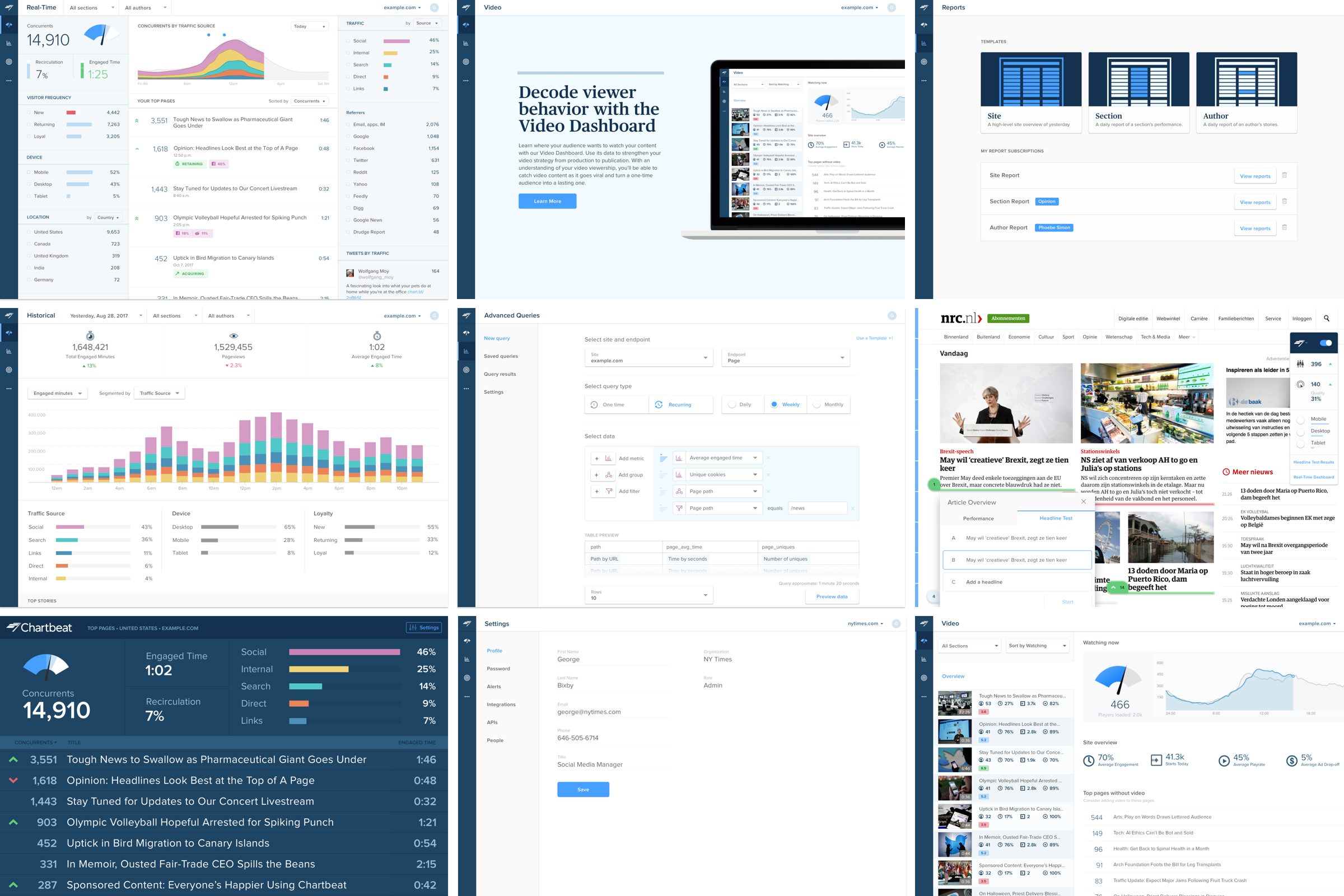
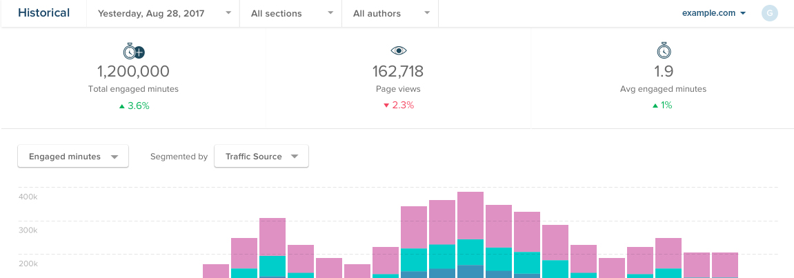
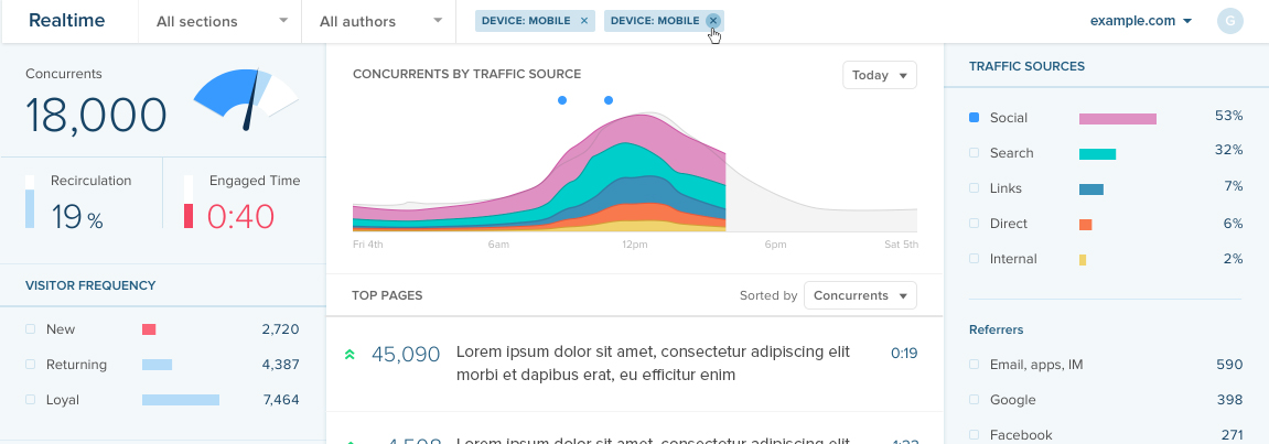
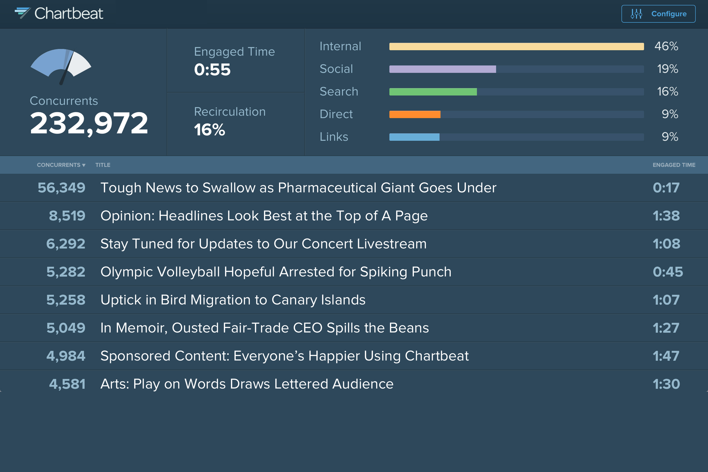
Real-Time
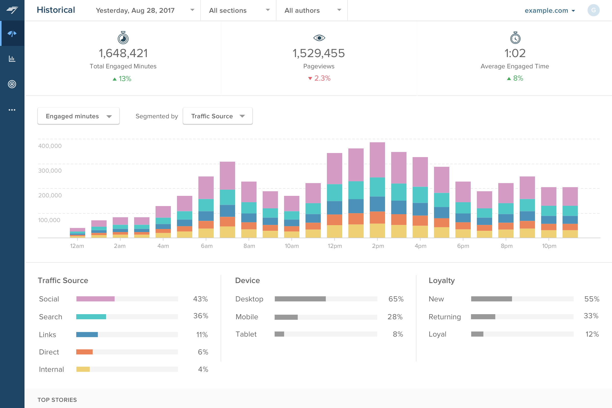
Bringing brighter, more saturated colors and less bulky type to our Real-Time Dashboard really cleaned up the experience of our most-used product. The badges you see in the Top Pages list were pulled over from our Historical Dashboard to create cross-product consistency.
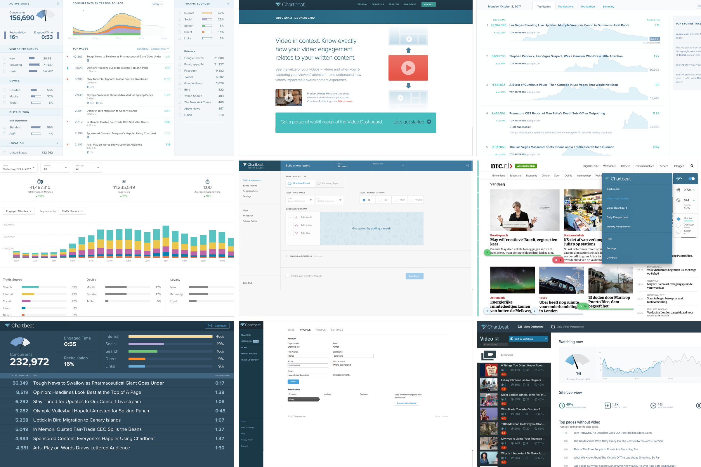
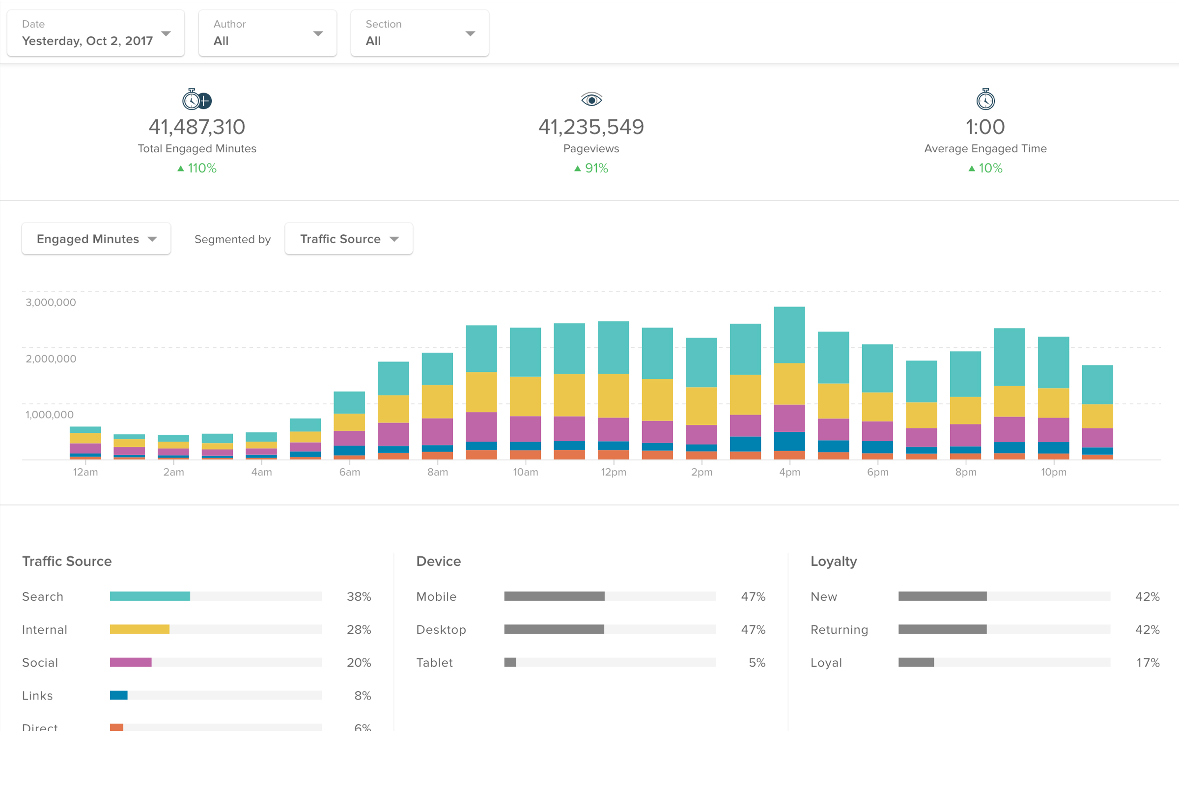
Historical
Historical was built on our new styleguide so had the least noticeable upgrade.
Since it had the most up-to-date designs, we turned elements of its design into common components that we incorporated throughout our suite, including badges and tooltips. See slide 3
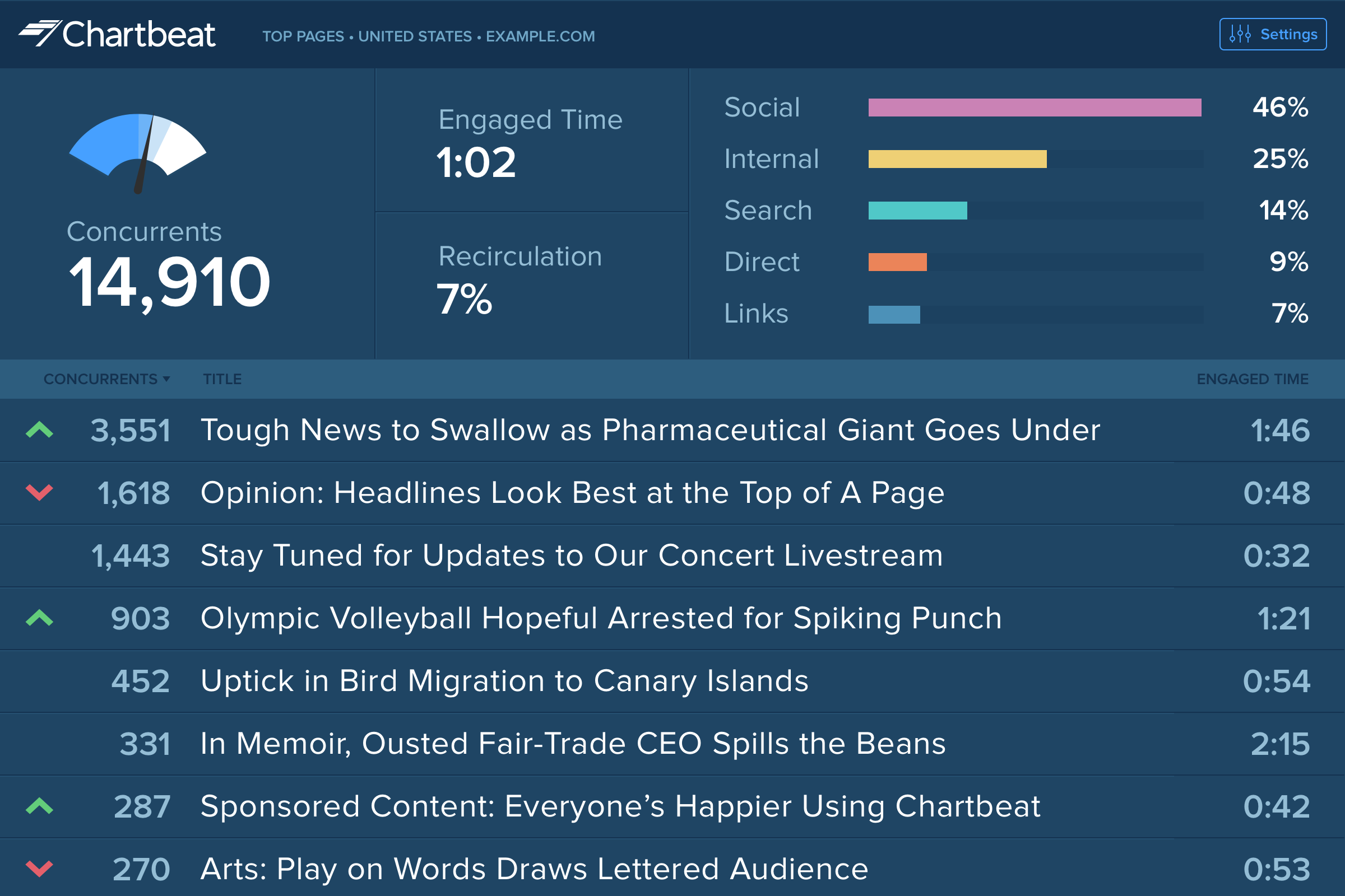
Big Board
The Big Board is our "presentation mode" of the Real-Time Dashboard and is most commonly displayed on large TV screens across newsrooms. Updating the palette here was a small change, but brought so much more contrast to a UI whose use-case depends on across-the-room viewing.
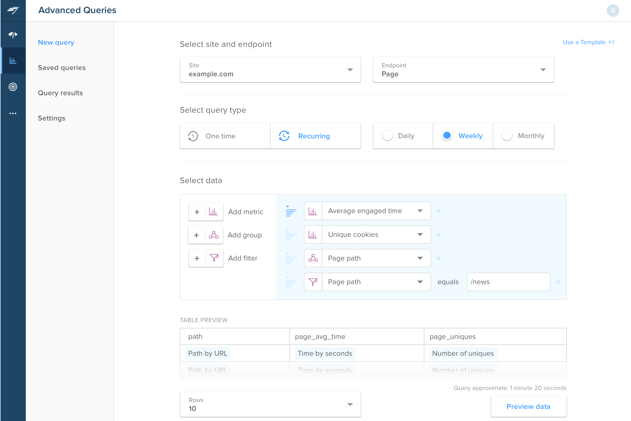
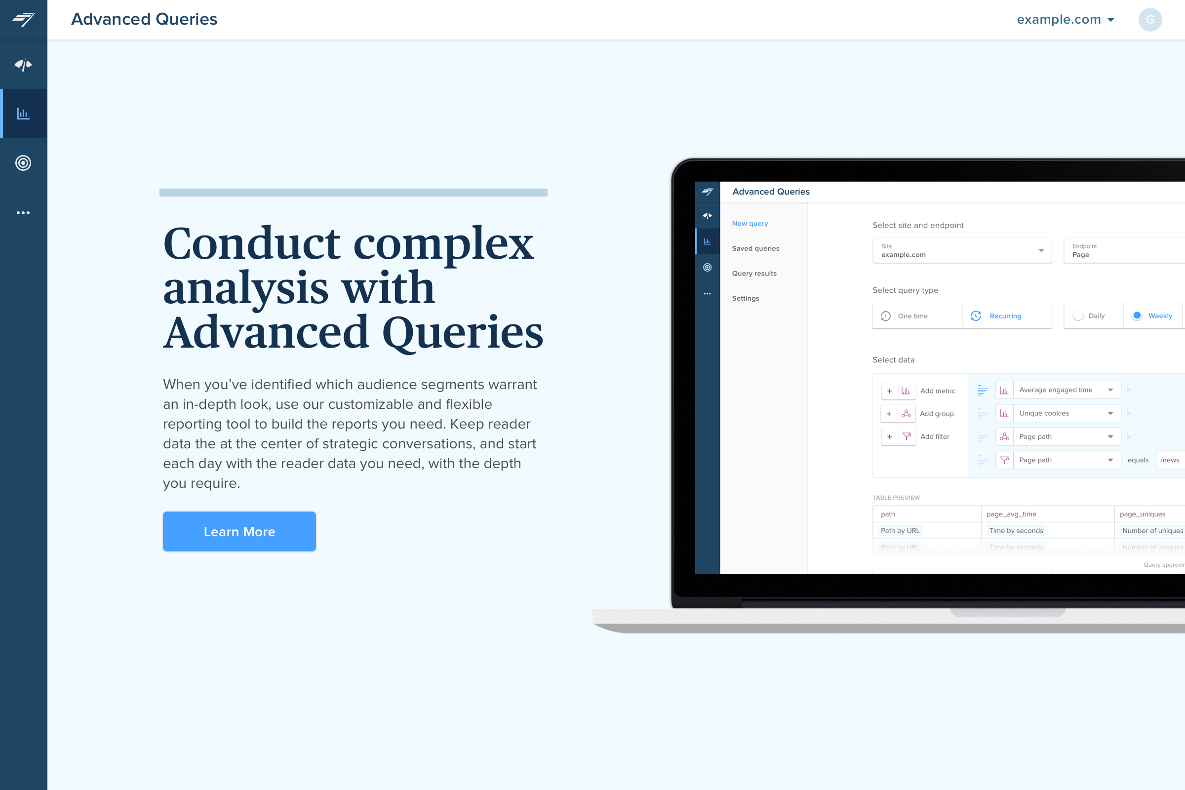
Advanced Queries
This is a great example of how the new navigation really effected the inner-workings of this product. Along with UI changes, we also had to restructure the top portion of this page.
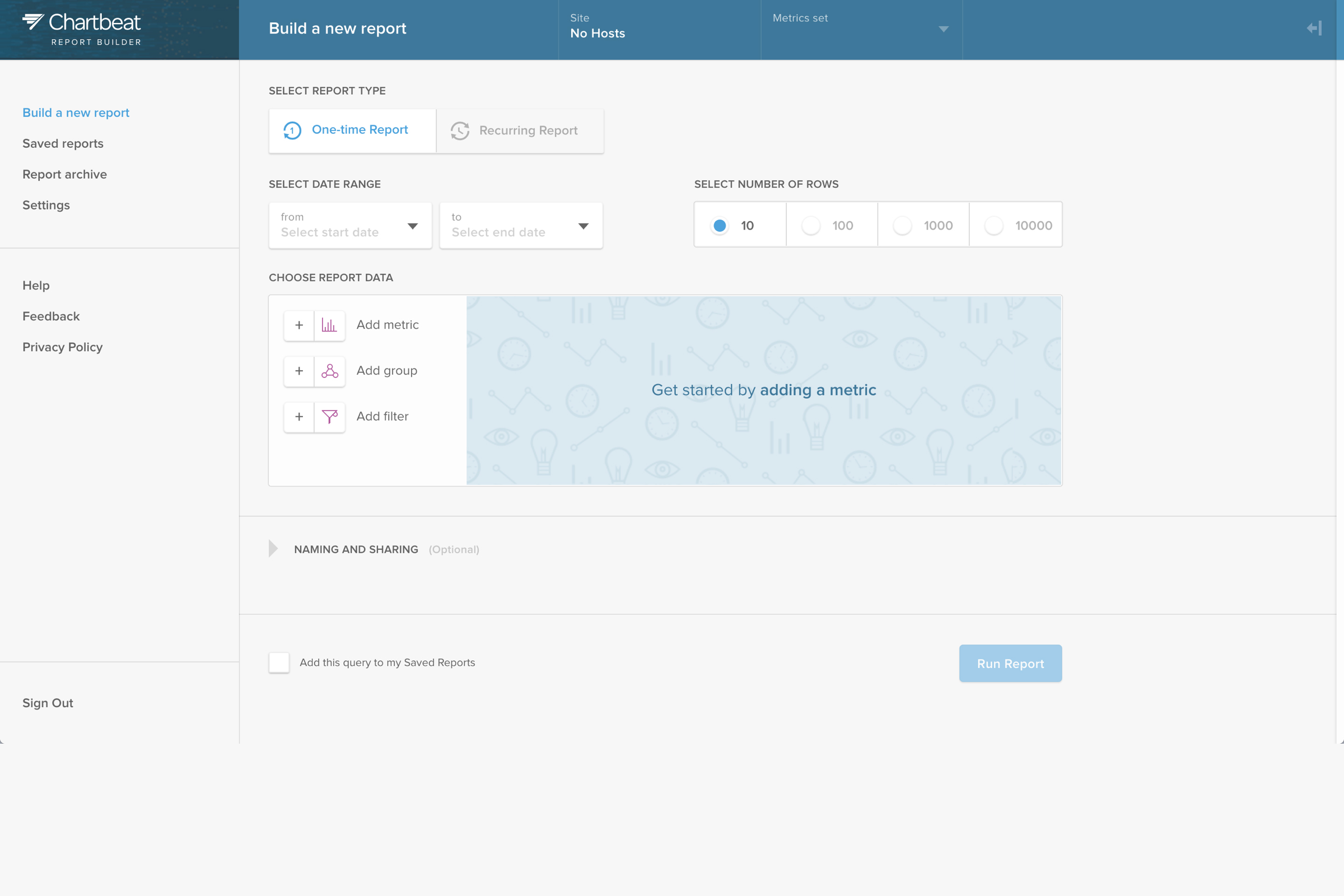
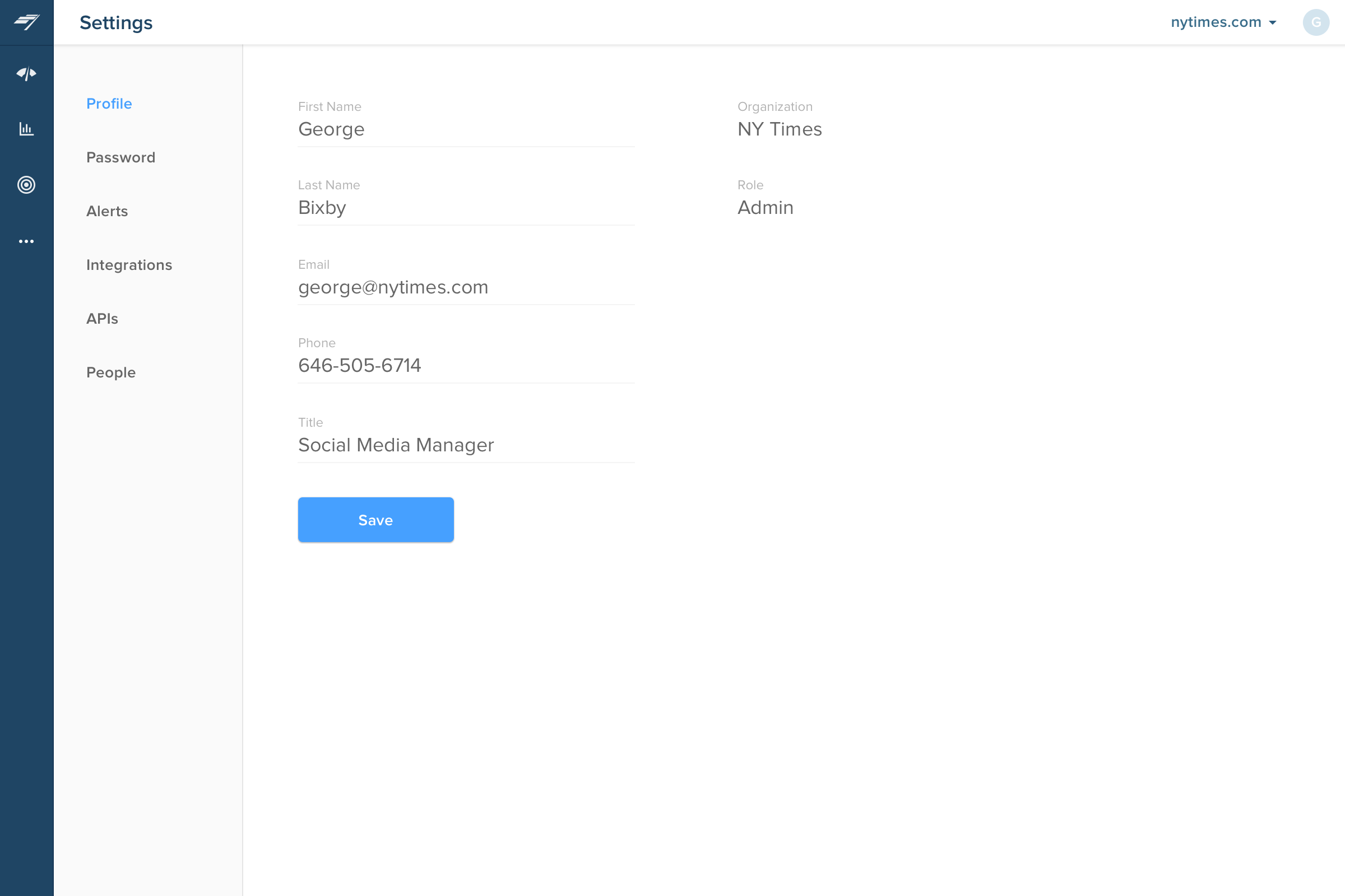
Settings Pages
Our Settings pages were some of the oldest designs in our system. They were built on an older codebase, so our engineers never wanted to work on it.
We re-organized the architecture (why have a settings link within settings?), and consolidated to a more intuitive set of pages.
We kept the UI design simple, as this was the second to last set of pages on the priority list for launch, so we had to keep things realistic, but I think that the small changes led to a big reward.
And the list goes on...
Not only did the UI improvements weave our experience together, it also set our team up to be able to design and code from a clean slate going forward. No longer, when working on legacy products, did we have to design backwards to fit into an older style. For the Front-End and Design teams, these improvements brought a new energy to our work. Even though we didn't get to everything, we were proud of where are our products suite stood, and we hadn't been able to say that since... ever.
4. Upgrade Experience
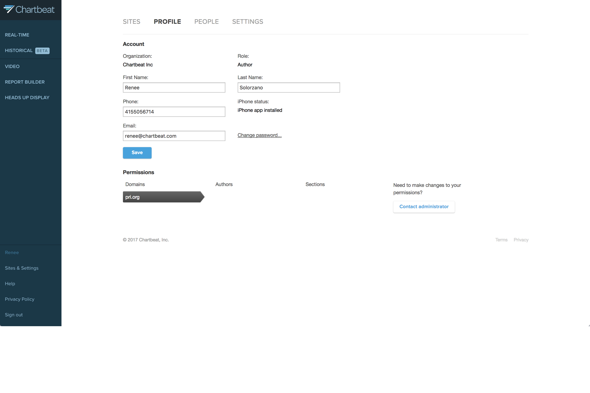
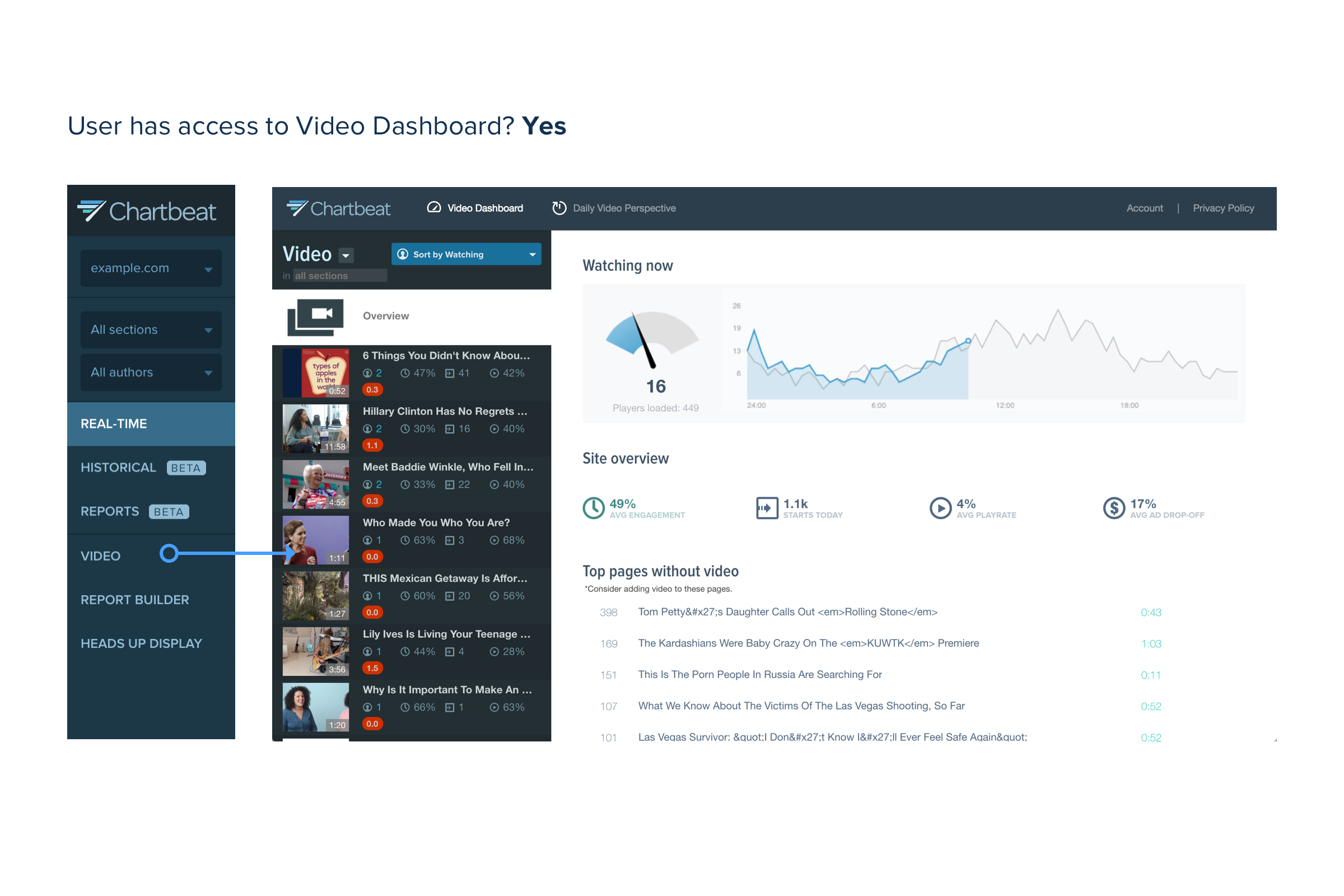
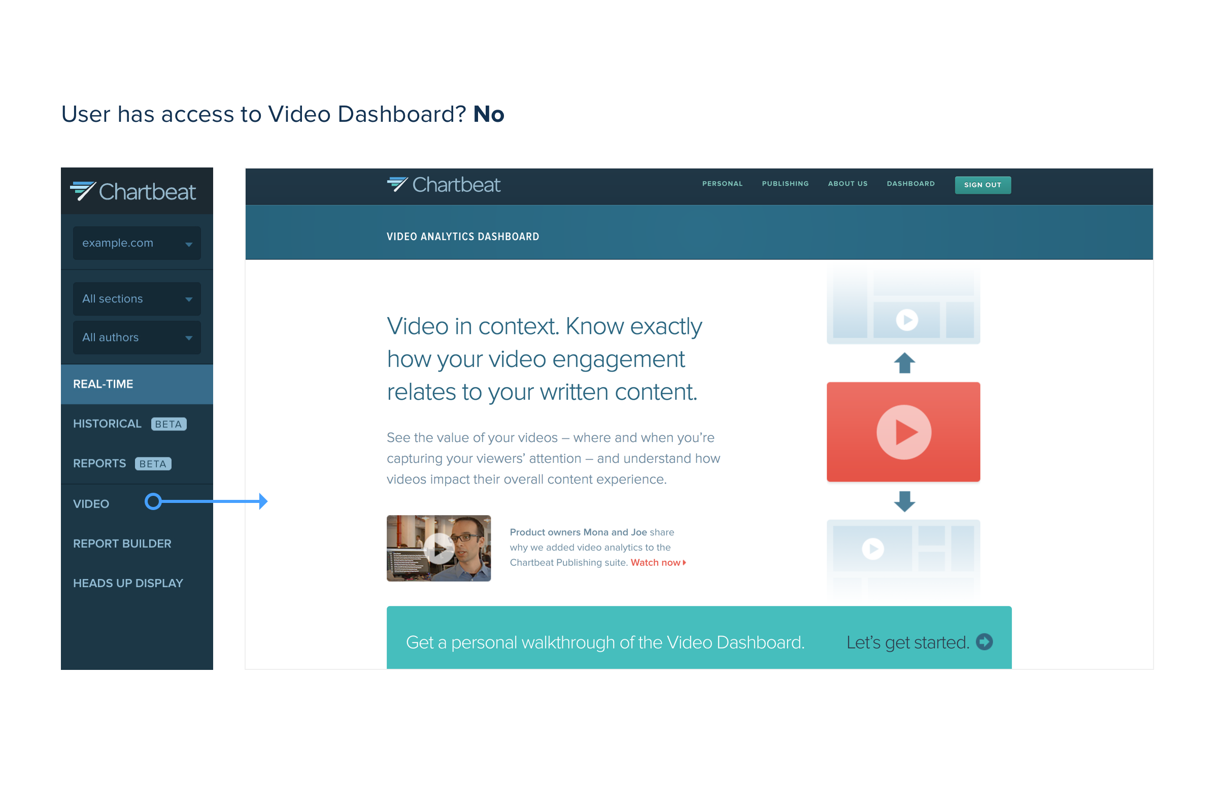
Chartbeat has 3 pricing tiers, Basic, Plus, and Premium, with each tier adding more product access. In the old nav design, a user had no concept of what tier they were in or what products they had access to.
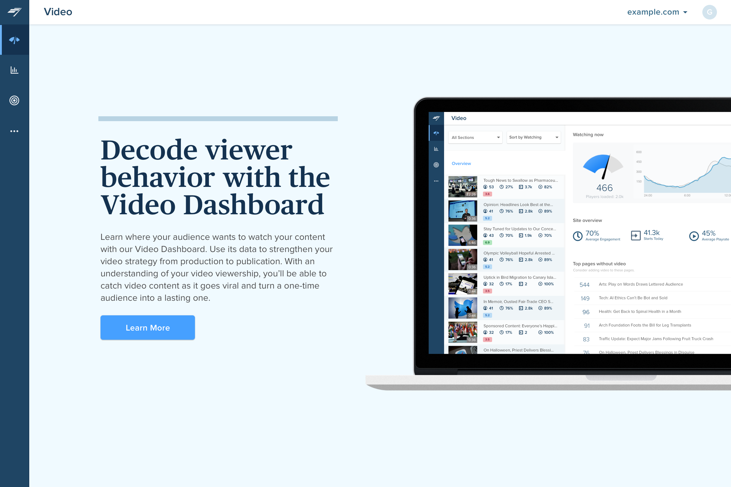
See example to the right of a user with and without access to our Video product. The "without" route brought users out of the product and to a landing page on our marketing website, with the only way back to the product using a browser back button.
Solution
We wanted to clearly indicate upgrades in the navigation, so that users understood that, for one, we have upgrades, and two, that when you click on these items, a different experience is anticipated.
We worked together with Product Marketing and our Upgrades team to build in-product landing pages that were designed to accomplish a few things:
- Provide a clear understanding of the product and its value proposition
- Keep users in-product to not disrupt their experience
- Easily connect users to our Upgrades team to discuss fit and pricing
Since launch, there have been over 100 inquiries brought into the upgrades pipeline.
Results
Customer Feedback
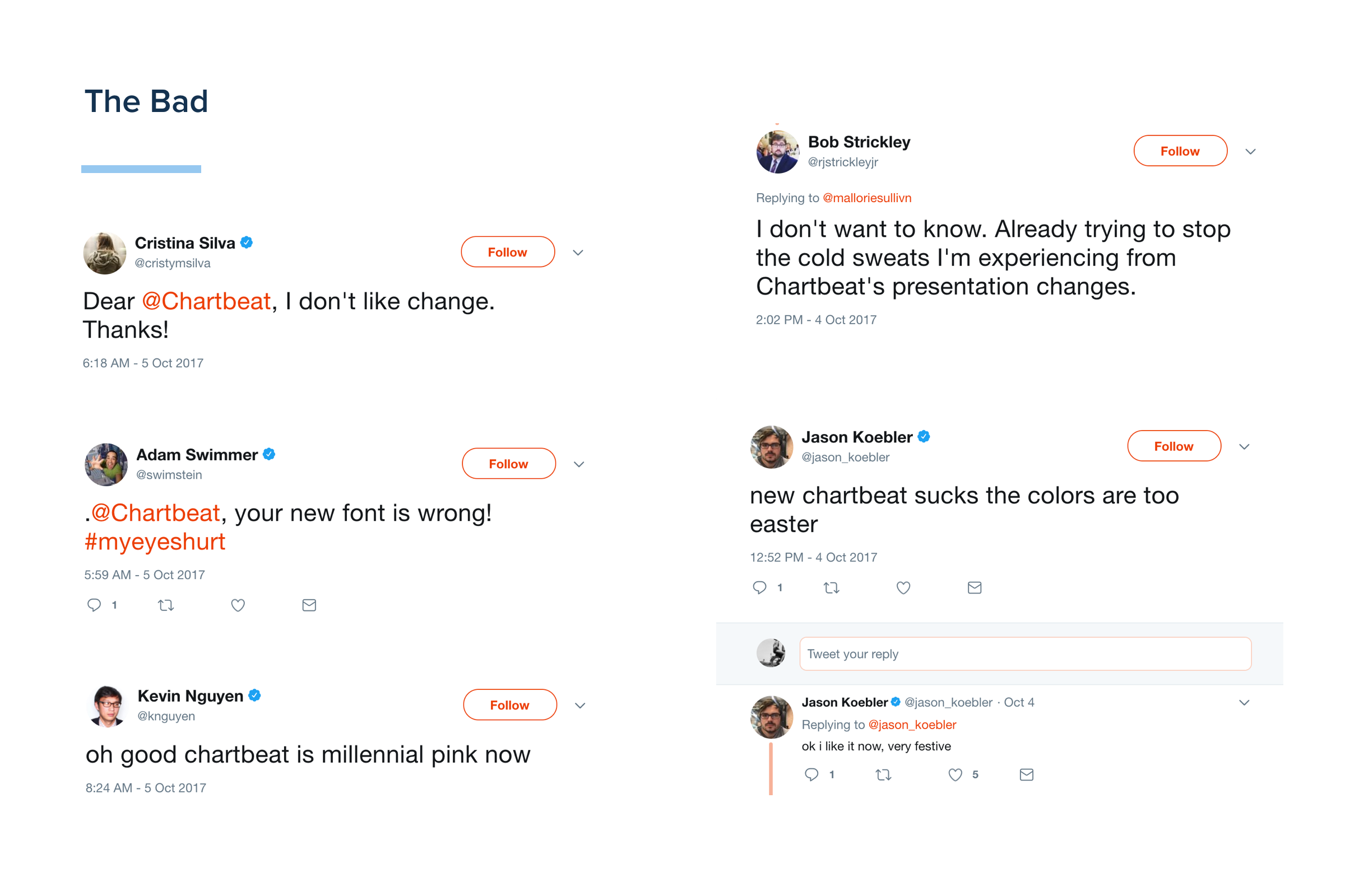
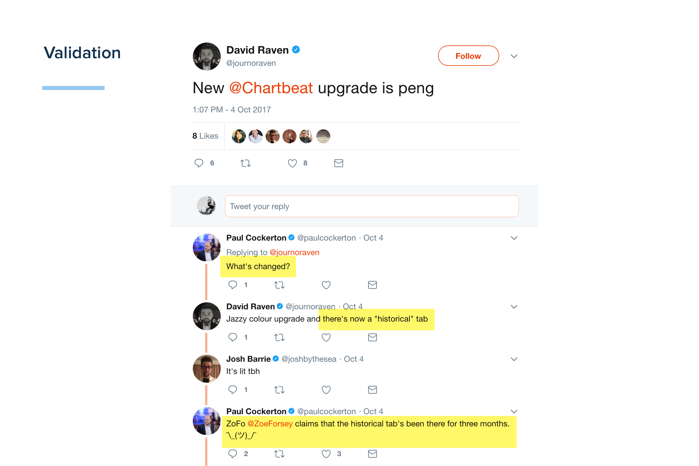
We launched the new navigation and product updates the day of our external launch at ONA. It is commonplace to have customers tweet at us, so we anticipated some good and some bad, of course.
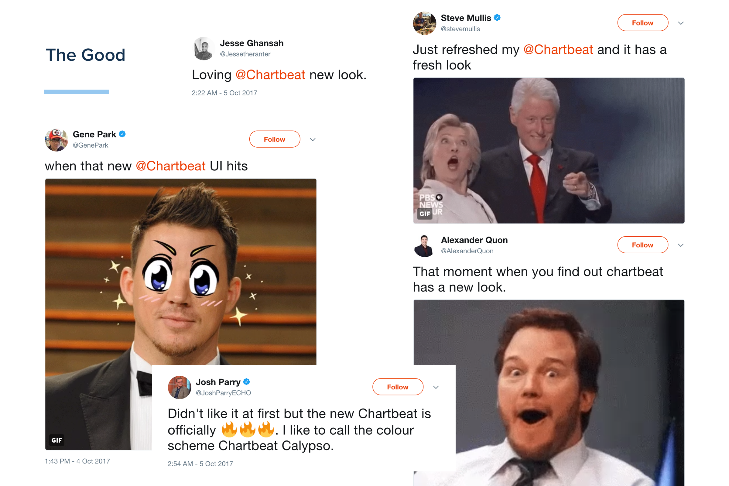
My favorite piece of feedback is a thread of conversation validating an assumption we had before. That nobody looked at our navigation. When we introduced Historical to the nav and didn't see usage spike, we didn't know if users just weren't interested or didn't know it existed. Historical launched 3-5 months before this conversation.
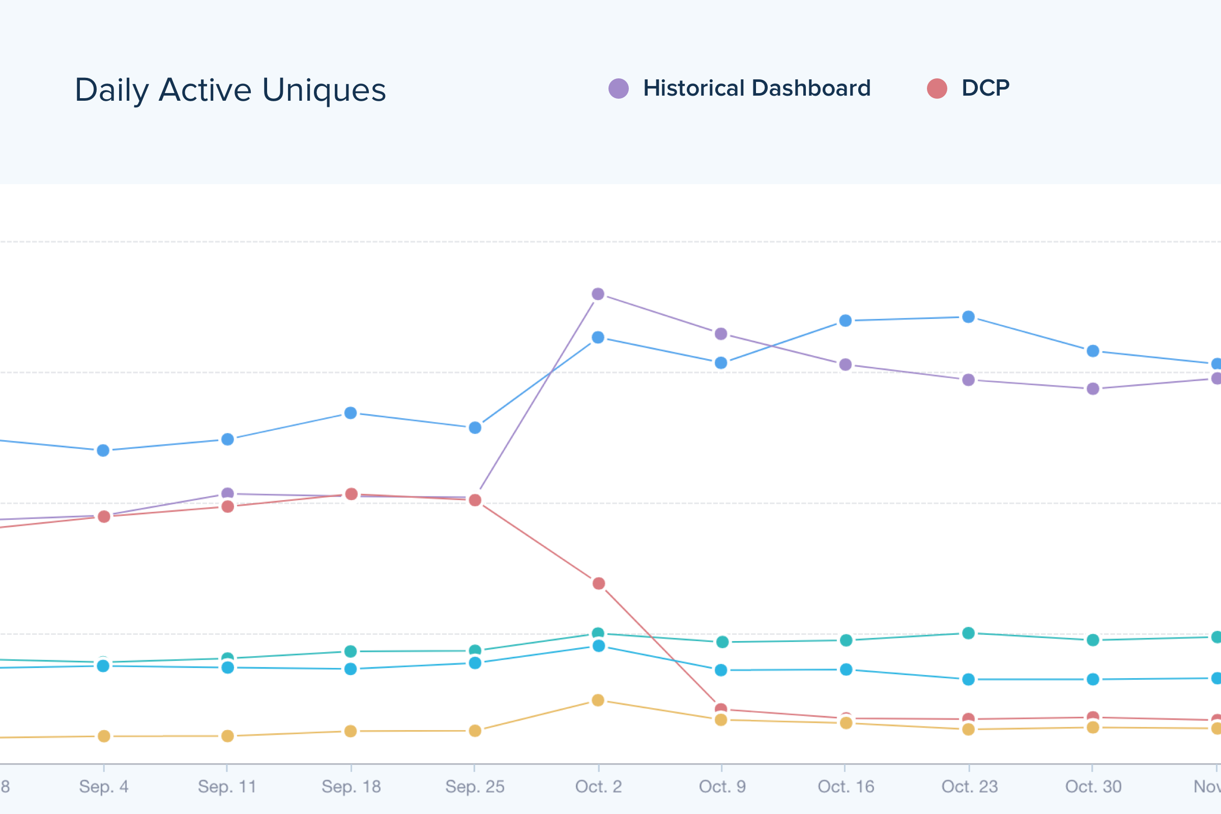
Screenshot of Mixpanel data showing the spike of Historical usage after launch in comparison to our legacy daily report that we originally wanted Historical to replace.
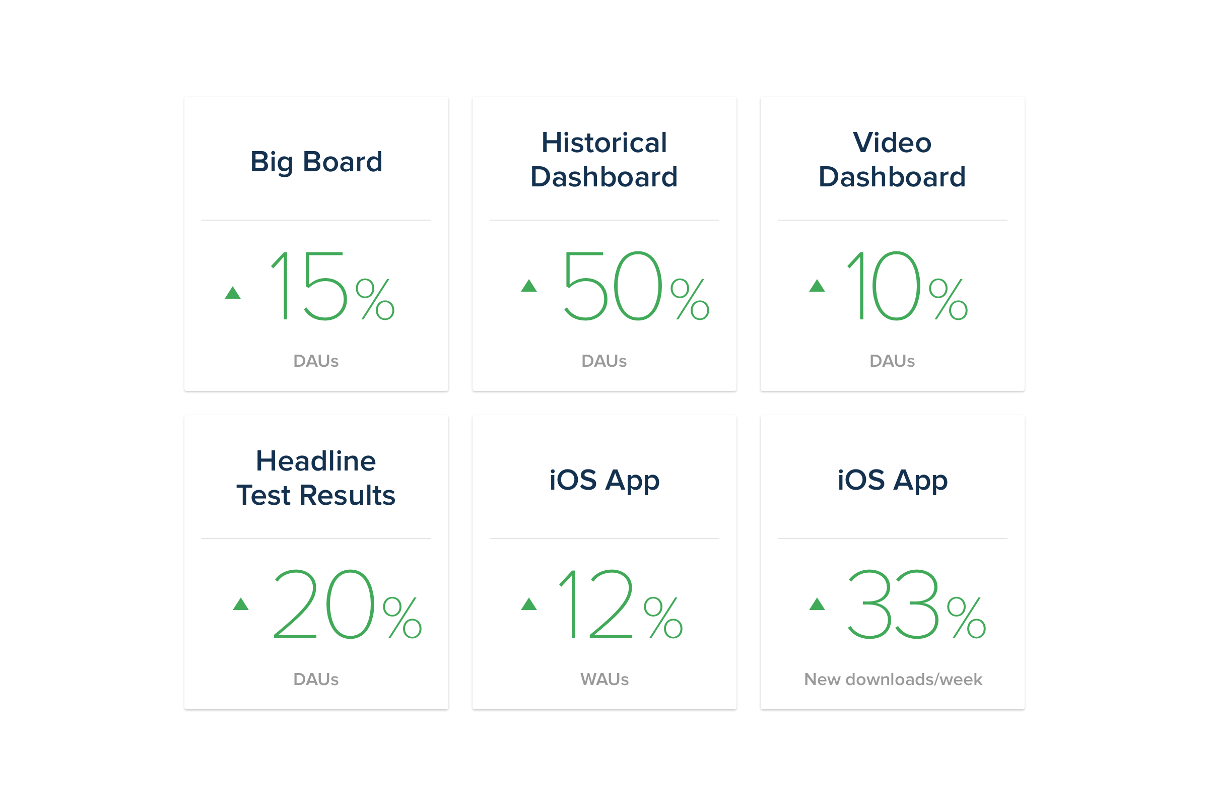
Usage data
For all of the desired results we wanted to hit, we saw immediate behavior changes after launch, including:
- Increase in non Real-Time product usage
- Increase in multi-product usage
- Increase in upgrade conversations to premium products