Background
Chartbeat launched in 2009, and is known as the best-in-class provider of real-time traffic data for the digital publishing industry.
Understanding that real-time data only provides a sliver of the data picture, our product team focused on evolving our suite to include more context. This included launching a dashboard showing historical data, topic analysis, and a daily email digest. Despite multiple product launches, our qualitative and quantitative research showed that for a majority of our customers, we were still perceived and used only as a real-time data tool.
How might we get customers to notice our evolving mission?
Solution
After multiple launches without user traction, we had to catch our customer’s attention in a different way. We set out to change this with two major project initiatives:
1 - A company rebrand focused on updating our brand perception from a real-time tool to a product suite.
2 - Product updates focused on improving the UX to better promote, acknowledge, and experience Chartbeat as a suite. See this project in full here.
Role
Design Director
- Creative Direction + Design
- Brand Strategy
- Event Design
- Spatial/Office Design
Team
- CMO
- Design Team
Our old logo, an abstraction of a dial in our Real-Time Dashboard UI.
Strategy
I spearheaded the rebrand alongside our CMO, and we additionally hired Red Antler to help us in the strategy and brand identity phases of this project.
Through mapping the strengths and weaknesses of our current brand, as well as those in our competitive set, we honed in on our strategic focus: our story, value propositions, personality, and brand promise. [Full strategic work confidential]
We used this strategy to find an opportunity to develop a unique vision for the brand. We found that to best differentiate ourselves in the market, we should:
Create a brand that is visually rooted in the media landscape, rather than the analytics world.
This meant rooting the expression of our brand in the work of our users, the stories they tell, and the language they speak. It was a seemingly small pivot but it immediately changed the way we thought about everything.

This industry inside-joke shows the market reach and power of Chartbeat as brand, as well as its synonymous link to real-time as a passive understanding of data. Internally, we call this symptom "the dial-on-the-wall" syndrome.
A new mark and bold updates
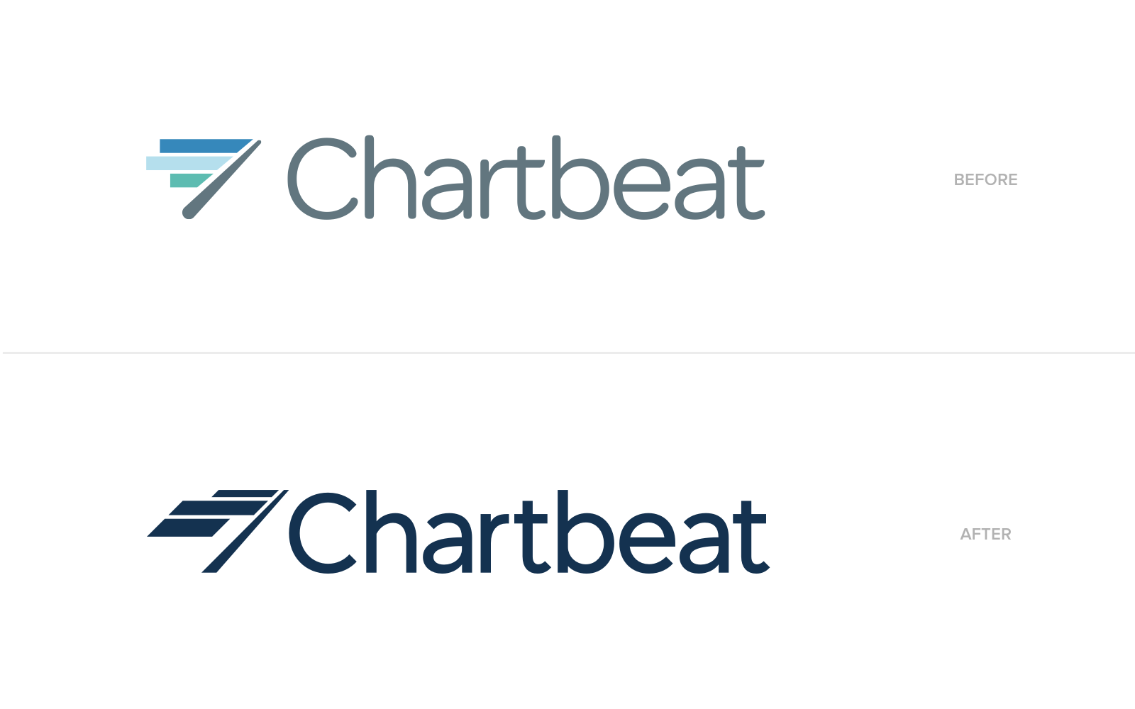
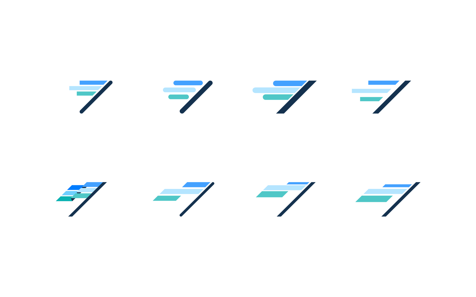
Our previous mark was an abstraction of a real-time dial, so our first instincts told us to move far away from it. But, after a few out-there explorations didn't catch, our eyes caught some hidden gold in our old mark. With just a bit of reorganizing, we could evolve it into something much more meaningful, a flag. It suited our new brand promise perfectly: the flag represents the dedication and momentum of the publishing industry, as well as our company putting a stake in the ground to represent our partnership with the industry. It retained our brand recognition while pushing our brand forward.
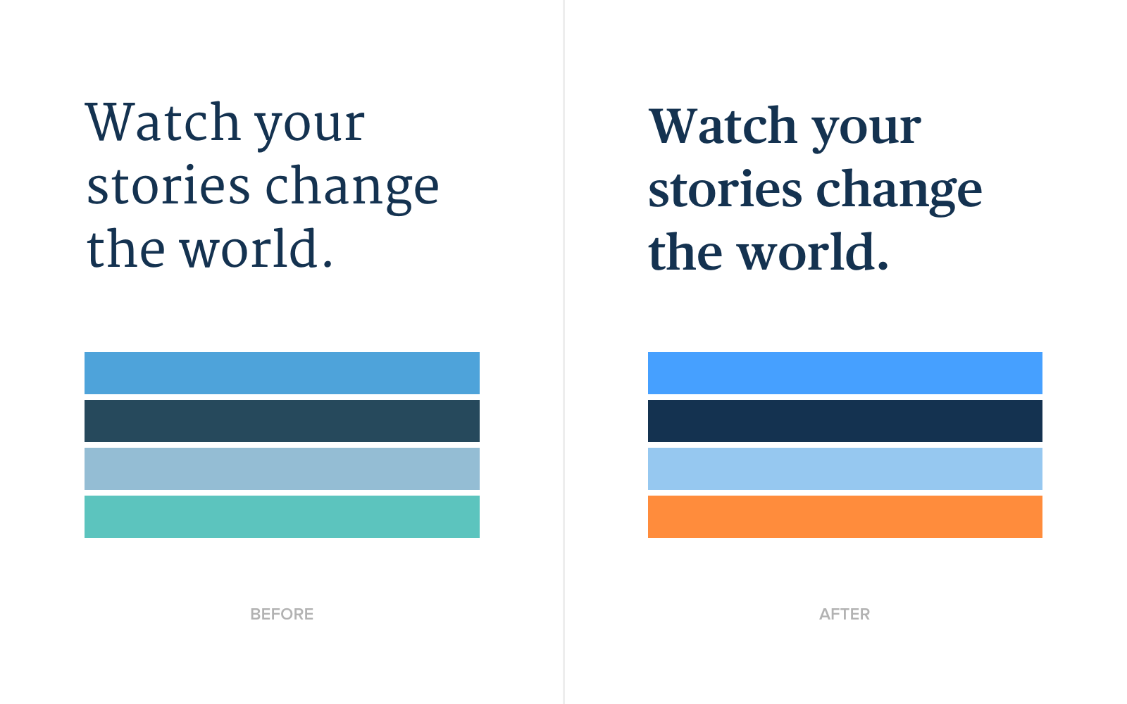
The new design is much crisper, which inspired further visual changes including updating our typography, and upping the hues and saturation of our palettes. We were inspired by the bold headlines of front pages, and chose Publico as our new serif typeface.

Celebrating the story
To bring our new customer-first positioning to life, we wanted to celebrate the meeting point between the industry and our products, the stories themselves.
This focus effects every touch-point of our business, from how we talk about our products to how we decorate our office. We prioritized the most impactful projects necessary for launch and hit all internal and external launch date goals.
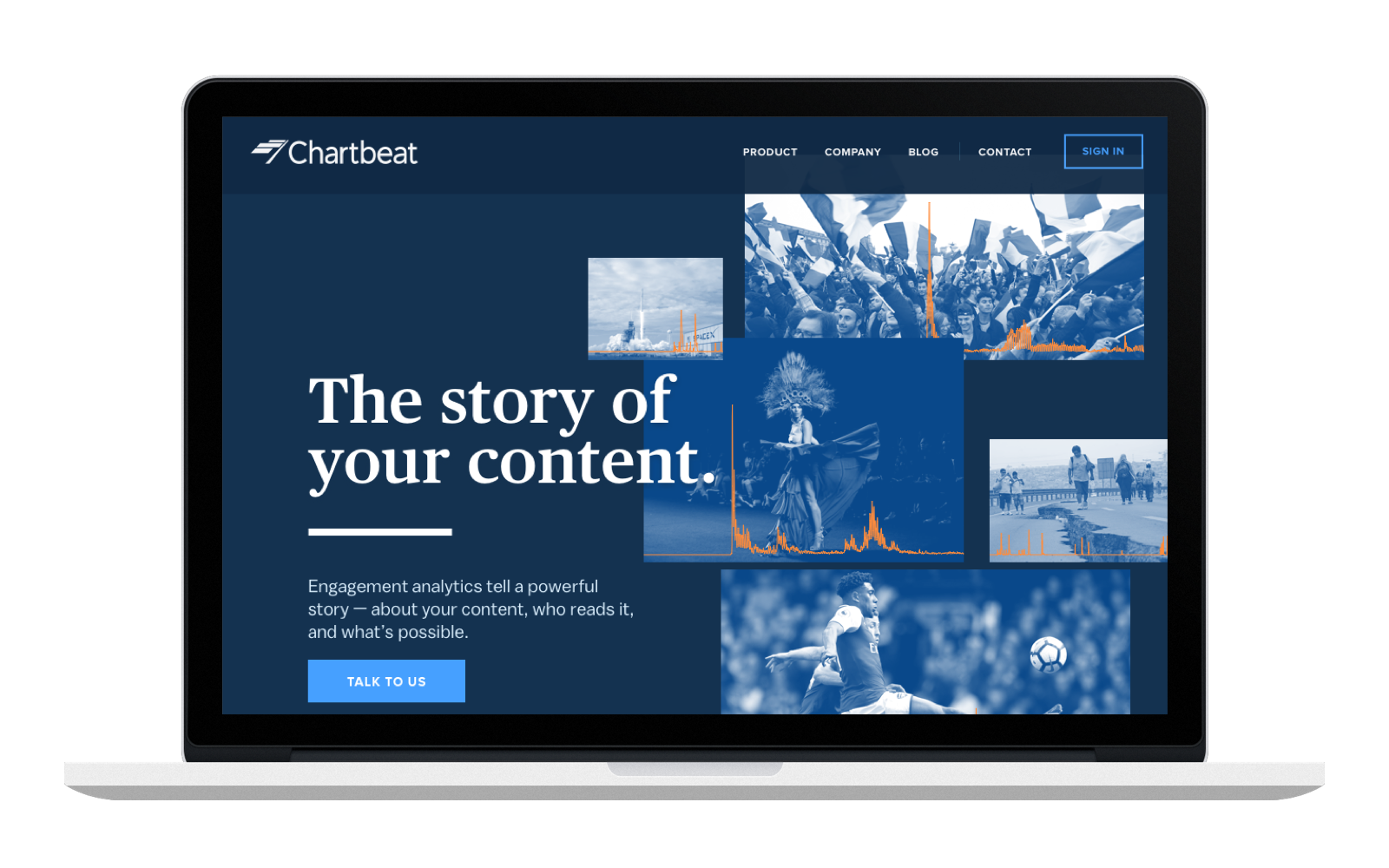
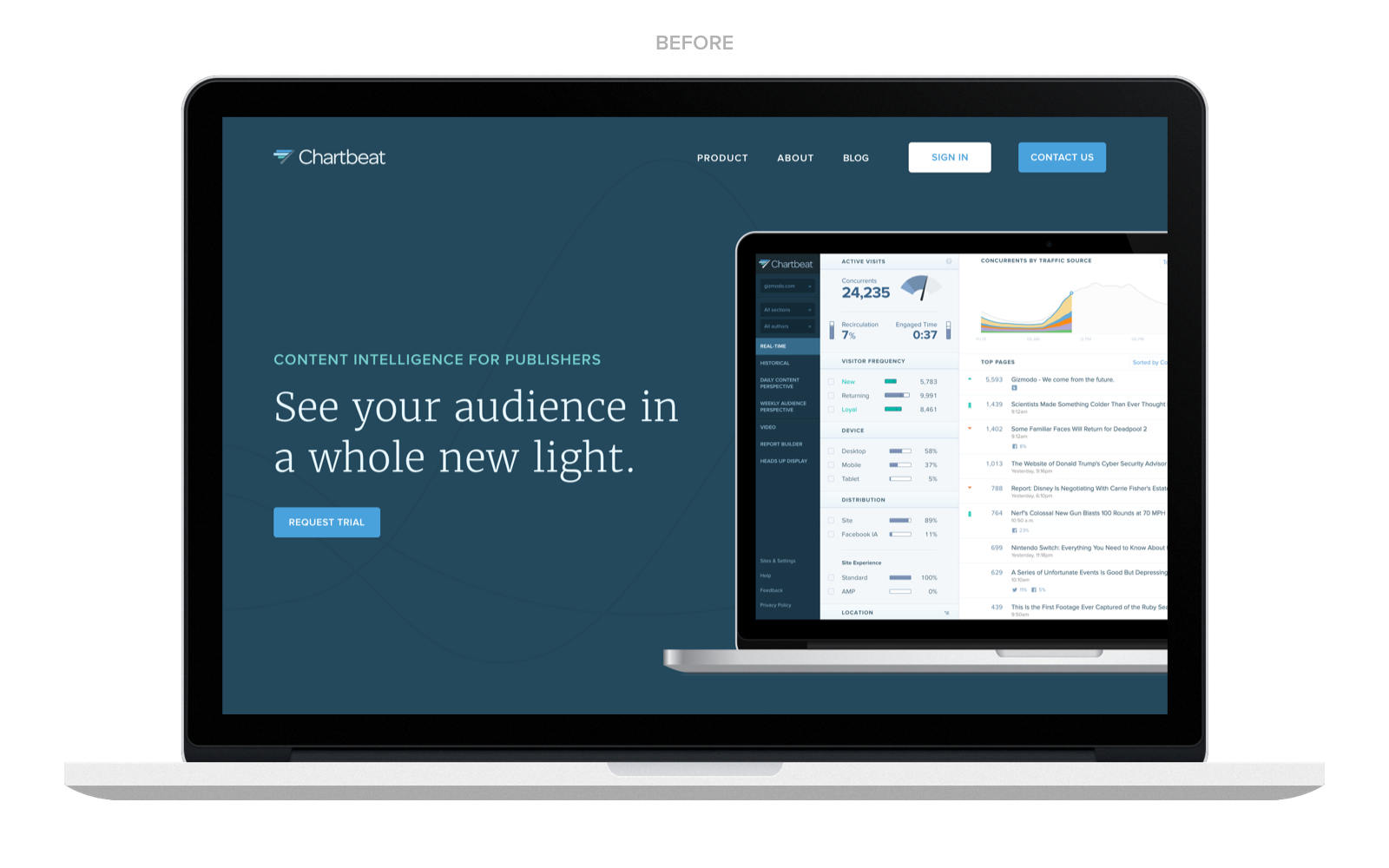
Website redesign
I wanted the website to tie together the relationship between stories told and our data. We incorporated photography for the first time, and it injected new life to our brand story.
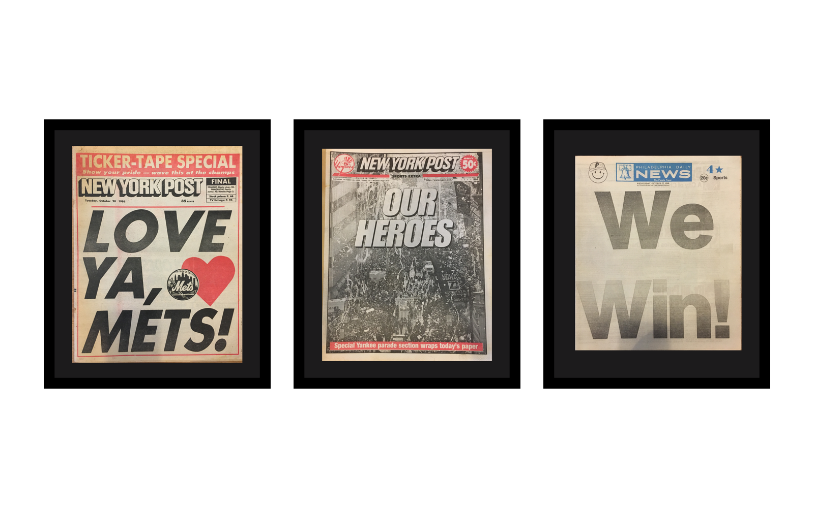
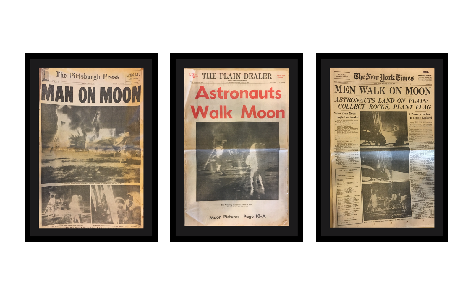
Office Design
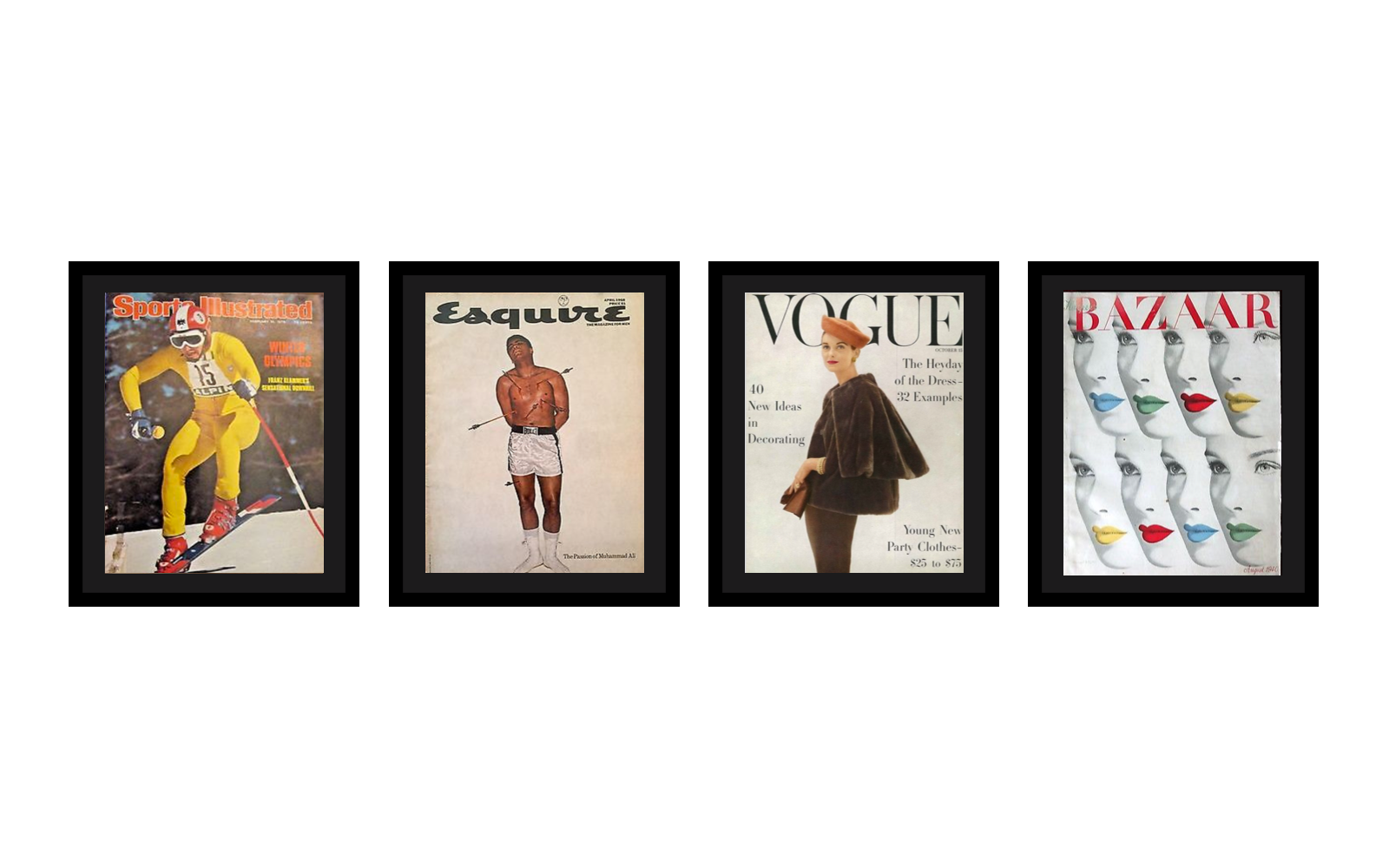
To bring our brand to life internally, I wanted our office to celebrate the history of news. I scoured eBay for impactful and iconic front pages to install in our conference rooms. These frames would honor the work of the industry and recognize the different types of customers and content types in the Chartbeat network (breaking news, sports, magazines, etc.).
The newspapers and magazines were custom-framed to hang in conference rooms, which were renamed with new signage installed to unveil at our internal launch.
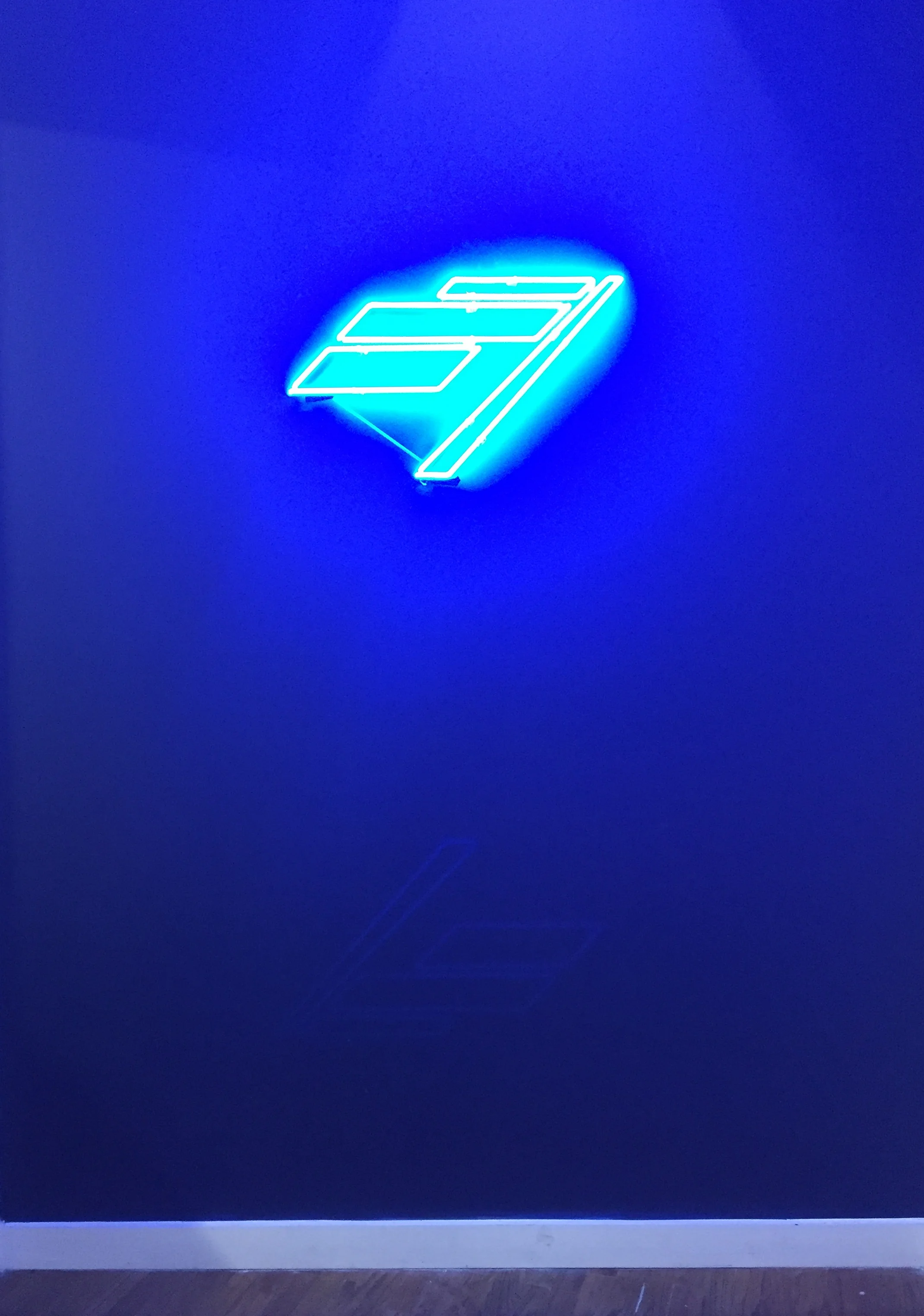
Neon logo installed in lobby
Brand Launch
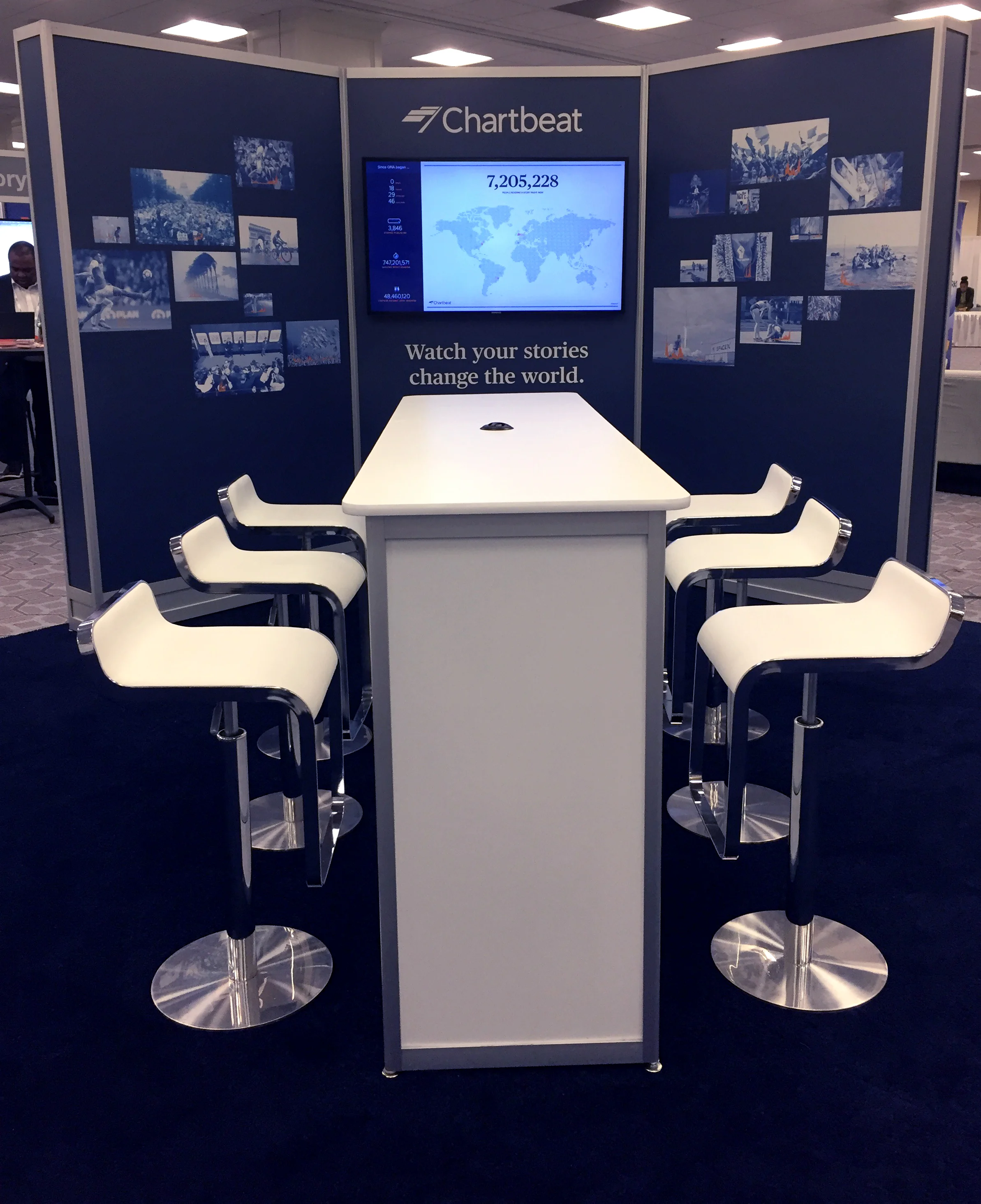
We launched our brand externally at the Online News Association conference in October, 2017. This included a 20x20’ booth design, updated collateral, swag, and interactive experiences.
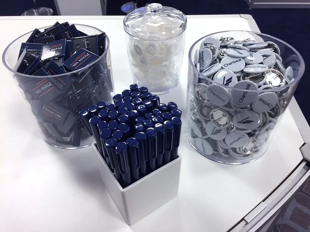
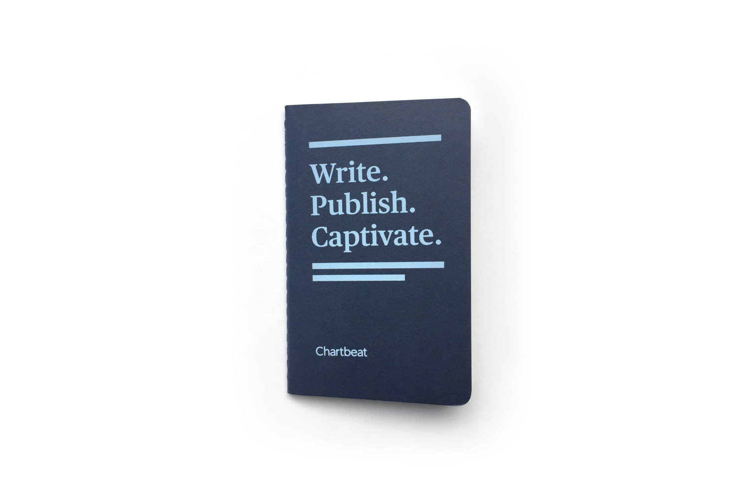
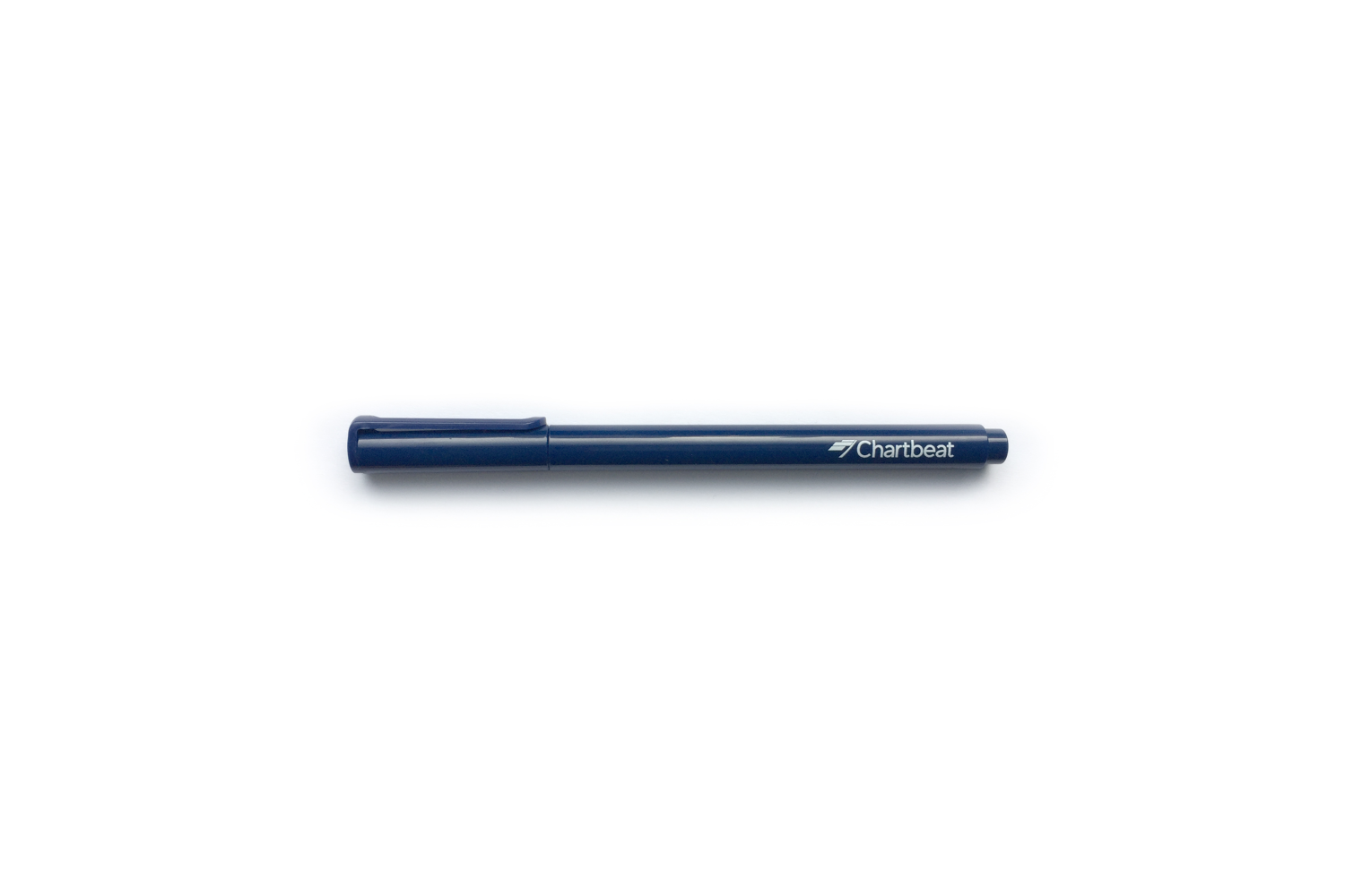
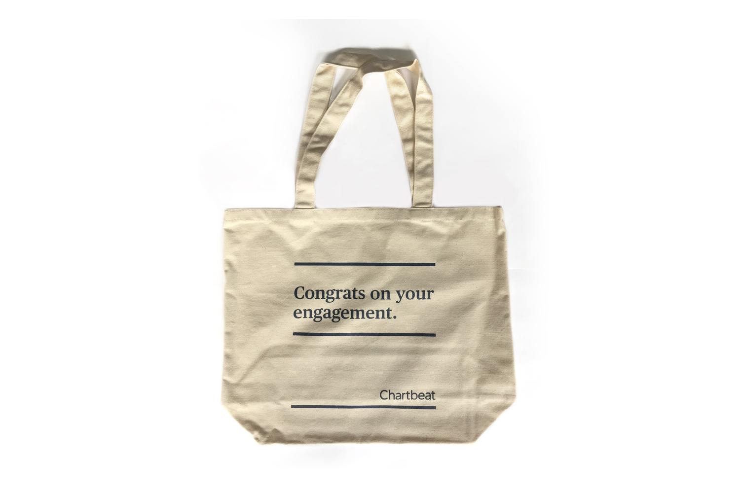
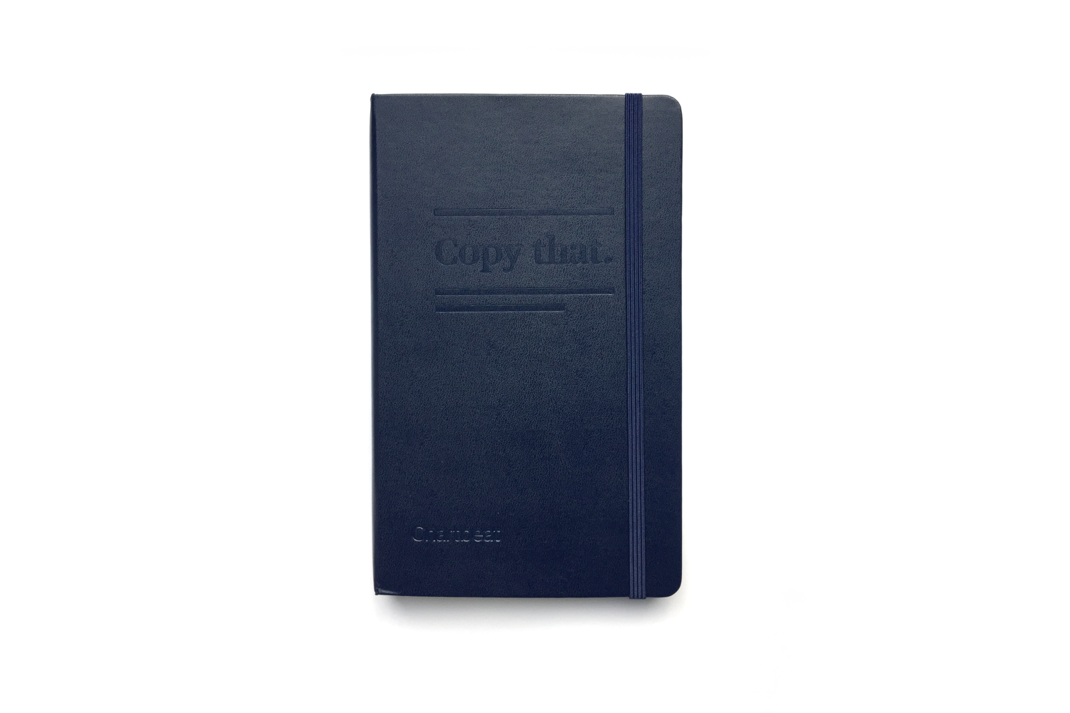
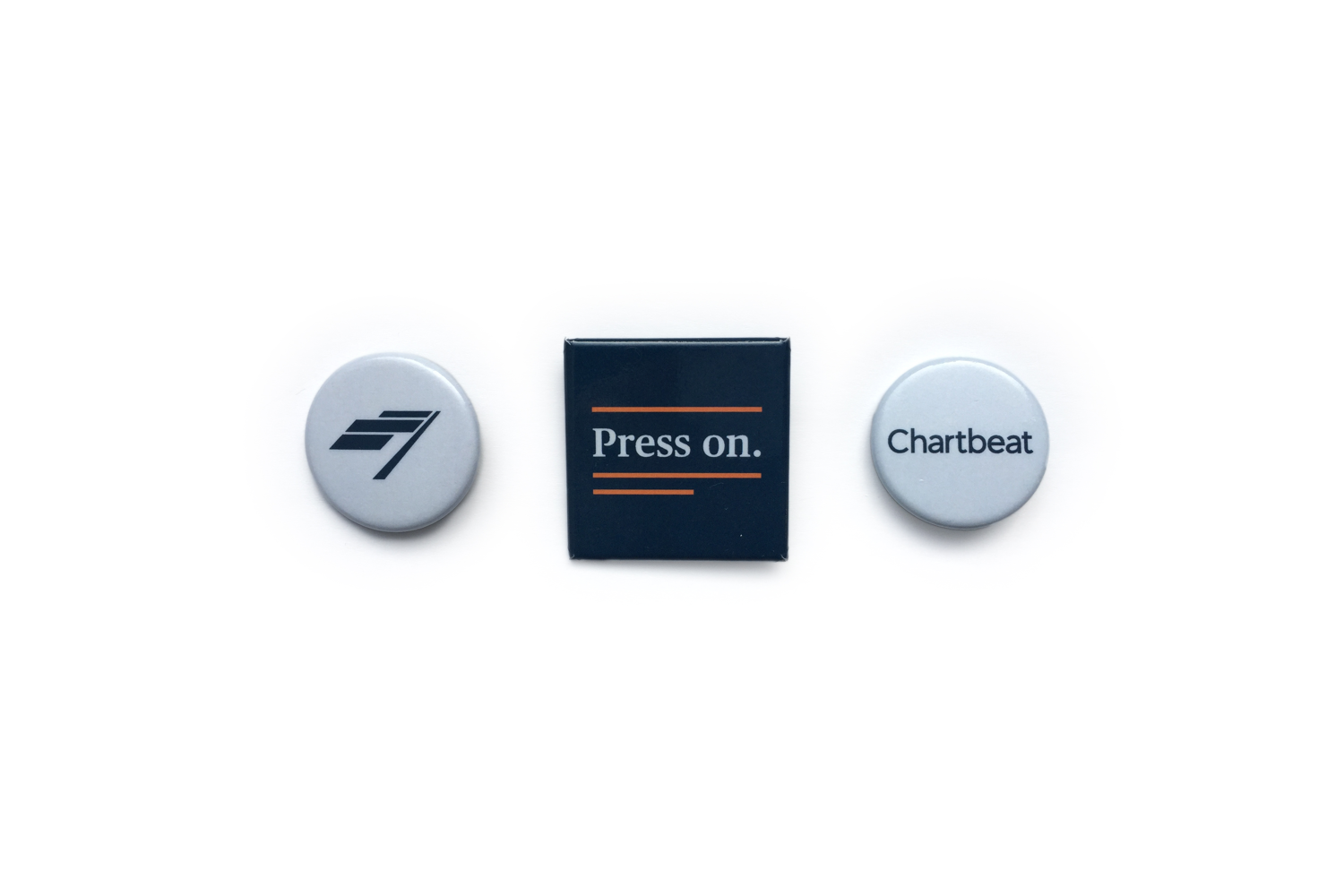
Swag & Stationary
What gets people more excited about a brand than swag? We redesigned our swag set to hand out at our internal and external launches.