Background
The Chartbeat iOS app was originally released in 2012 as a mobile extension of our Real-Time Dashboard. But, as our company and product evolved, our app did not. It grew buggy, our users complained about a lack of features, and we were not actively promoting it to new customers. Three years passed without an iteration or improvement.
How might we make the Chartbeat app the most useful extension of the desktop experience?
Solution
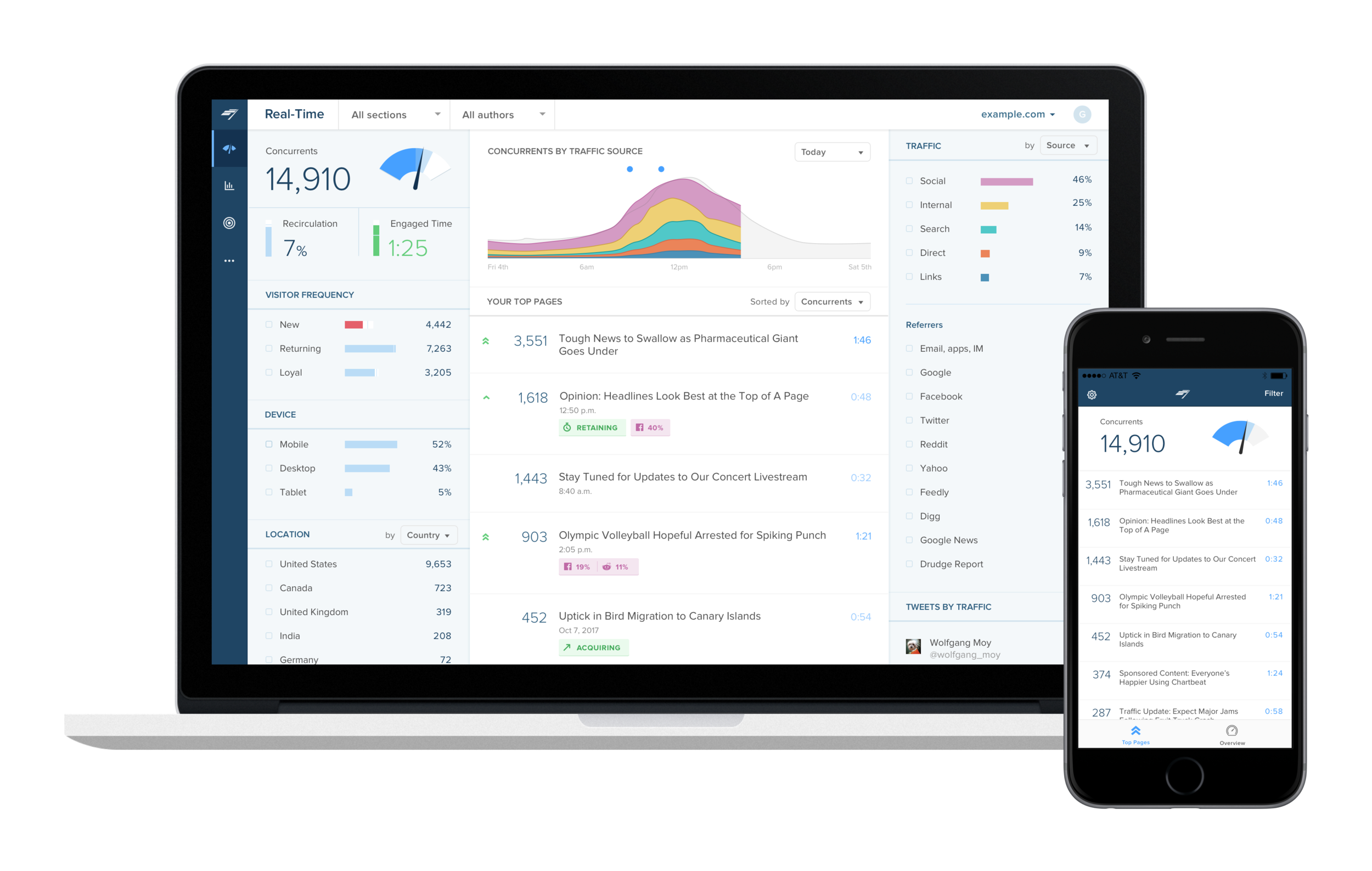
After better understanding the ideal workflow of a Real-Time and mobile experience, we redesigned the app to bring it up to date with our desktop experience, including similar UI patterns, new and widely-used features, and to develop a curated set of data that is important and actionable for our users on-the-go.
Role
Product Designer
- Research
- UX/UI + Visual Design
- Prototyping + Testing
Team
- Product Manager
- Front-End Engineer
Where we begin
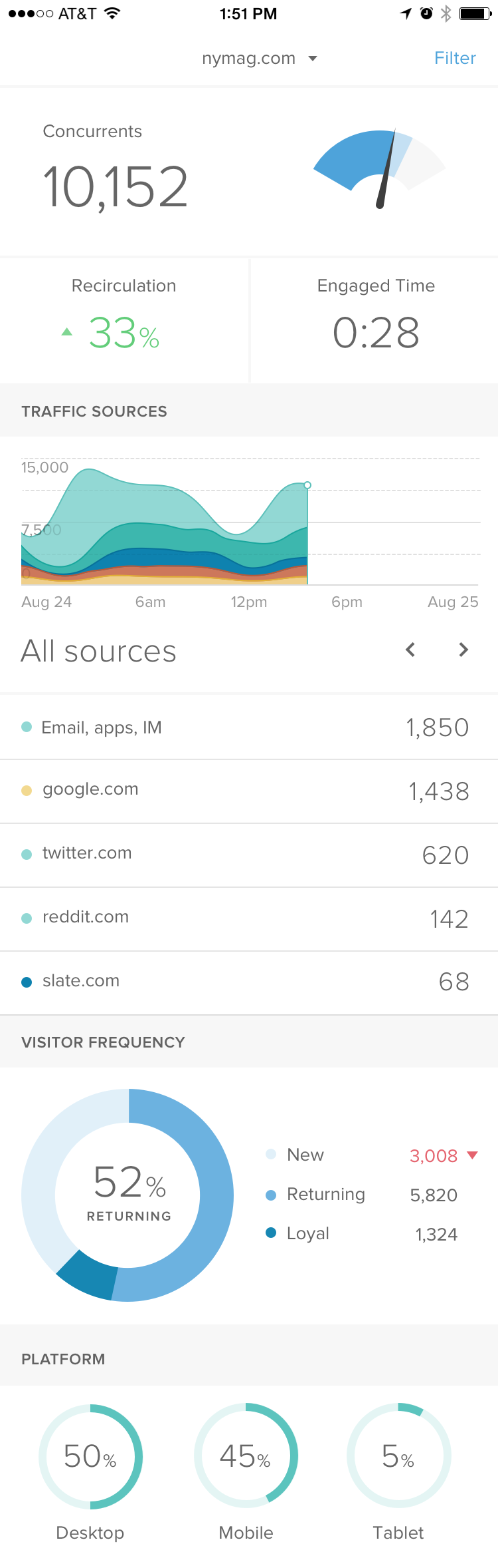
Here are screenshots of the app at the start of this project. At this point, 3 years had passed since its last release. It is visibly buggy, and is nowhere close to having a consistent experience to its desktop companion.
To kick off research, I read every email sent to "Thoughts on the app?" and organized feature requests and pain points described by users.

Customer Interviews
I spoke to a range of customers in order to understand the use cases of a Real-Time Dashboard mobile experience. How would a Chartbeat mobile app best fit into their workflow? What is most important on-the-go? Where I landed:
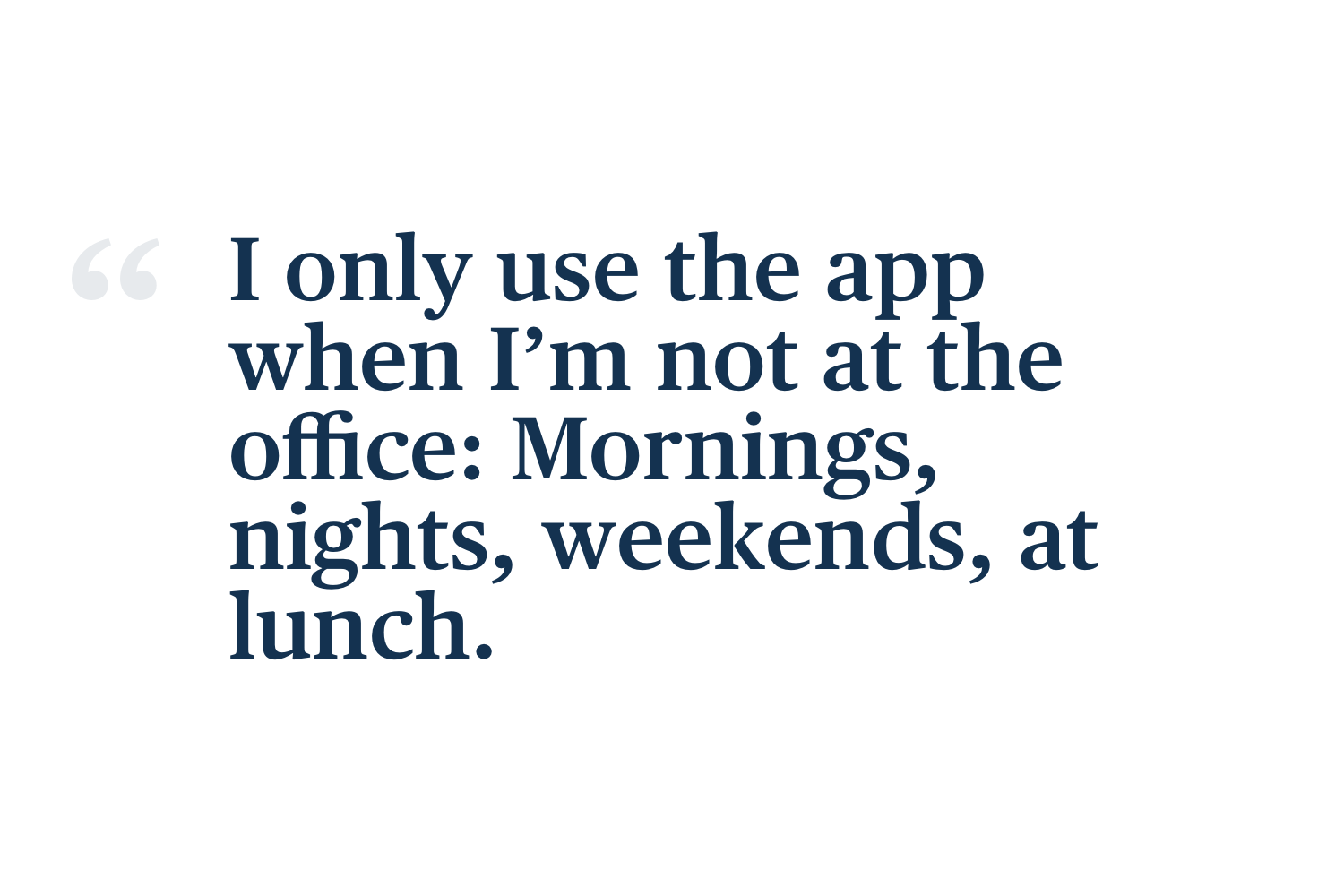
- Users open the app when they are not at their desks, and intend to use it as a quick health check. If traffic is unusually high or low, they dig in further to figure out why.
- As this experience is on a much smaller screen, the app experience must be kept simple and easy to scan.
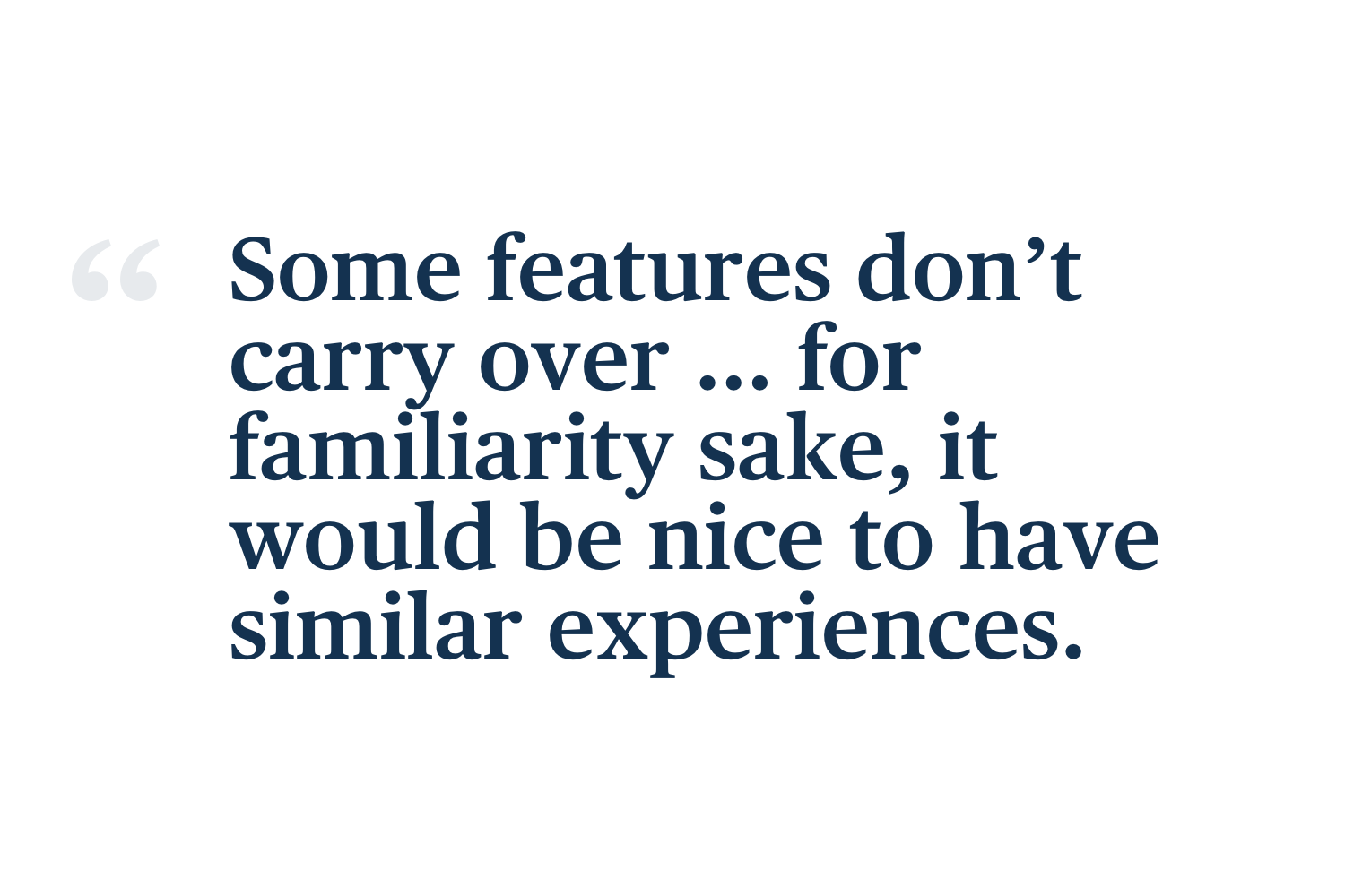
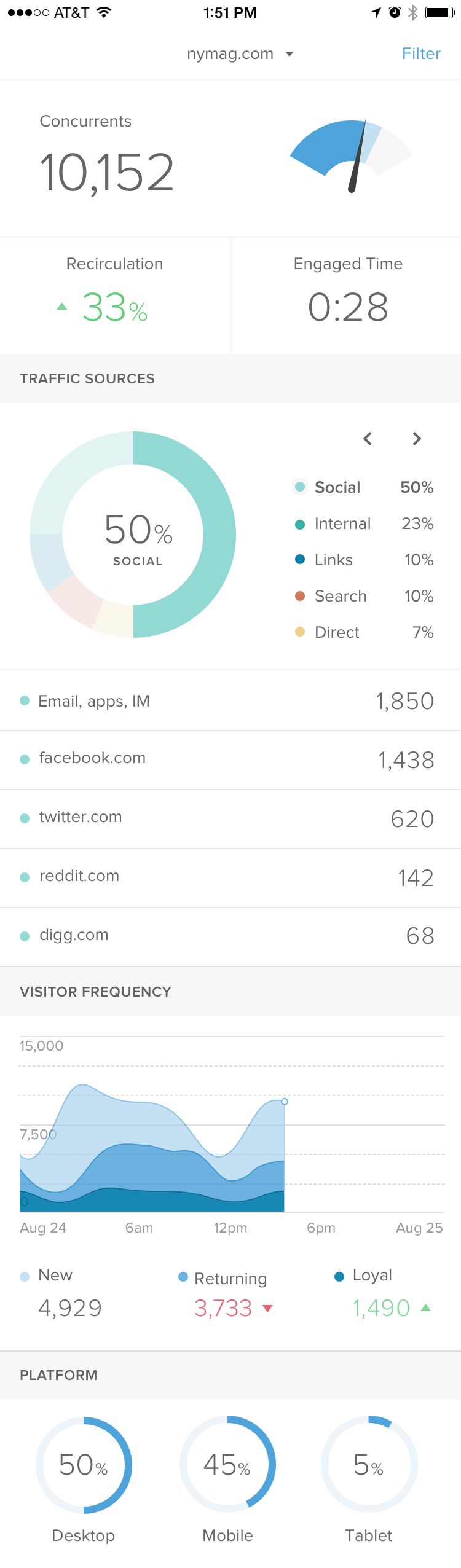
- The desktop-to-app inconsistent experience is confusing. We left out new features that have proven to be useful on desktop, including more ways of understanding traffic sources, referrers, and social.
- We should take advantage of the phone as the medium, utilizing notifications and alerts to engage users when it is most important.
- Lots of common bugs/pain points that need to be addressed (sign people out all the time, don't show full headlines, etc.).
Exploration
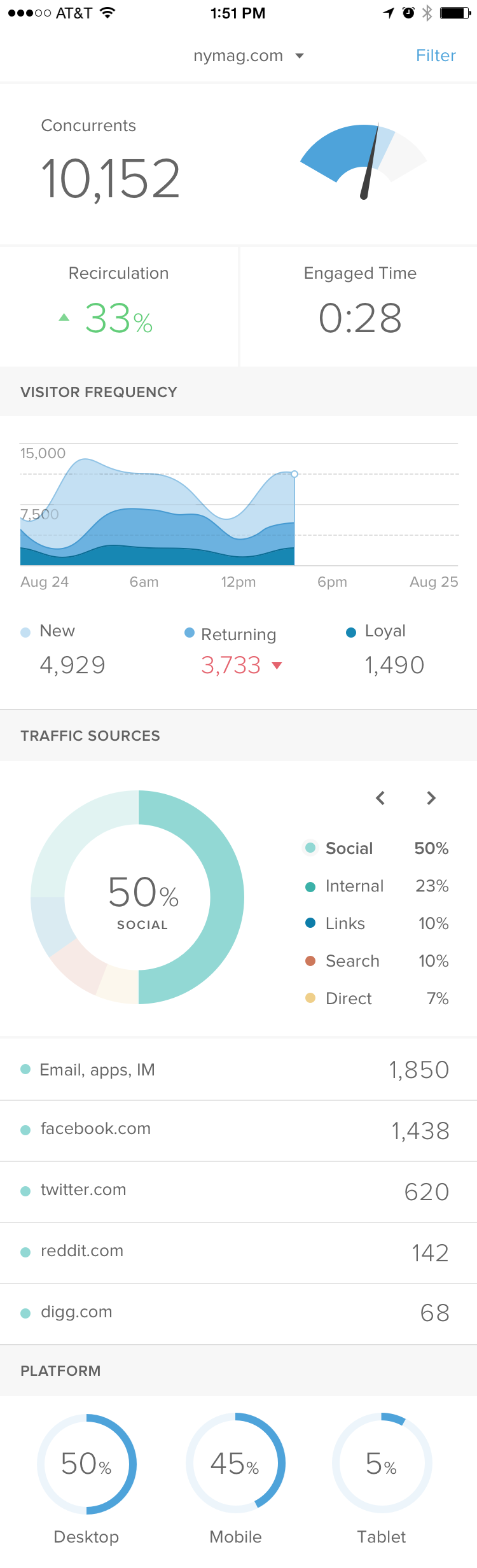
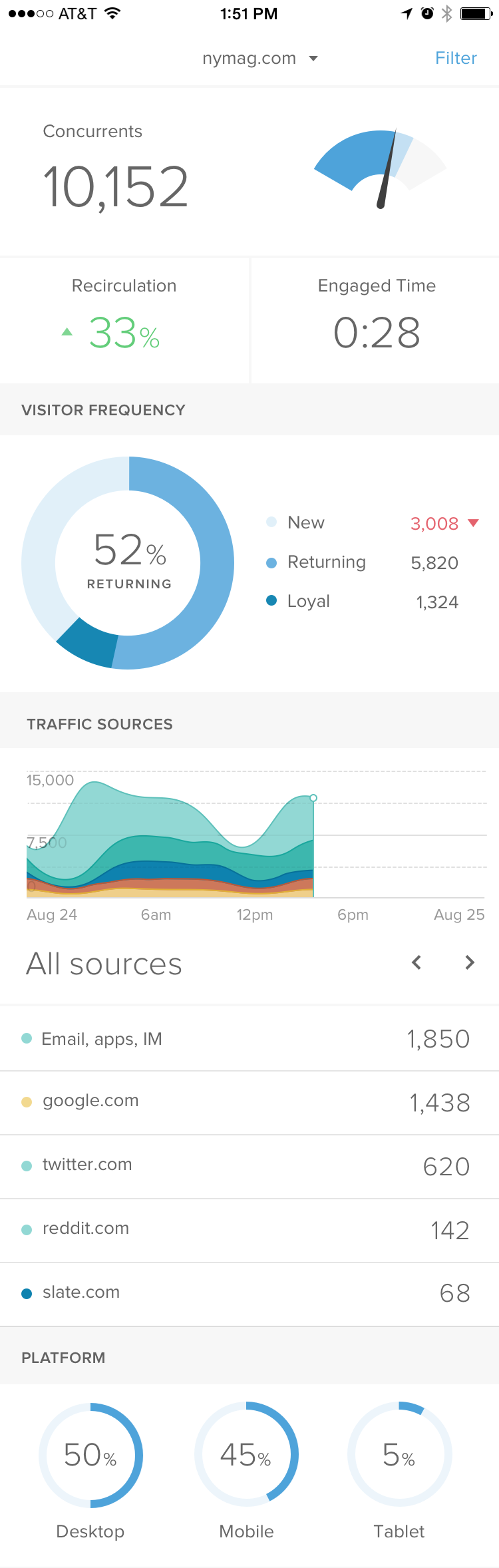
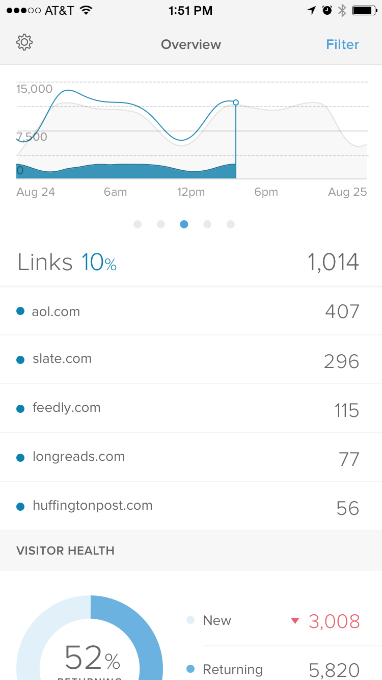
Keeping the experience simple, focused, and easy to scan is no small feat at 350 pixels wide. Whittling down our desktop experience requires heavy curation and clear information hierarchy.
In order to understand what data was most important to our users, I prototyped a range of versions of data organization and hierarchy to direct the final output of the navigation and page structure.
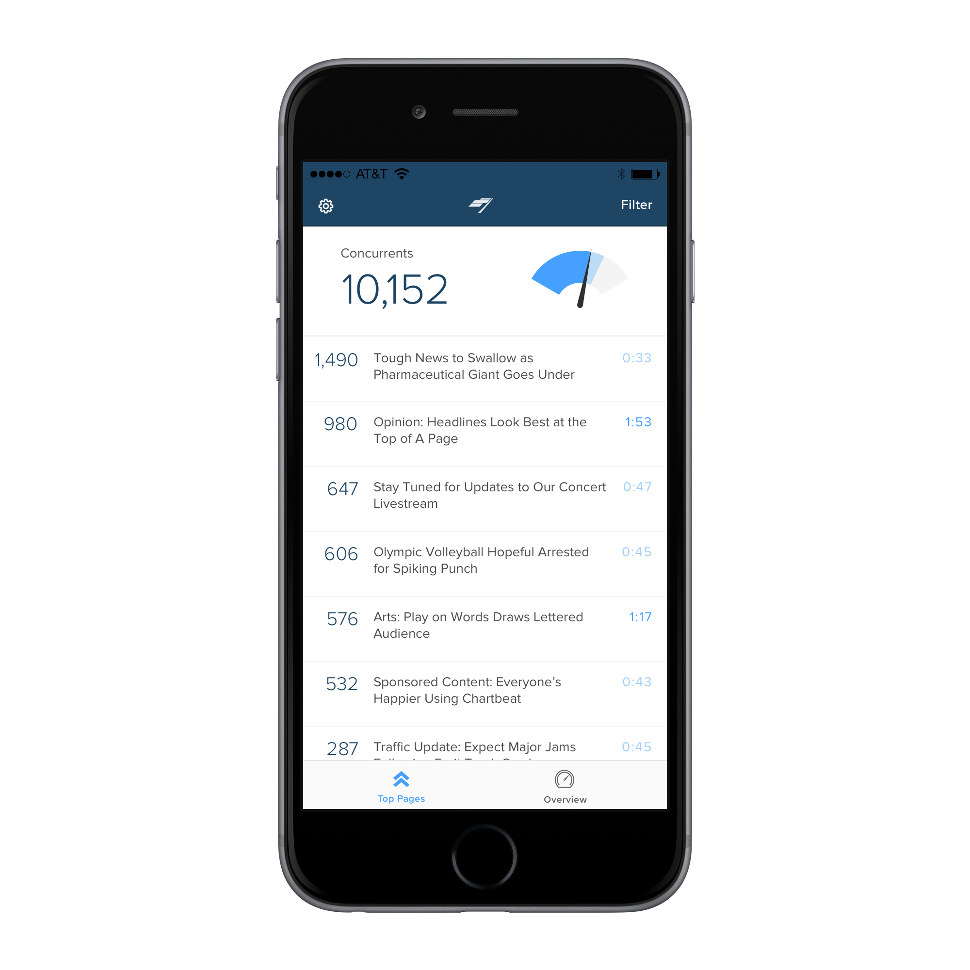
I originally had users land on an Overview page viewing top site metrics, but based on user feedback, discovered that the story is king. Landing on Top Stories first was a necessary first view of the app.

Sticky-note prototype allowed me to quickly reorganize data and page hierarchy
The challenge was not only in figuring out what data was important to our users, but also what visualization proved the best way to communicate it. Above are some variations we showed to users for feedback on order and viz.
Feature Concepts
Dig into the why
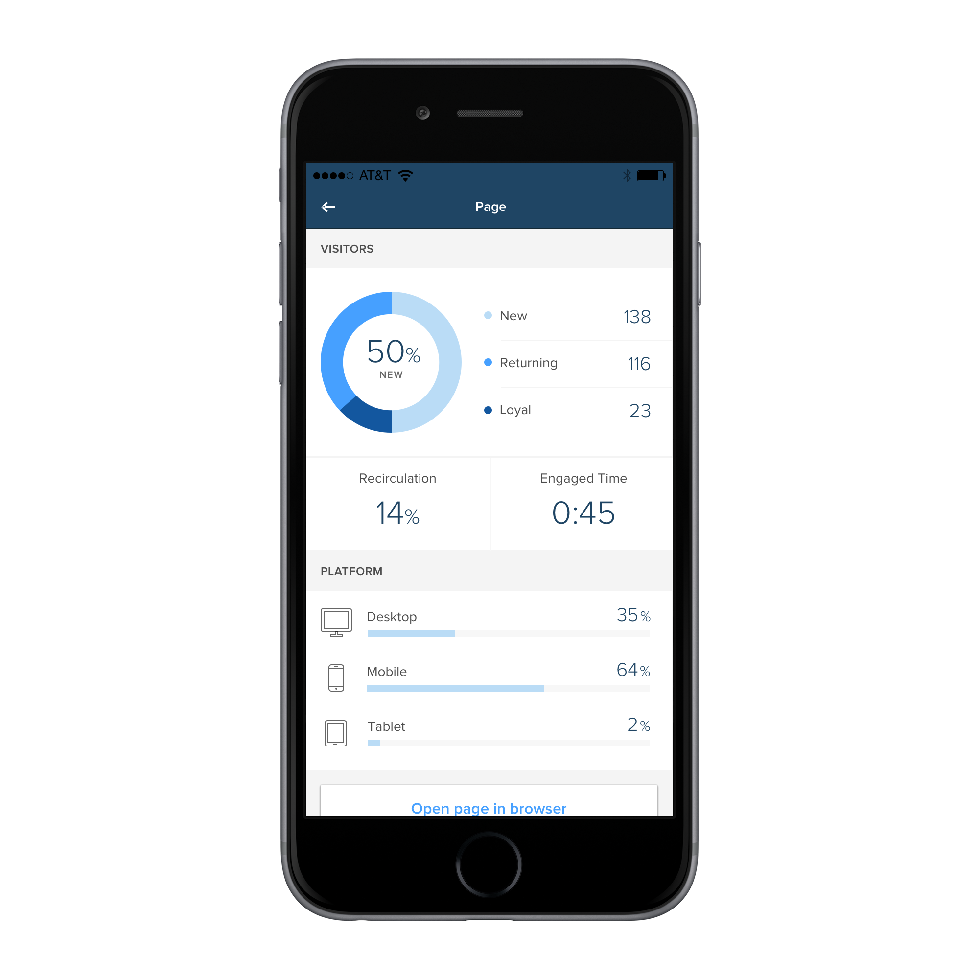
I wanted to create more avenues for users to dig into their data past top-level information.
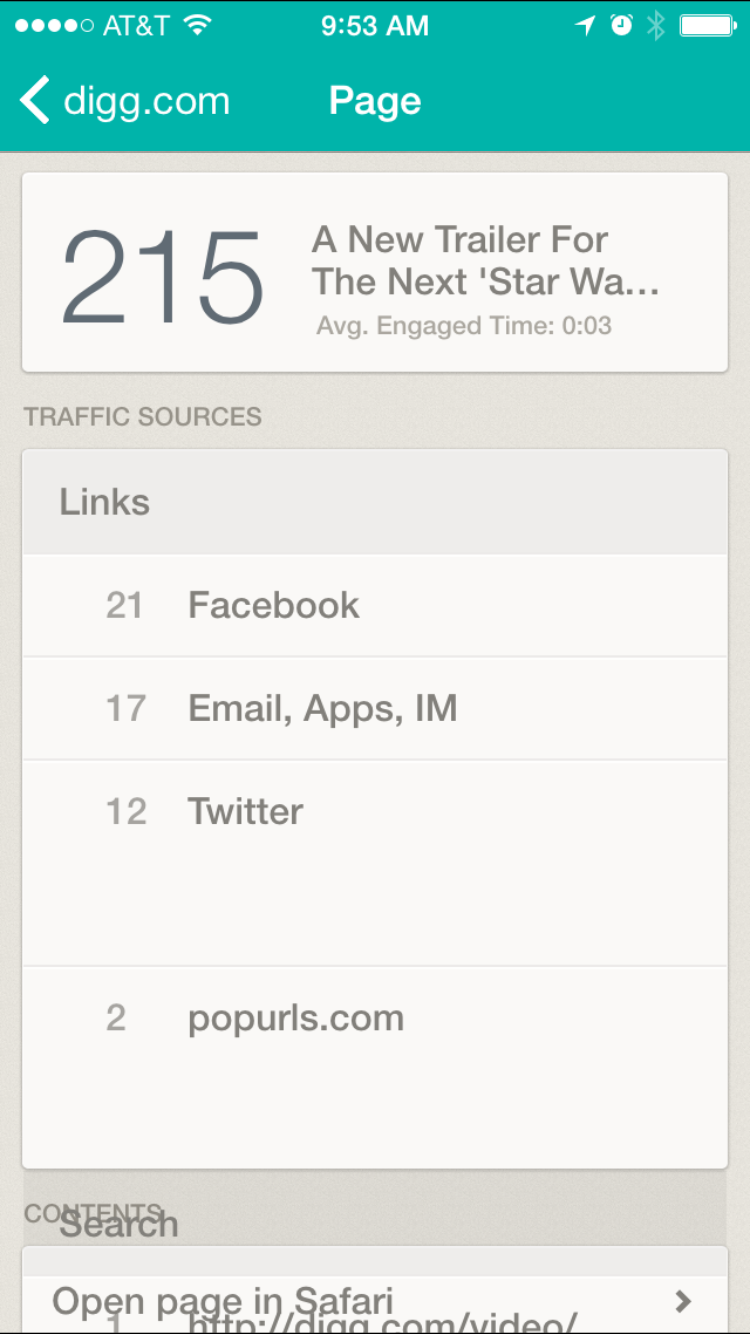
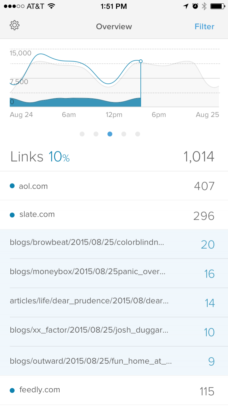
This design shows 3 levels of understanding traffic sources. Under Links, users can view their top traffic referrers, click to view specific paths within that universe, and then click to view a specific path itself, all while keeping the user in app.

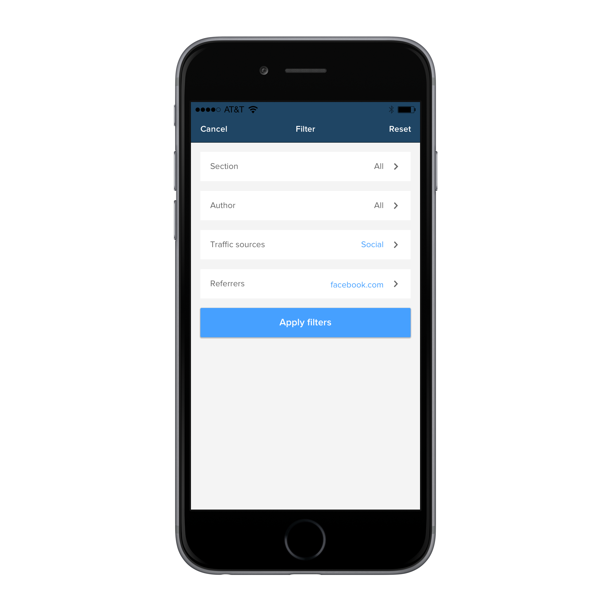
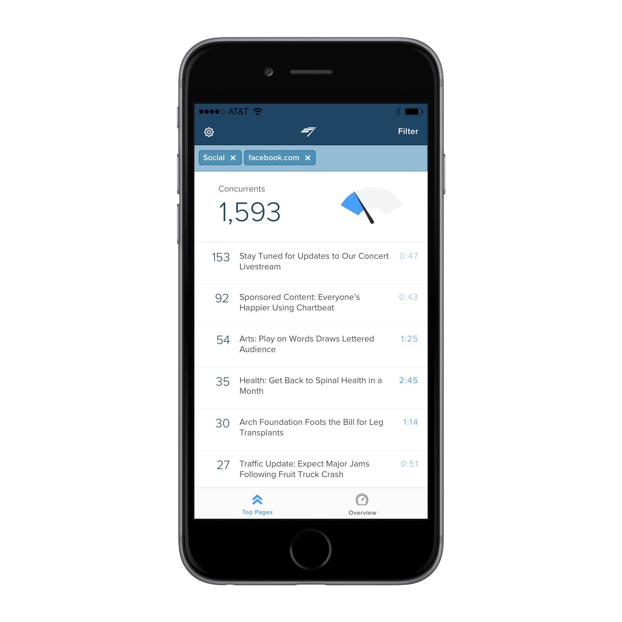
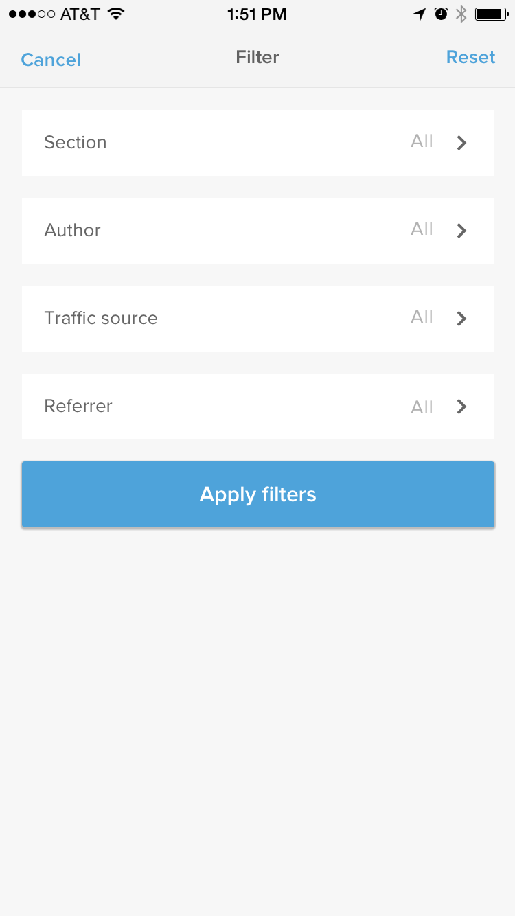
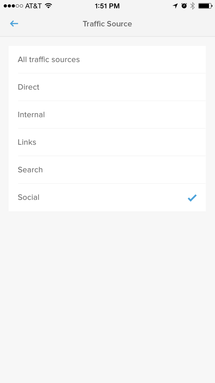
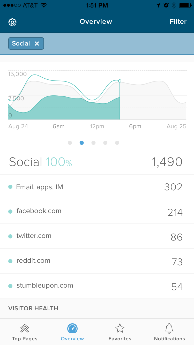
Filtering
This design shows another way of digging in, filtering. This is a user flow that was already validated in our desktop dashboard, and came up frequently in user research as a feature that would make a big impact in how they hone into what data is important to them.
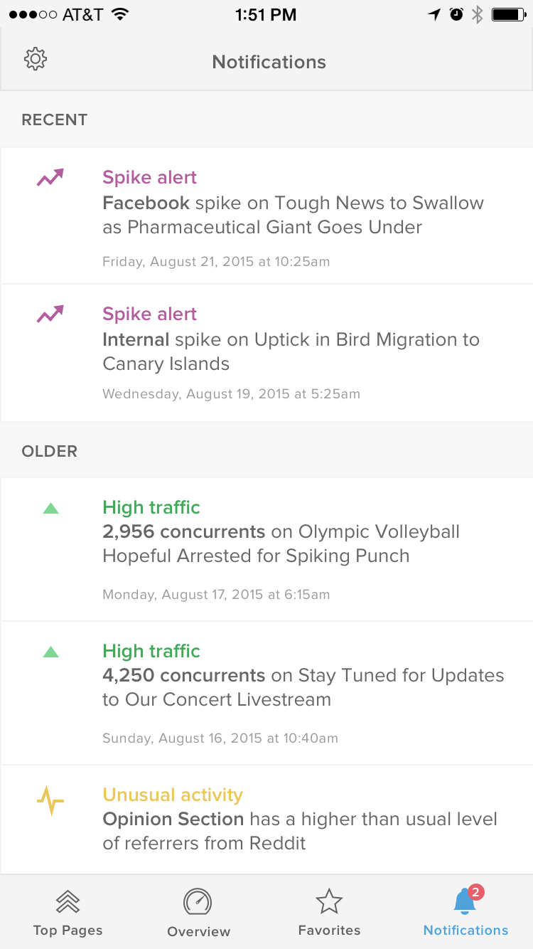
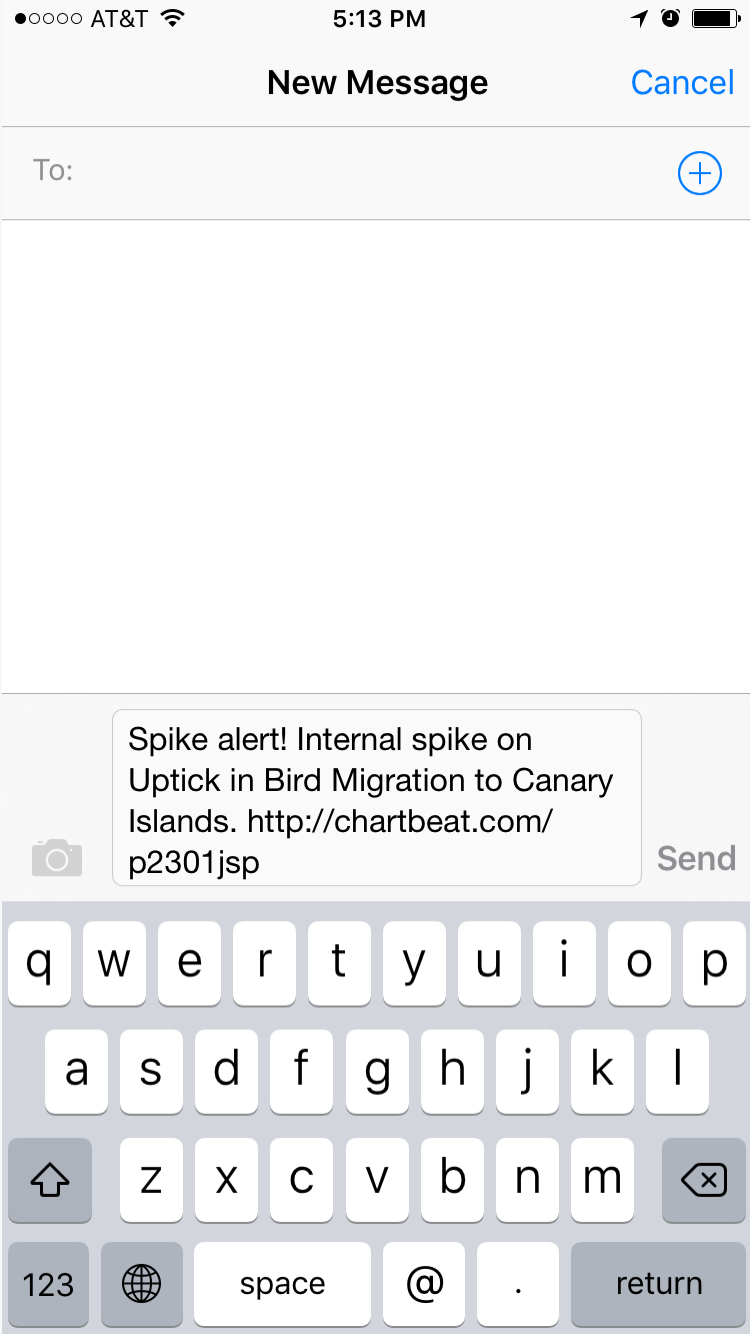
Notify users when they should pay attention
Why keep checking in to see if something is up or down when we can just tell you?
This concept utilizes notifications to alert users when there are anomalies in their data. The swipe to share feature makes sharing and flagging to colleagues easy.

Interaction Flows
Besides site and story data, the app had to encompass many other basic user flows: signing in, selecting a site, settings, empty states, etc. Here is a screenshot of my Sketch file, which tied together screens and interaction flows.

Launch
The app launched successfully to the App Store in February 2016.
For our MVP version, we did not get to build notifications or the 3-layer referrer flow. However, the release was still viewed as a massive upgrade. It brought UI cohesion with our desktop product, fixed all major bugs, and introduced new data features and functionality to help users dig in on-the-go.
We saw an uptick in app store downloads and a steady increase in Daily Active Uniques. Our Customer Success team now includes app training in their new customer onboarding.