
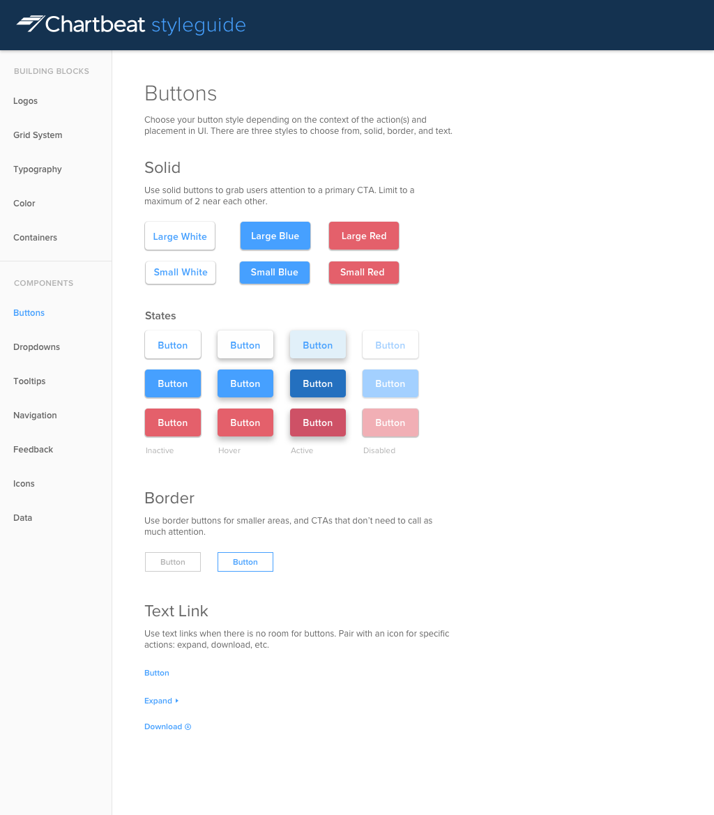
Chartbeat

Screenshot of the Chartbeat styleguide Sketch file when I joined
When I joined Chartbeat, I was introduced to a Sketch file that housed a handful of UI patterns that lived amongst the designers. It was a good starting place, but it had a long way to go before becoming a useful system. I saw two main problems:
- There was no connection between what got designed and what got coded. Newly designed products were starting to look similar, but there was no communication of this styleguide to the Front-End team, so none of the code was re-usable.
- The design system was new, and not tested on live products. It was designed in an ideal vacuum and I wanted to reflect back on it to validate the use cases it was solving for.
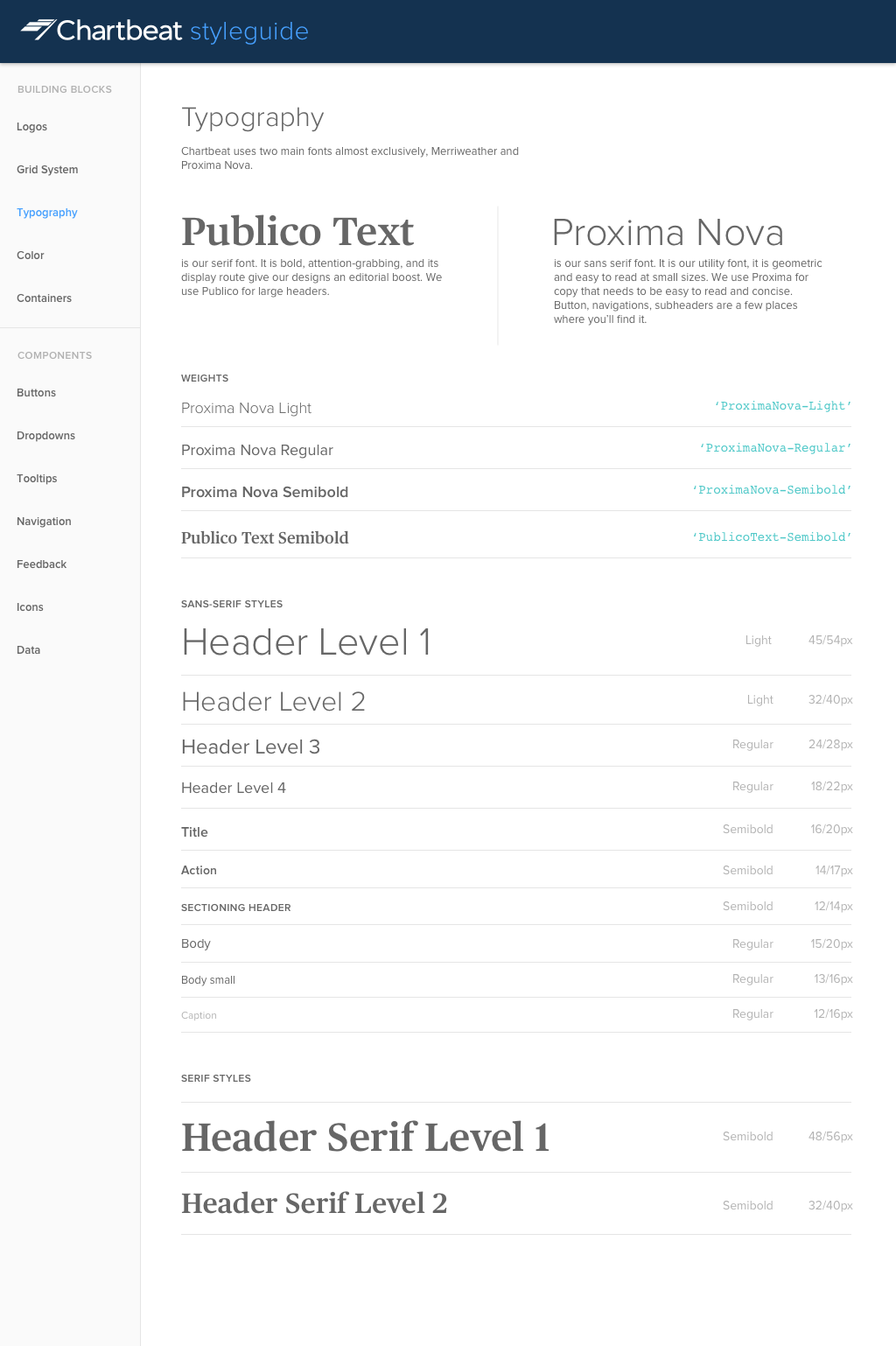
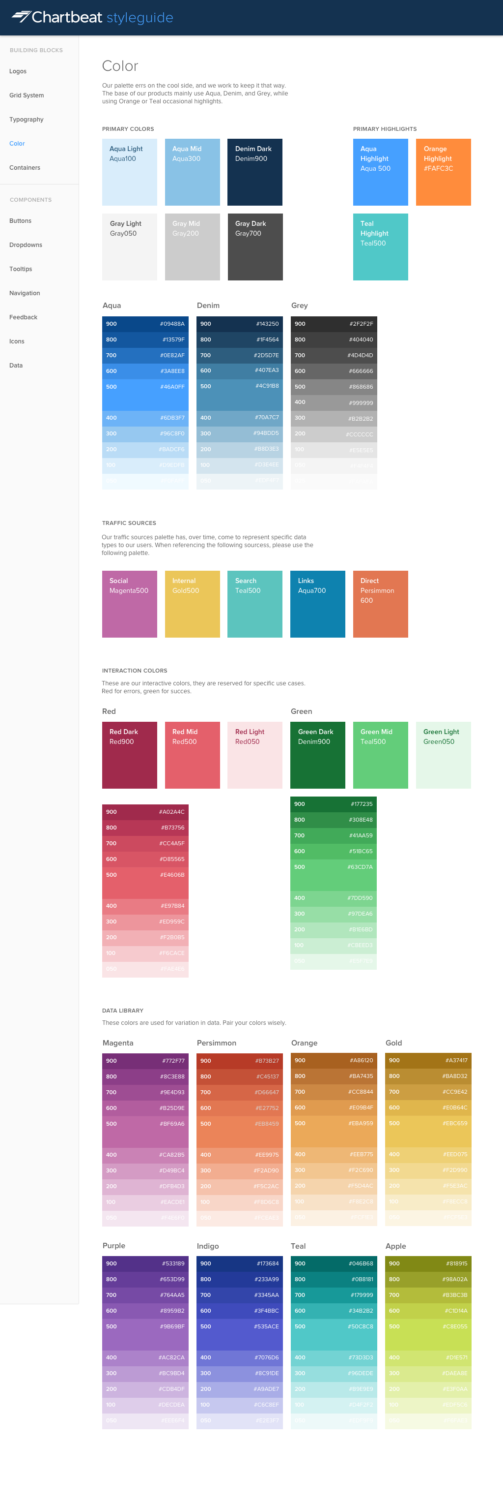
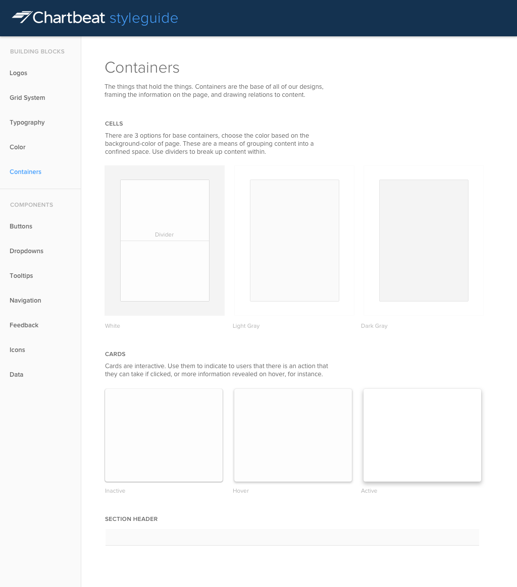
I worked on building a relationship between the Front-End and Design organizations in order to better understand each other's workflows and build a system that was helpful for both of teams. We joined forces to collaborate on a live styleguide that we still iterate and update to this day.
I also worked with the design team to update the styleguide contents and make sure we prioritized design rules and flexibility around the UI that we used most often.
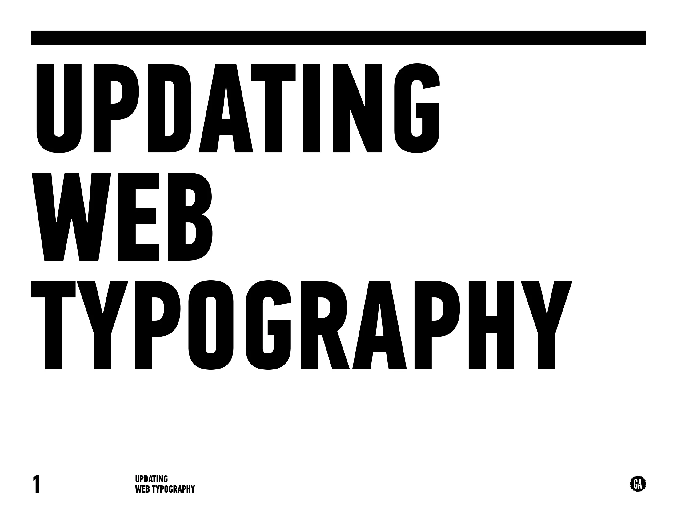
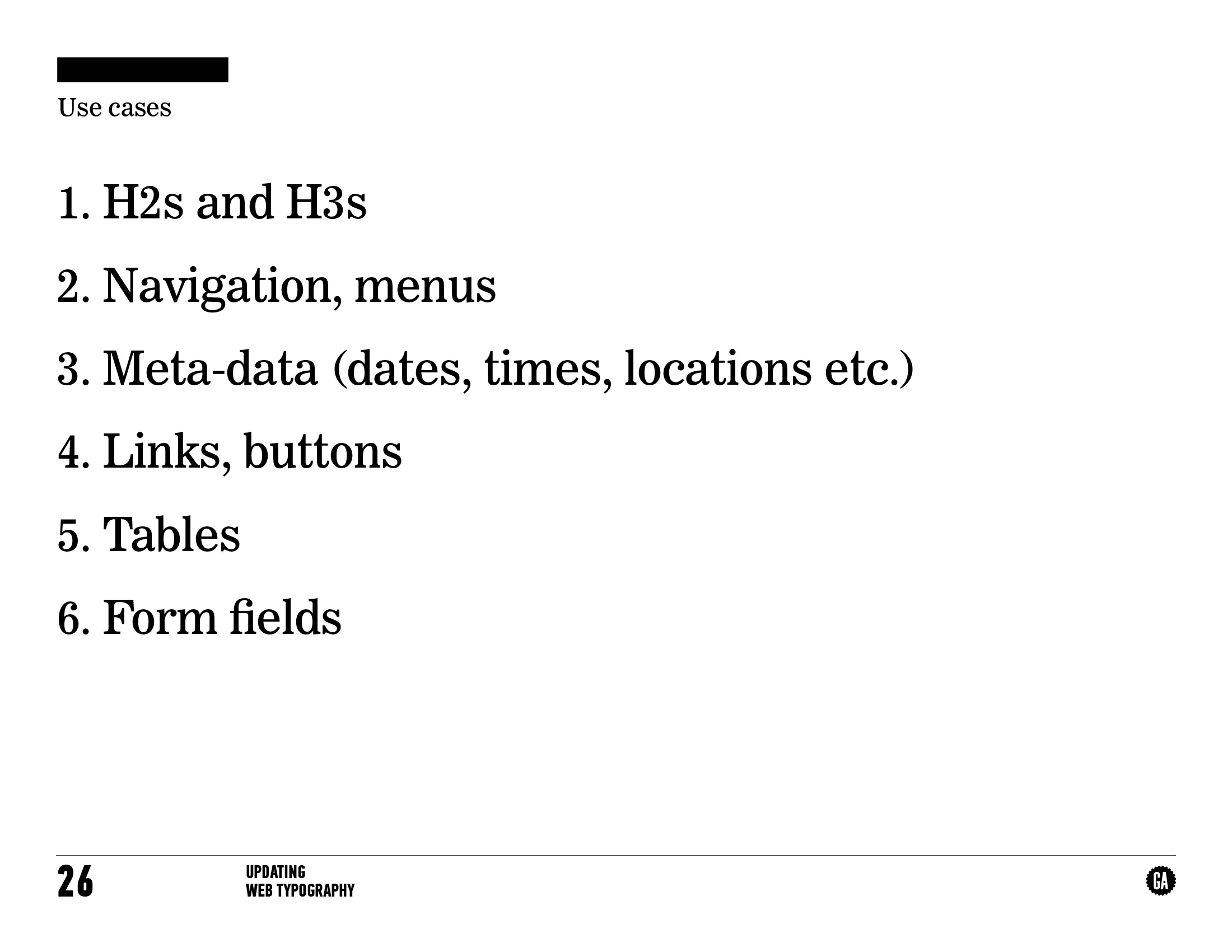
General Assembly
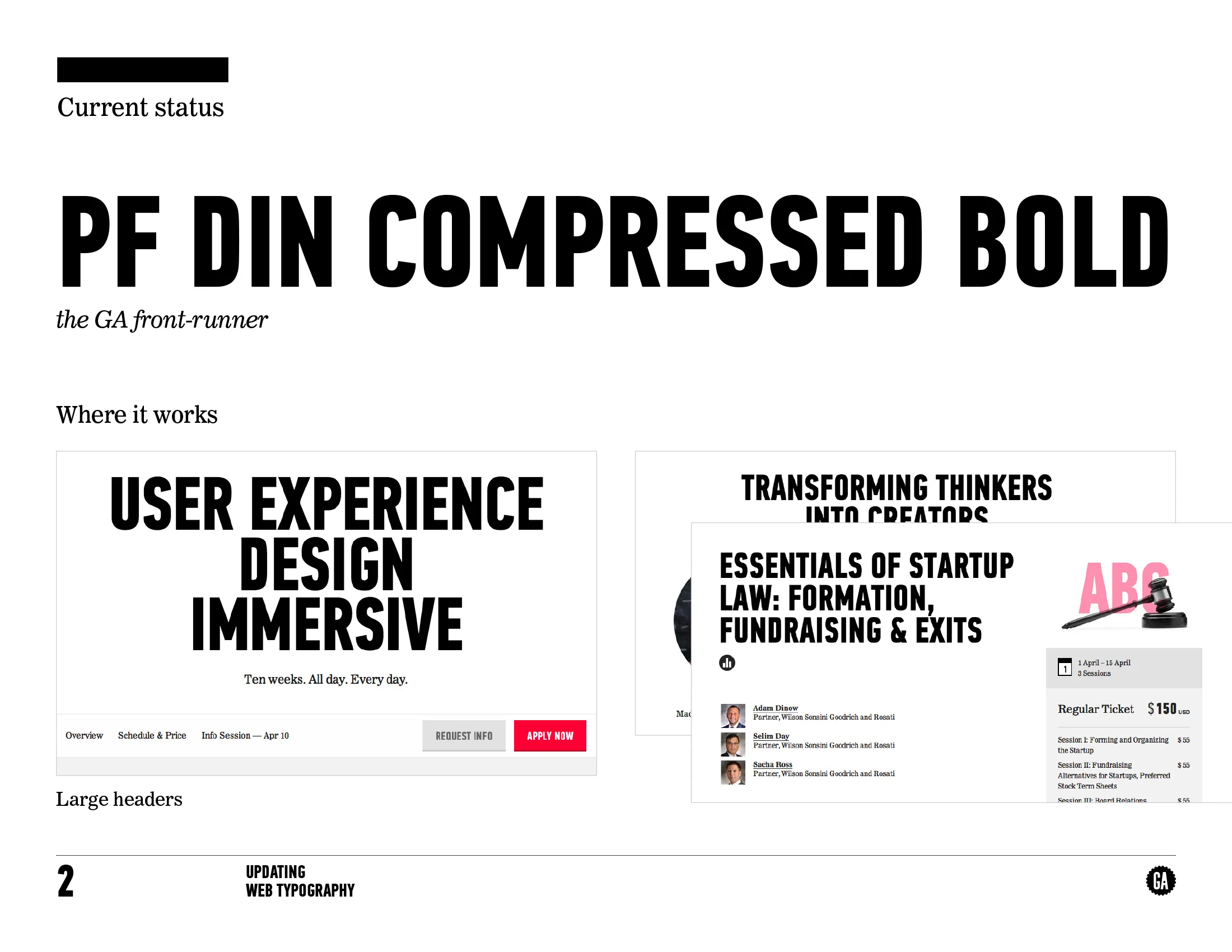
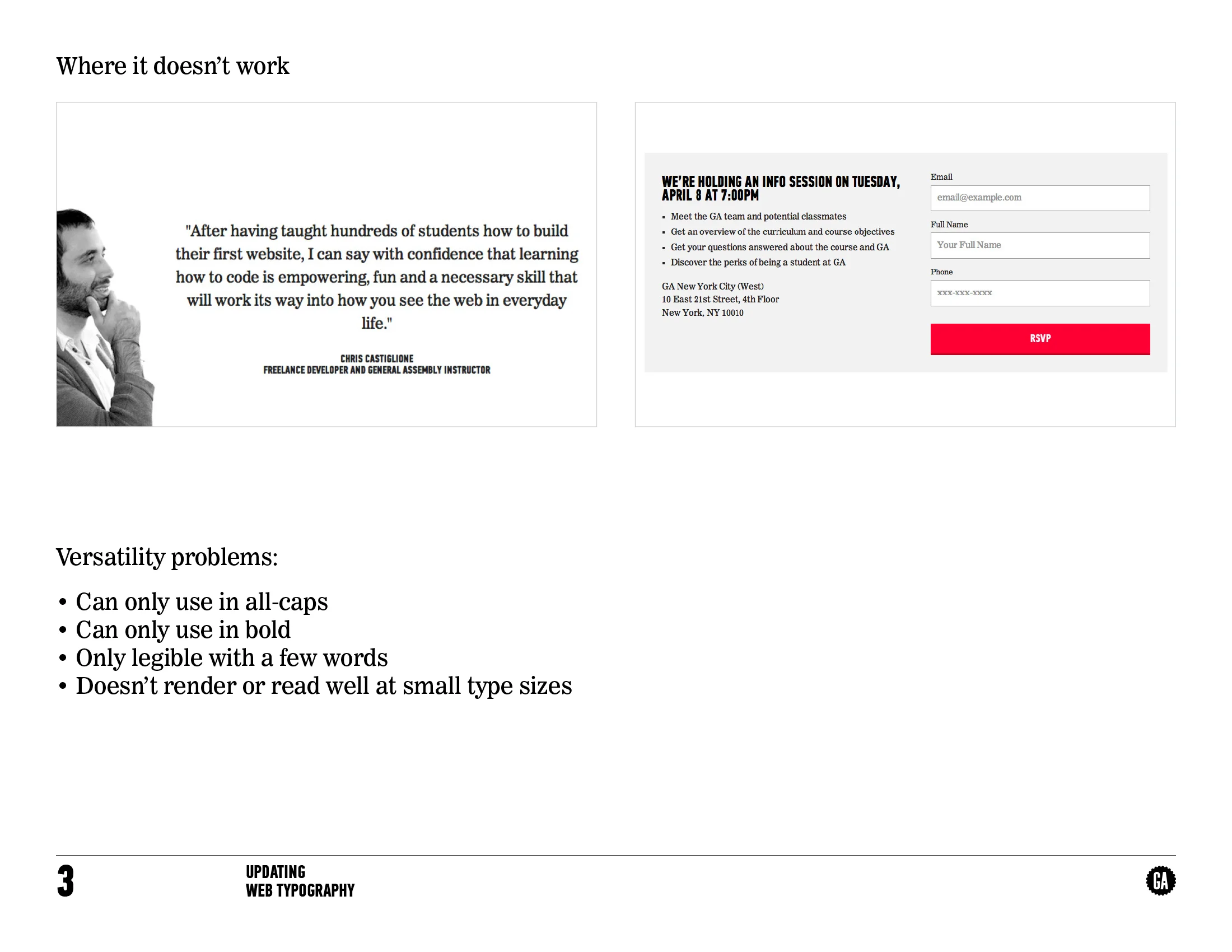
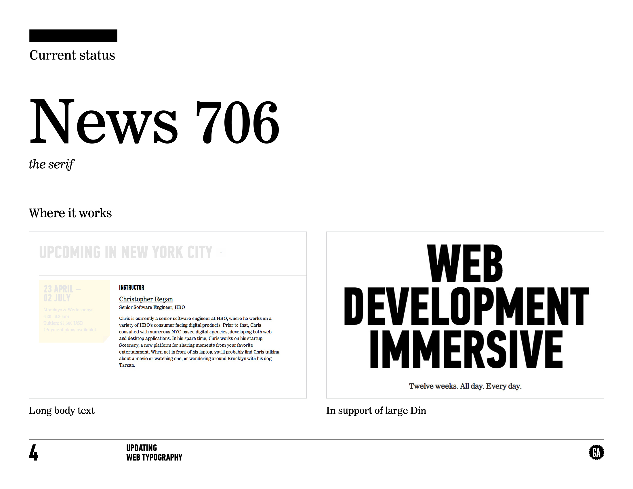
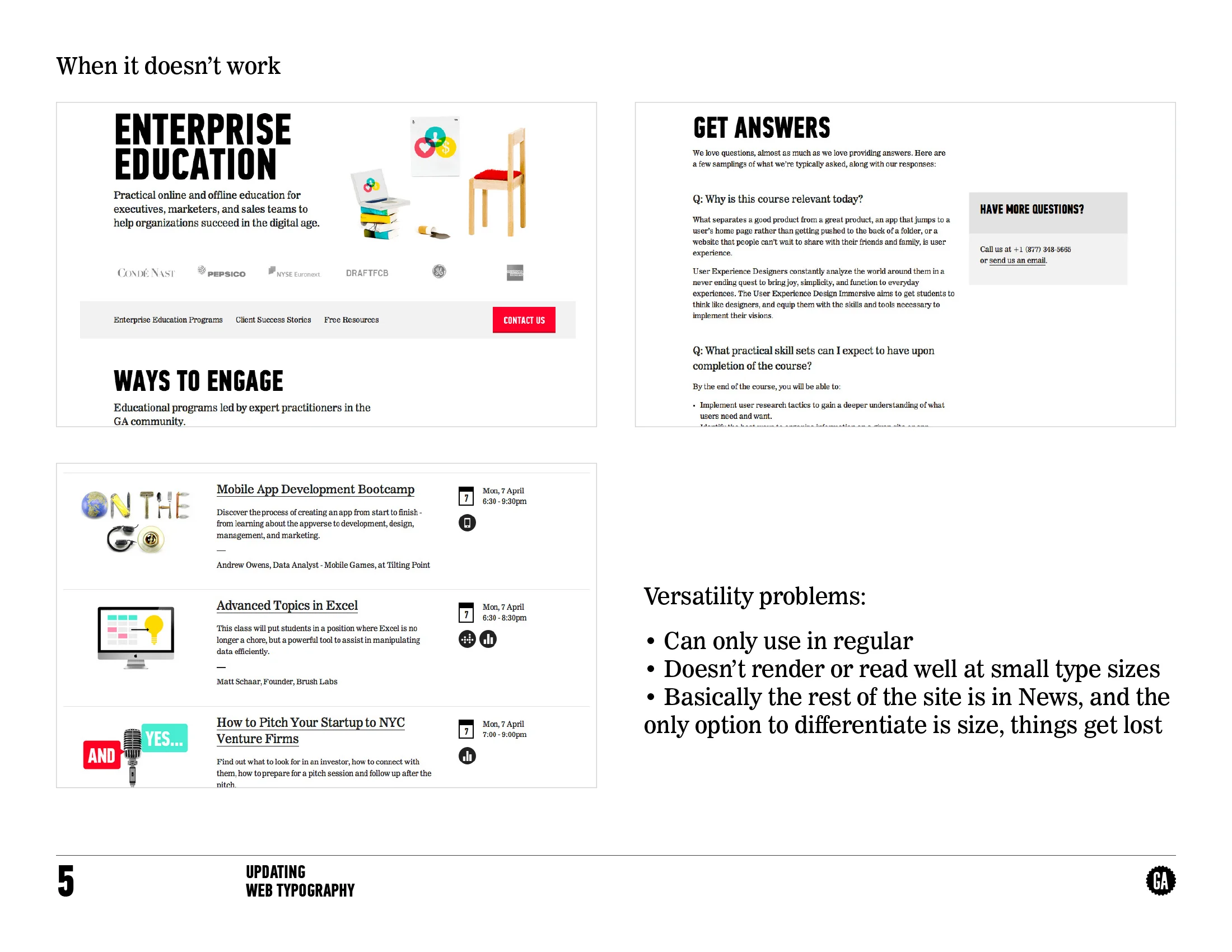
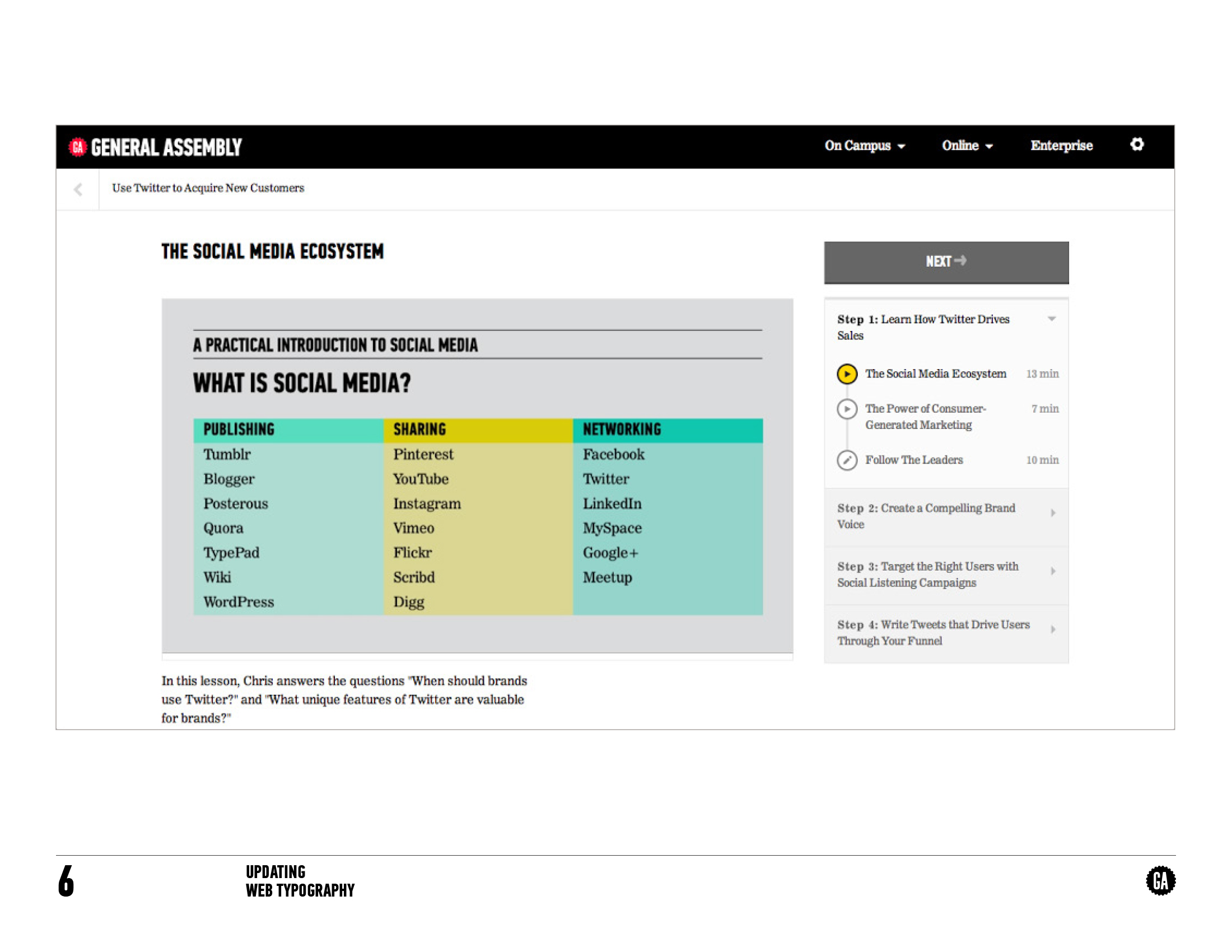
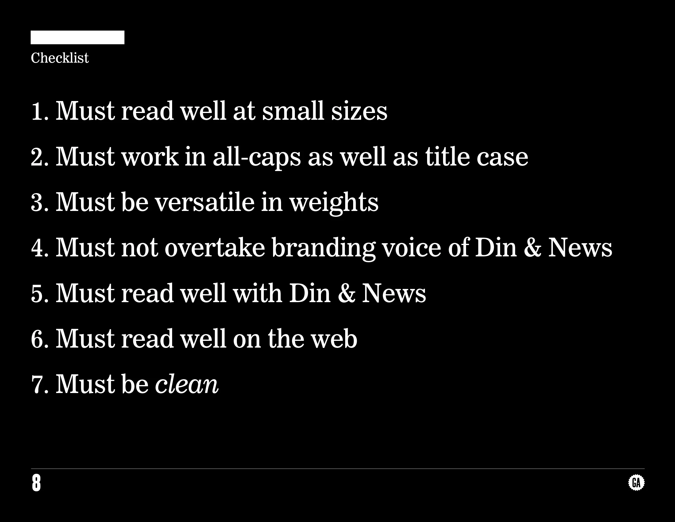
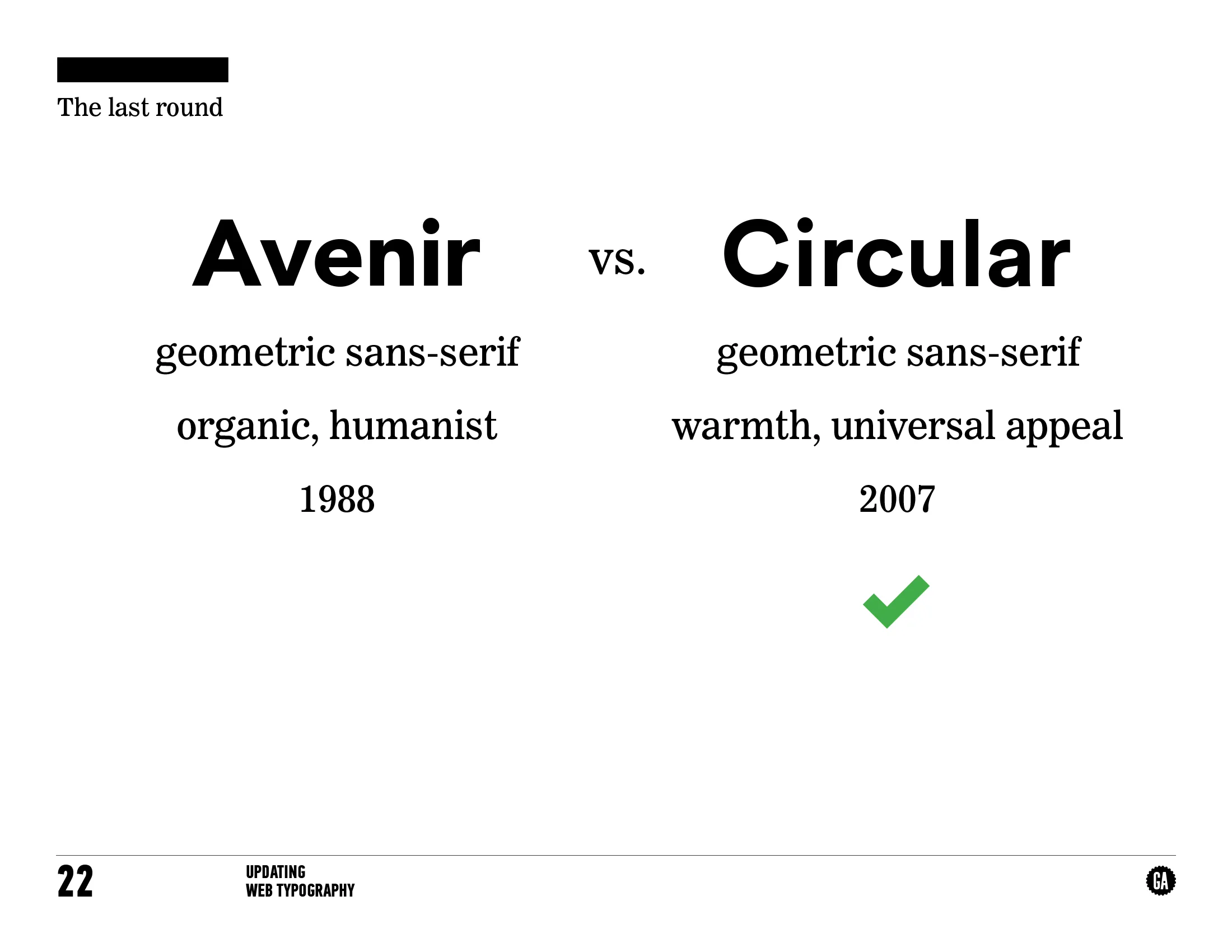
GA's original brand and design system was quite strong. It grounded the company and made it stand out in the sea of ed-tech startups. But, it was built for print and spacial design, not for building digital products. When I arrived, it was obvious that the team was held back by the limited styles and our designs were suffering because of a lack of hierarchy options.
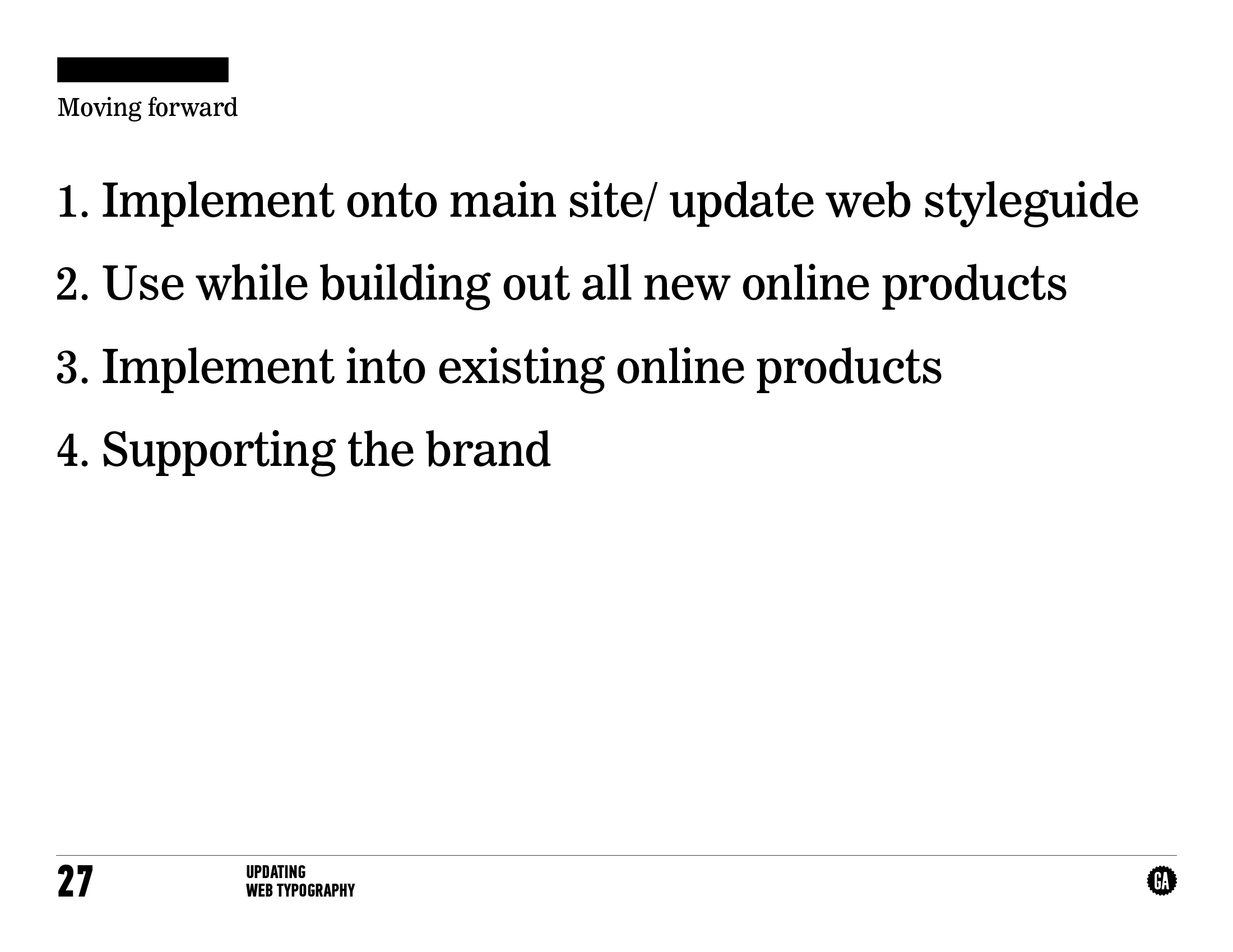
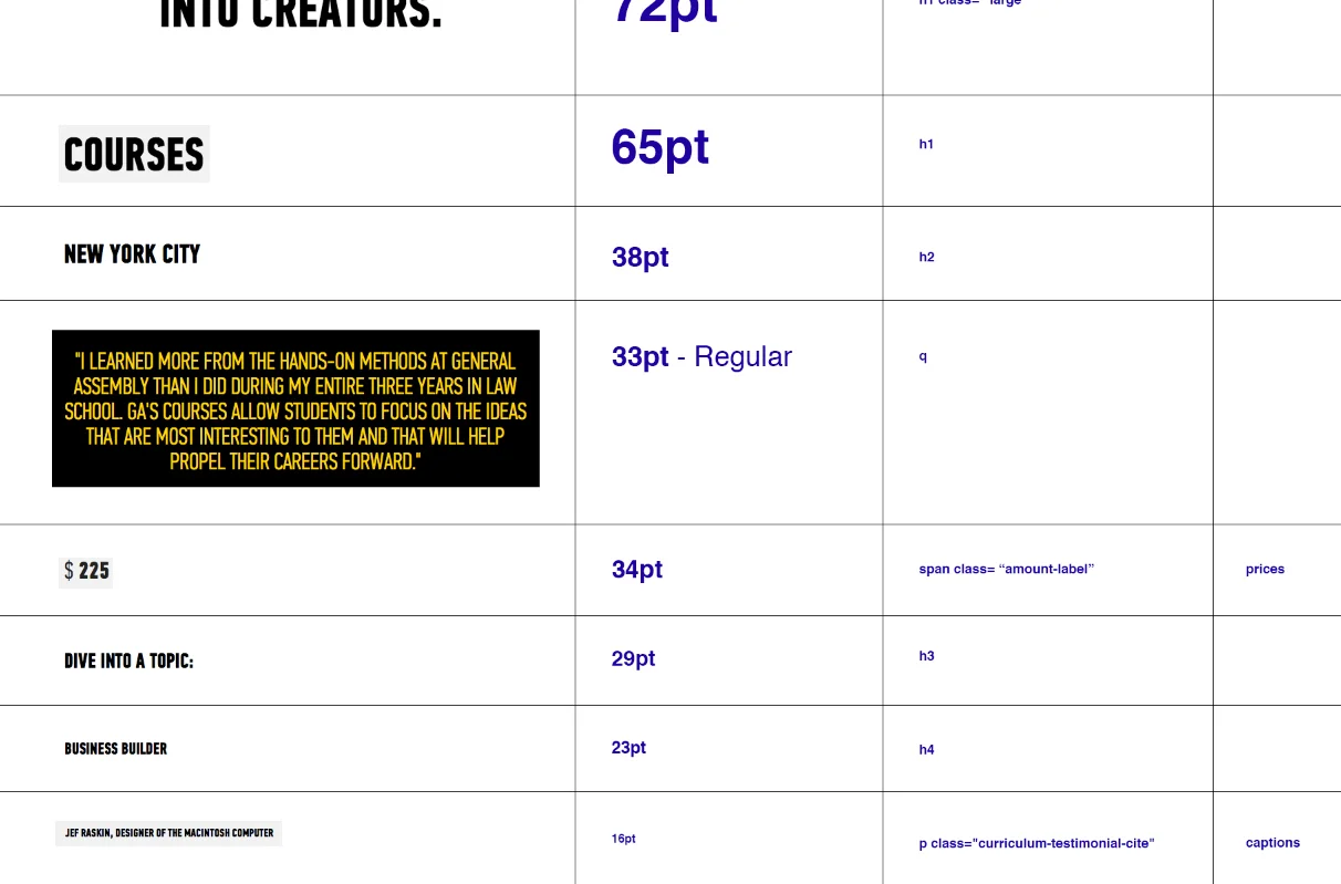
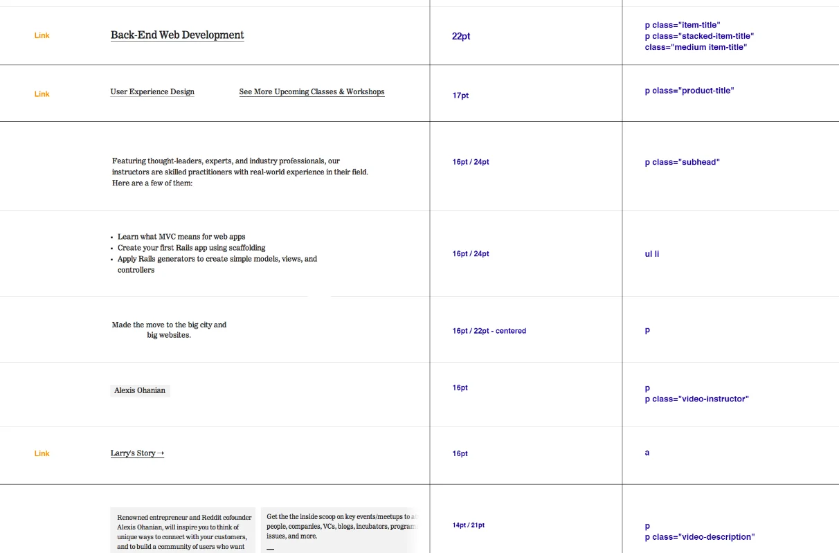
The founders held the brand very close, so changing anything about it needed strong justification. I put together a proposal to explain why, specifically, the brand typography needed iteration. After presenting the below deck to them, the updates passed to great success. I then led type and color audits to ground the buildout of our updated type and color styleguides.

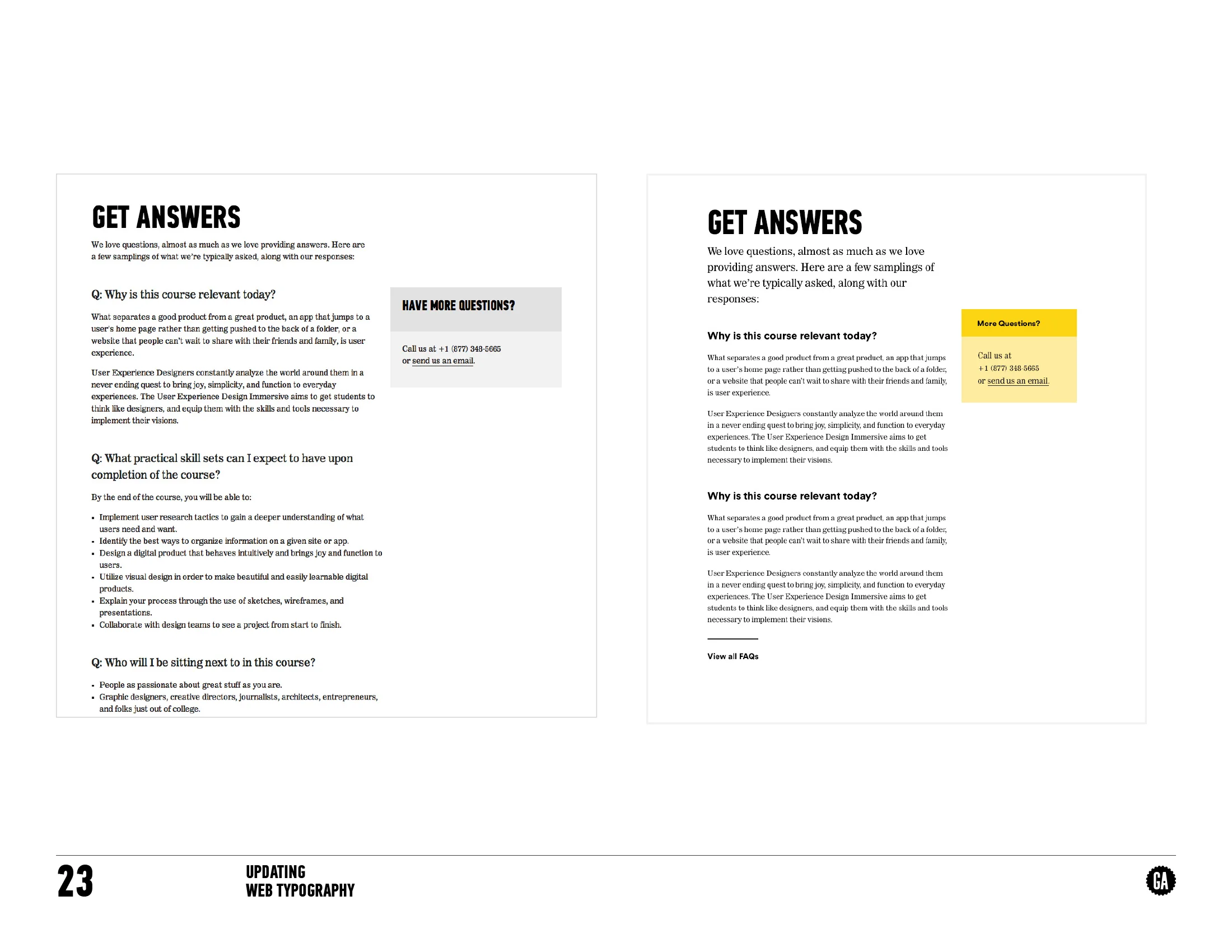
GA's original styleguide
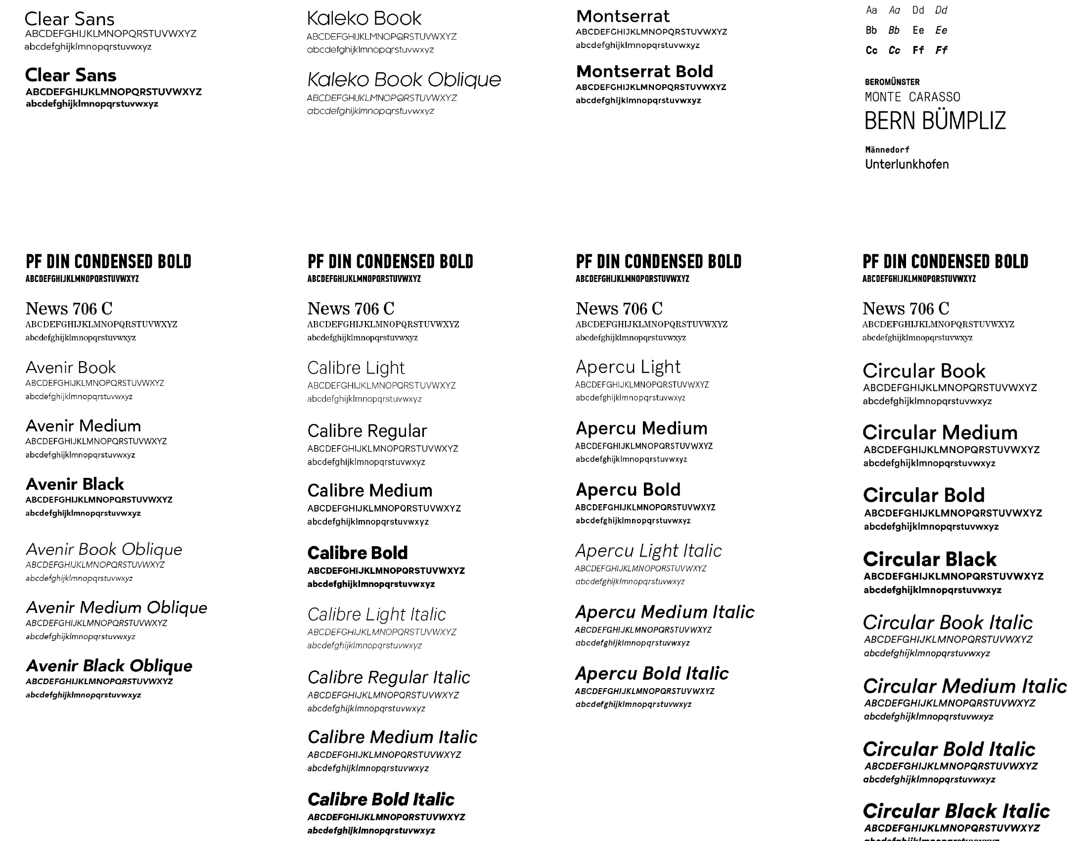
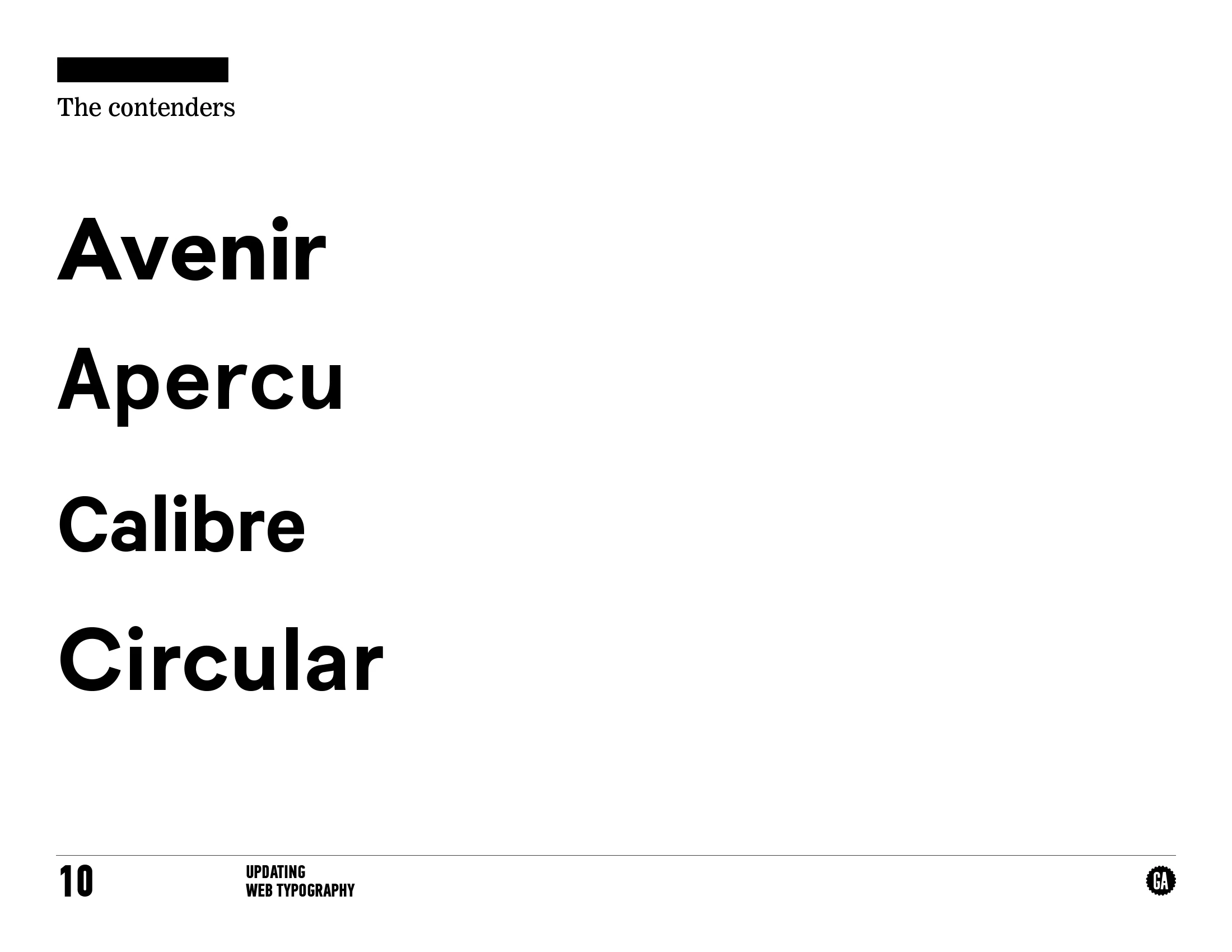
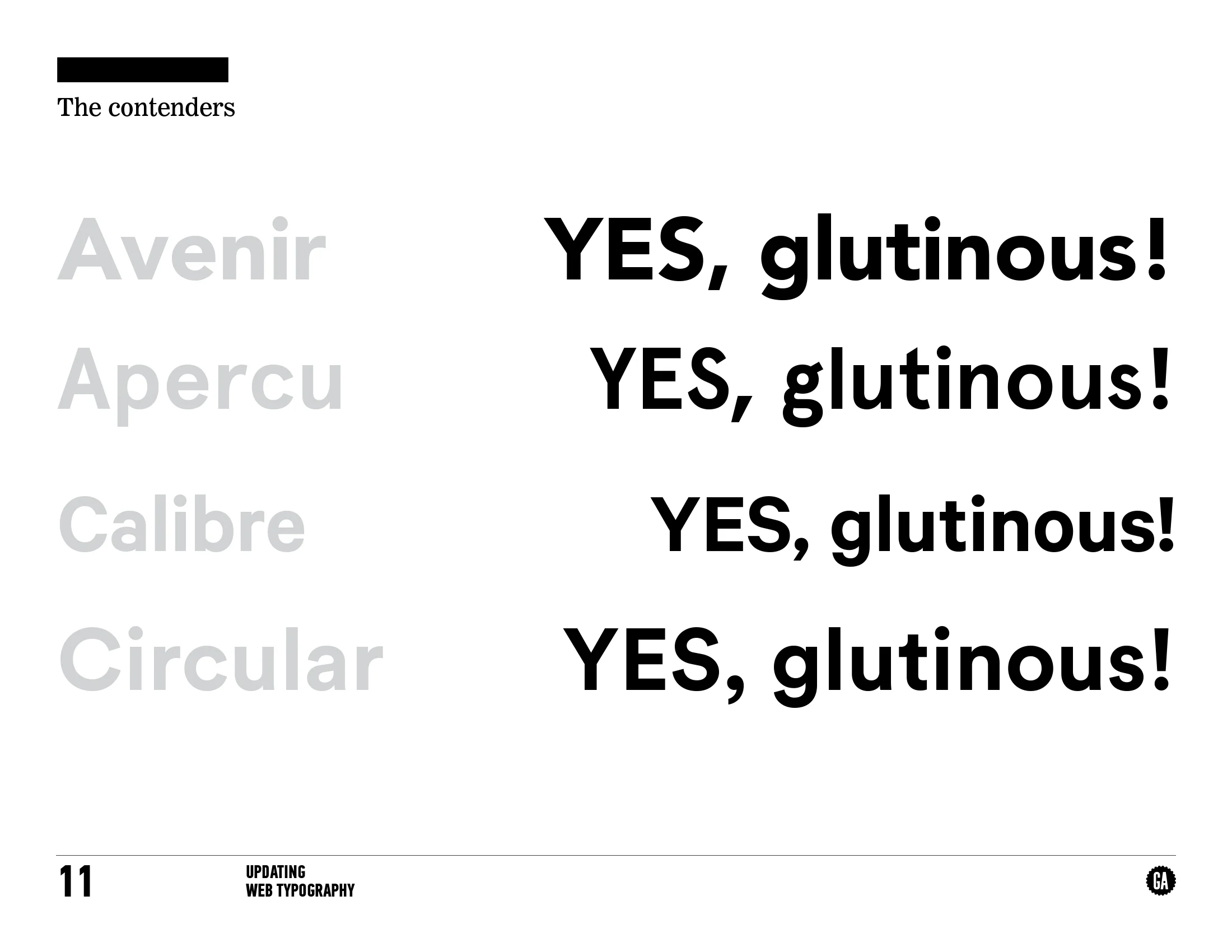


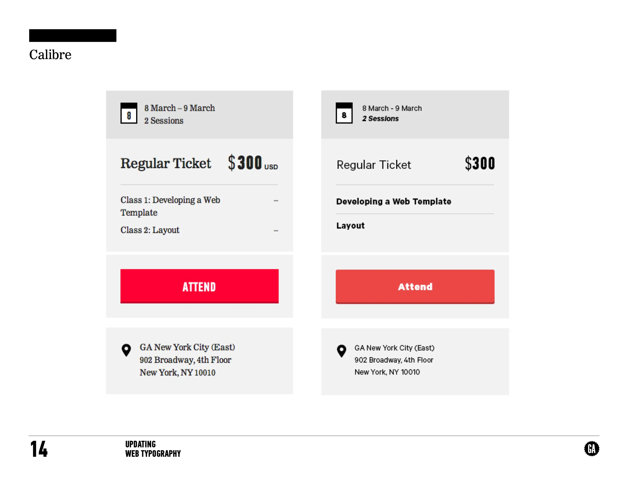
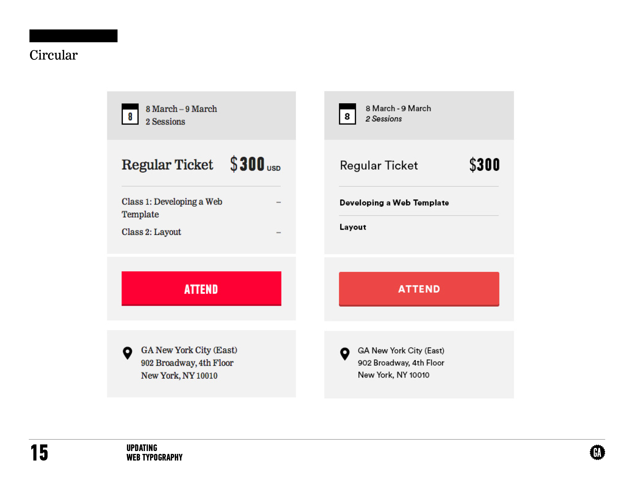
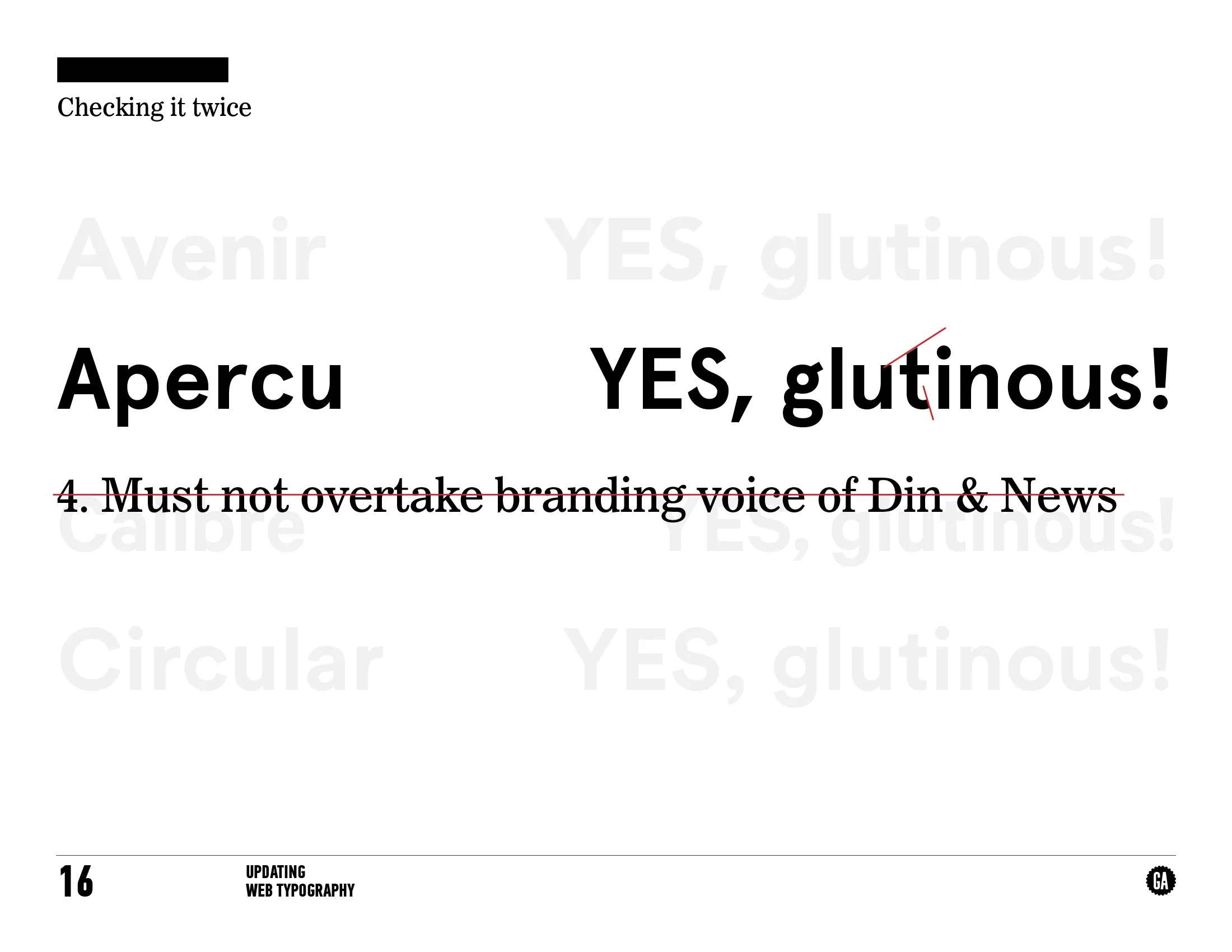
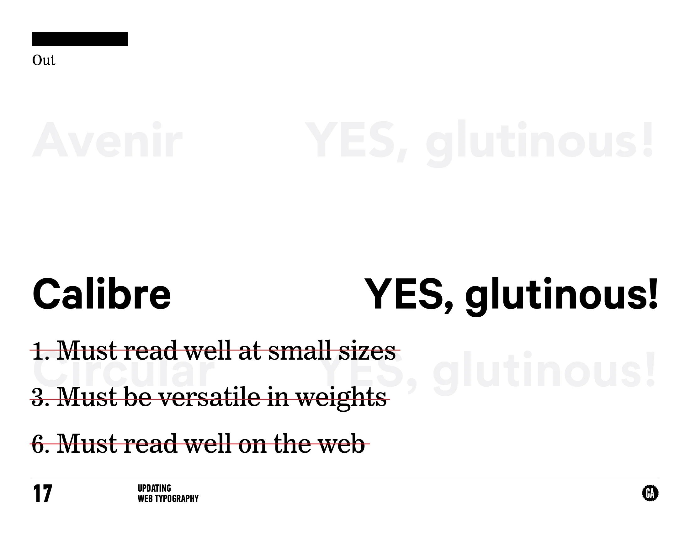
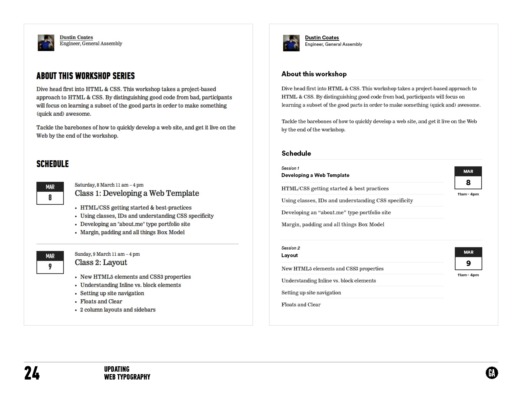
Screenshots of type audits built in order to determine needs and use cases of the introduction of Circular.
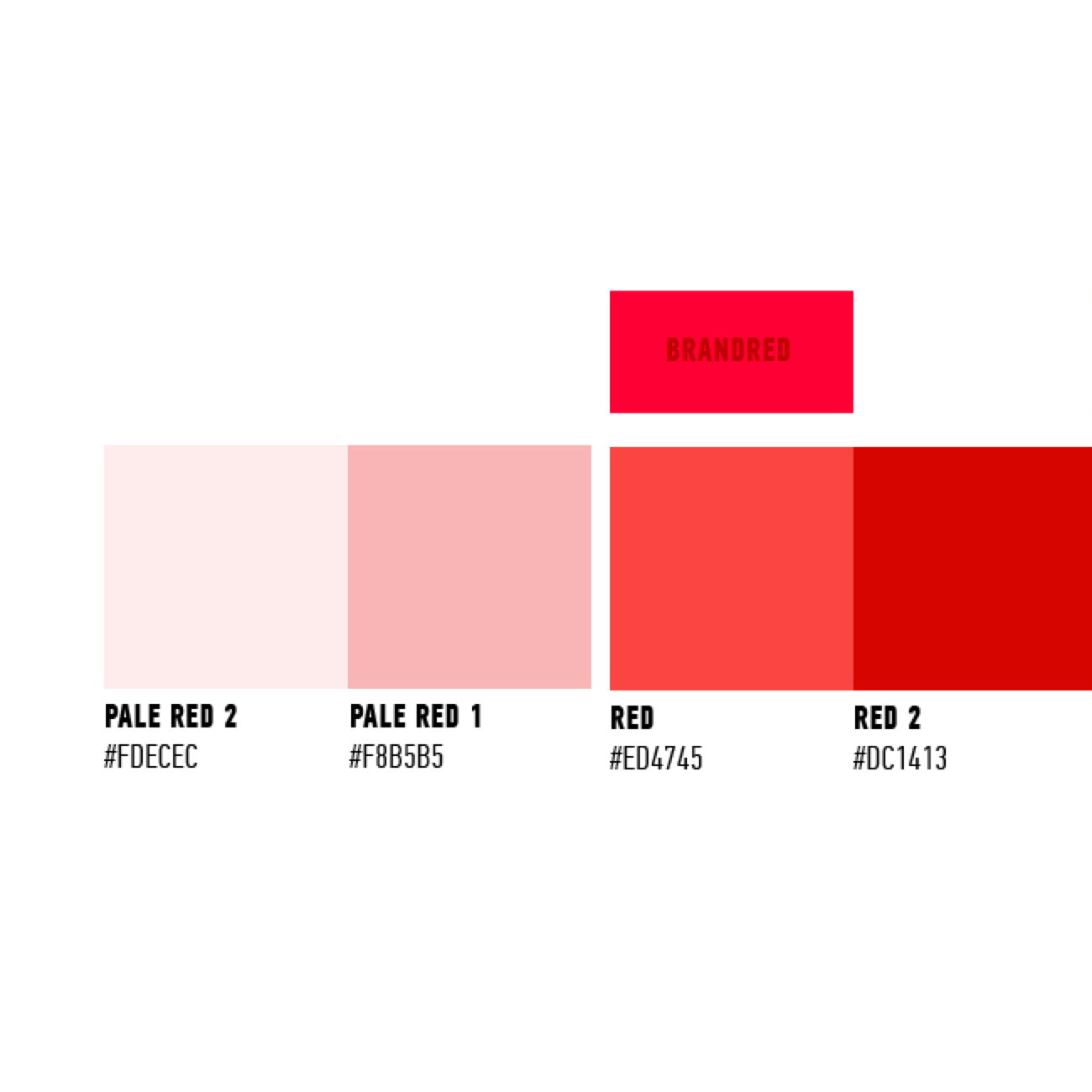
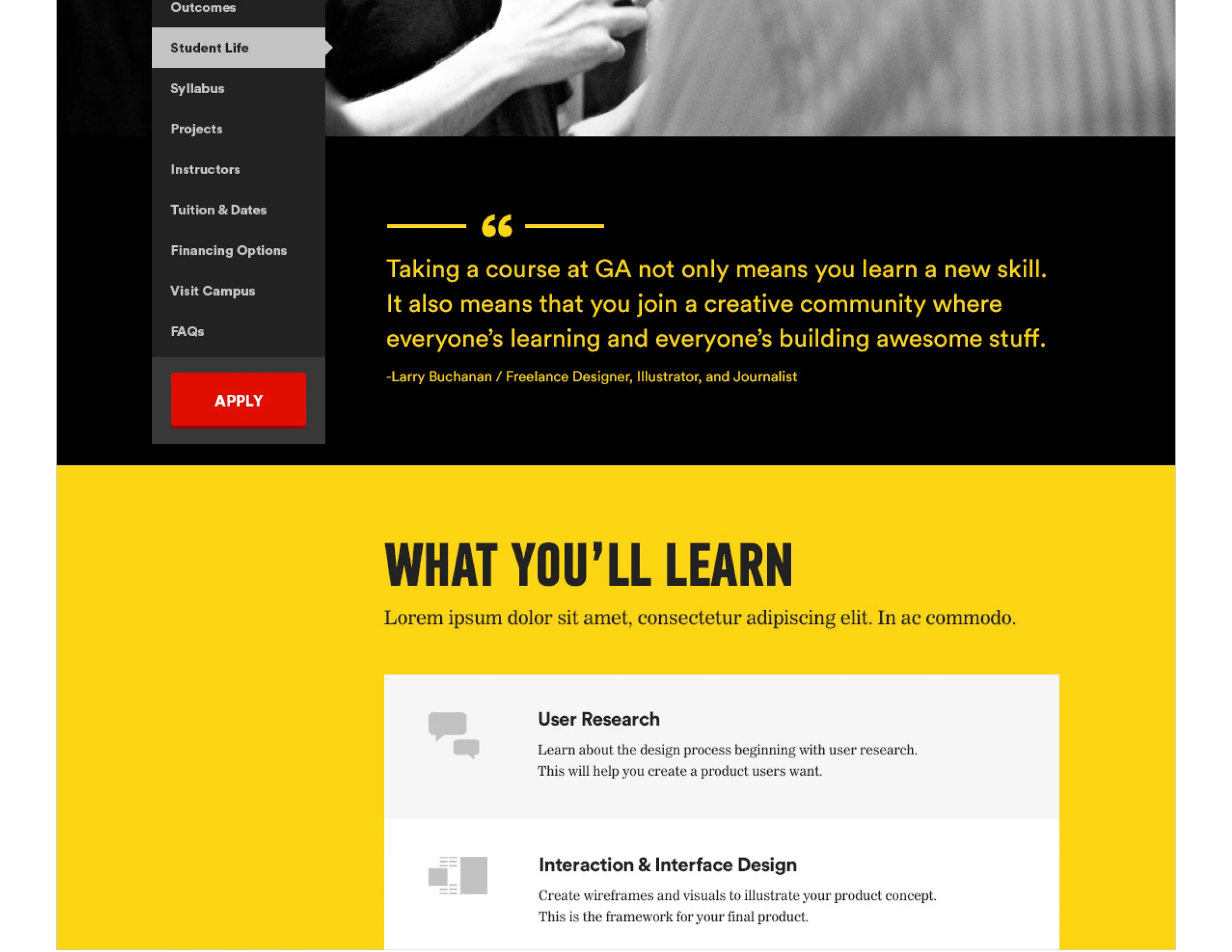
Updated type styleguide and palette methodology.

